Typeface
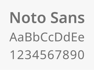
The Massachusetts Design System brand typeface, Noto Sans, was chosen because it is highly legible with support for many languages.
Provided by Google, it is free to download and use for your projects.
Type styles
Using type styles consistently makes content easier to scan and navigate, helping create clear and trustworthy experiences.
General guidelines
- Headings should use Noto Sans SemiBold (600)
- Body text should use Noto Sans Regular (400), be at least 16px in size, with 180% line height
- Type sizes should follow a 4px unit system for size variants (16px, 20px, 24px, 28px, 32px etc.)
- Only use italics to enhance meaning and clarity (titles, names, foreign language etc.). Never use italics to style full paragraphs.
- Try to keep paragraph widths below 75 characters per line to increase readability

Semantic type style definitions
A semantic type style definition names text styles based on their purpose or role (like “Heading” or “Body”) rather than their appearance. This makes it easier to keep typography consistent and meaningful across designs and code.
Heading styles organize content on a webpage, making it easier for users to scan and for assistive technologies to navigate the page structure. All digital experiences must use clear heading tags (H1, H2, etc.) to structure content. This ensures that every user, including those using screen readers, can easily understand and navigate the page.
Body styles are used for main content and longer text to keep information clear, readable, and consistent.
Label styles should only be used for short text elements like buttons, links, menus, and form labels.
Designing with semantic type styles in Figma
Designers leveraging our Figma libraries, can easily choose from the predefined set of semantic type styles to maintain consistent approaches to typography.
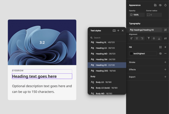
View the type style definitions in Figma
All type styles were created using our base (also known as primitive) variables for font family, size and weight.
Token theme files for developers
We’re currently exploring options for providing token theme files to make implementation more consistent and efficient. If you have suggestions, use cases, or preferences for how these files could be delivered, please send an email to designsystem@mass.gov. We'd love to connect and hear your input.
Implementing with REM units for accessibility
A REM is a unit of measurement that’s based on a single root font size. Instead of using fixed pixels, REM units scale automatically if a user adjusts their text settings.
When type styles are implemented in code we recommend using REM units.
Why it’s useful:
- Keeps sizing consistent across the site
- Makes it easier to update or scale designs by changing one root value
- Improves accessibility by respecting user font size preferences
PX to REM values
At this time Figma does not support the use of REM units. If you are partnering with engineering to implement designs, or getting started with building out a ramp with REM, here is a high level reference for how PX map to REMs for our base type tokens.
| Token | PX | REM |
|---|---|---|
| type-size-175 | 14 | .875 |
| type-size-200 | 16 | 1 |
| type-size-225 | 18 | 1.125 |
| type-size-250 | 20 | 1.25 |
| type-size-275 | 22 | 1.375 |
| type-size-300 | 24 | 1.5 |
| type-size-325 | 26 | 1.625 |
| type-size-350 | 28 | 1.75 |
| type-size-400 | 32 | 2 |
| type-size-450 | 36 | 2.25 |
| type-size-500 | 40 | 2.5 |
| type-size-550 | 44 | 2.75 |
| type-size-600 | 48 | 3 |
| type-size-700 | 56 | 3.5 |
| type-size-800 | 64 | 4 |
| type-size-1200 | 96 | 6 |
| type-size-2100 | 168 | 10.5 |