Brand colors
We chose our color palette to reflect the state’s identity and make sure all digital services are accessible.
General guidelines
All organizations should use the Massachusetts Design System color palette as much as possible. This helps make sure residents experience an accessible and recognizable look, no matter which service they use.
Bay Blue

Bay Blue is the main brand color. It grounds the color palette and creates a consistent look across products.
Base hex color code: #14558F
Bay Blue interactive colors
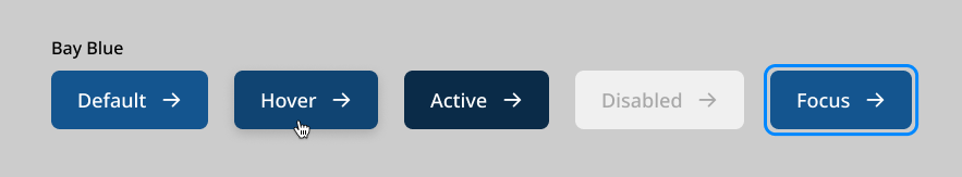
Interactive hex color codes:
| Default | Hover | Active | Disabled | Focus border |
|---|---|---|---|---|

#14558F | 
#104472 | 
#0A2B48 | 
#F0F0F0 | 
#0088FF |
Berkshires Green

Berkshires Green is the accent brand color. It works with Bay Blue to add balance and variety, and it often appears in secondary interface elements.
Base hex color code: #388557
Berkshires Green interactive colors
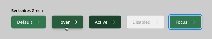
Interactive hex color codes:
| Default | Hover | Active | Disabled | Focus border |
|---|---|---|---|---|

#32784E | 
#275D3D | 
#1C432C | 
#F0F0F0 | 
#0088FF |
Duckling Yellow

Duckling Yellow is the highlight brand color in the palette. Use it sparingly to draw attention to key information and add warmth and energy to the overall experience.
Base hex color code: #F6C51B
Independence Cranberry

Independence cranberry is a supporting brand color in the palette. It is not usually used for interactive elements and is most often used in multicolor graphics.
Base hex color code: #680A1D
Granite Gray

Granite Gray is the neutral brand color in the palette. Use it as a background color to create contrast and support readability without overpowering the primary or accent colors. This helps those colors stand out as focal points.
Base hex color code: #535353.
Utility
Utility colors are used to show specific system states and user feedback, such as focus, success, warning, and danger. These colors give clear and consistent signals that help users understand what is happening and how to respond. For example, they can show which input field is active, alert someone to a problem, or confirm that an action was successful.
Because these colors have important meaning, their use is limited and standardized across the system. This helps keep them reliable, accessible, and free from overuse or decorative use, so users can trust what they mean wherever they are used.
Success Green

Success Green is used to show positive outcomes, successful actions, or completed processes. It gives a clear and accessible signal that something has gone right. For example, confirming a form submission, showing a success message, or highlighting verified information.
Base hex color code: #24A850
Warning Yellow

Warning Yellow draws attention to important information that may need caution or action. It signals situations that are not errors but may need user awareness, such as upcoming deadlines, incomplete tasks, or possible issues that need review.
Base hex color code: #F6B622
Danger Red

Danger Red is used to show errors, serious issues, or destructive actions. It gives a clear and accessible signal that something has gone wrong or needs immediate attention, such as form errors, system failures, or permanent actions like deleting data.
Base hex color code: #CD0D0D
Focus

Focus highlights interactive elements when they receive keyboard or programmatic focus. It provides a clear visual indicator that helps users understand their location on the page when navigating without a mouse.
Focus on light
Hex color code: #0088FF
Focus on dark
Hex color code: #B2DBFF