Getting started with Figma
The Massachusetts Design System (formerly Mayflower) provides libraries of design assets in Figma for the most commonly used interactive components that can be adjusted and combined to meet a wide variety of use cases.
Code resources for the components are not available at this time. We are currently evaluating how we might approach this on our design system team roadmap to help enable others in the future.
Required components
State banner

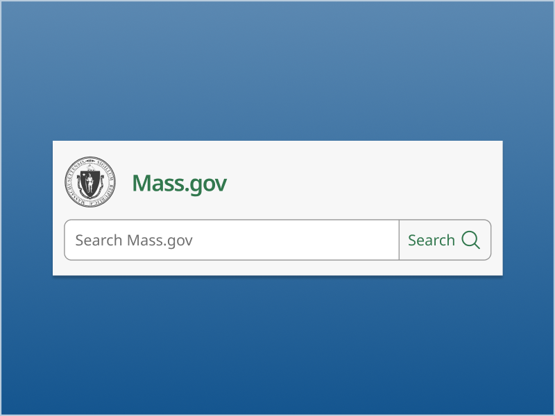
The Massachusetts state banner serves as a consistent, recognizable element across all Mass.gov digital properties to let users know they are on an official state website. It must appear at the top of each page within all Mass.gov sites.
You can use either the light or dark version to complement the content below the banner.
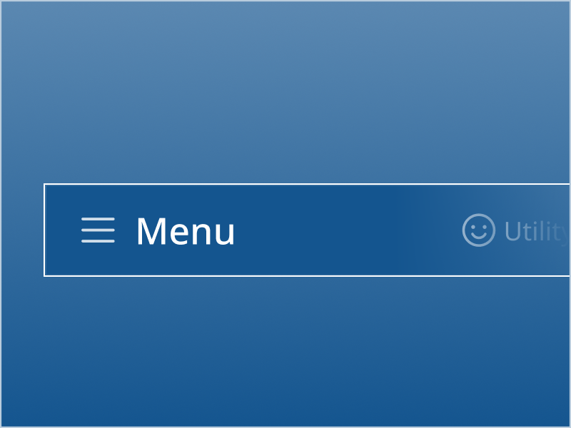
Site header
Utility navigation banner
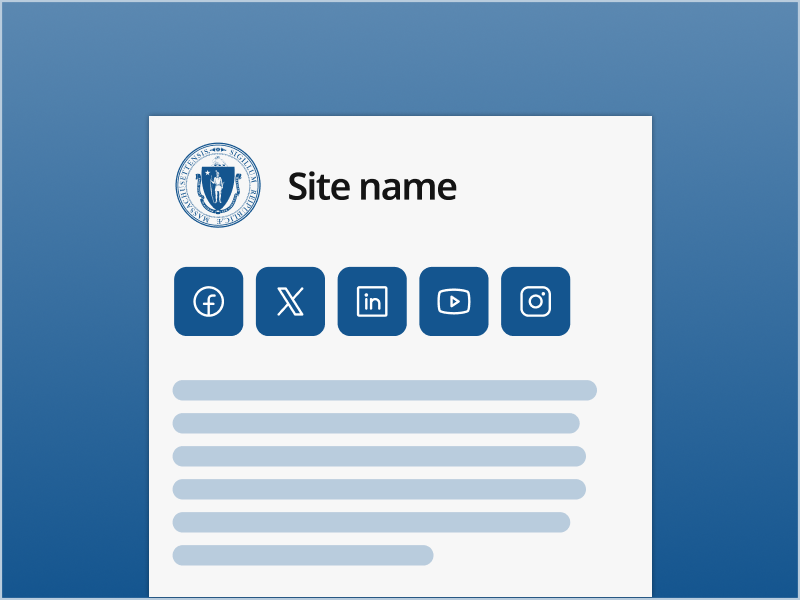
Footer
Available components
All components in Figma are publicly available to view, with detailed documentation including usage guidelines, responsive behavior, and accessibility implementation guidelines to support engineering. Think of the core component set like a starter kit that can be used to create a wide array of digital experiences for constituents far more efficiently.
Content

Accordion
Badge

Card

Details toggle
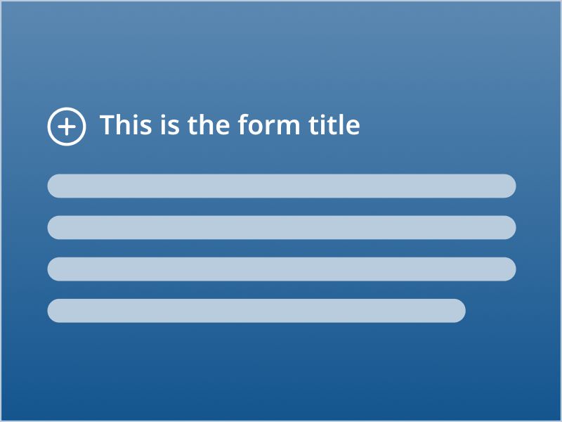
Form intro

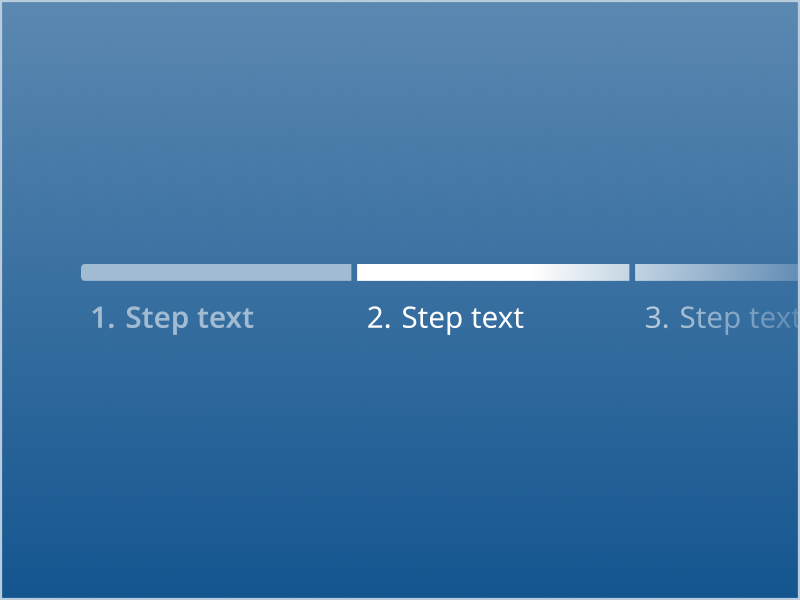
Lists
Input

Button

Checkbox

Date input

File upload
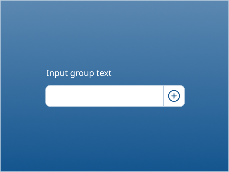
Input group
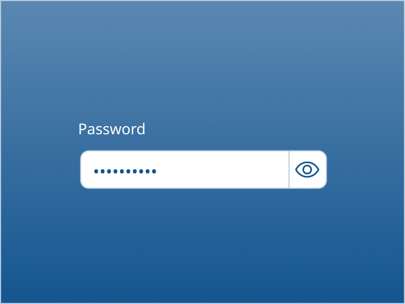
Password input

Phone input
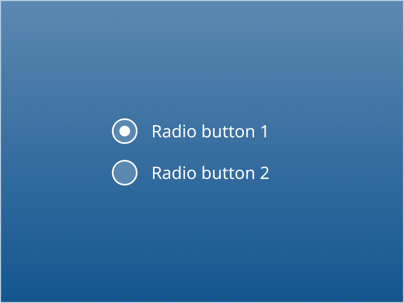
Radio button
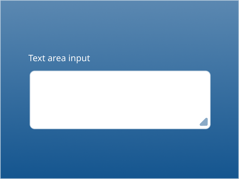
Text area input
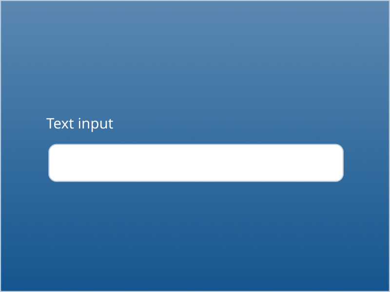
Text input

Switch
Navigation

Breadcrumb

Callout link

Icon button

Links
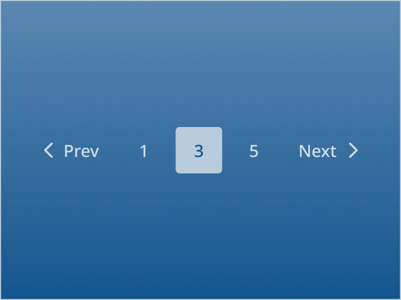
Pagination

Scrollbar

Tabs
Overlays

Modal

Popover

Popup menu
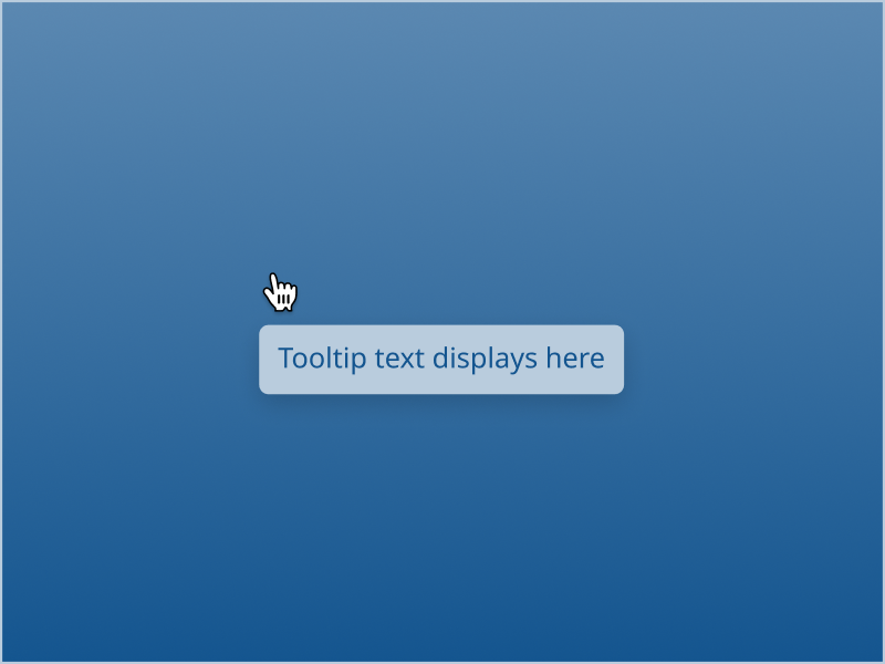
Tooltip