Corner radius
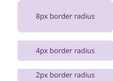
Corner radius controls how rounded the corners of an element are. It affects the look and feel of buttons, cards, and other interface components.
General guidelines
- Border radius should follow a 4px unit system for size variants
- The majority of elements in the system that are 44x44px in size and above have an 8px border radius (buttons, cards, callout links, input fields, alerts, etc). Smaller elements between 25-43px have a 4px border radius. Elements 24x24px and below have a 2px border radius.
Elevation
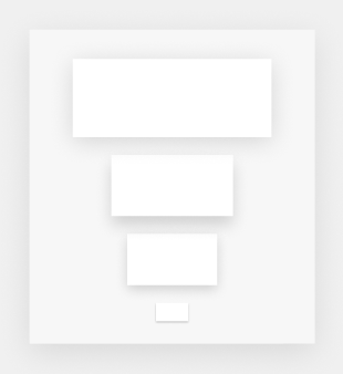
Elevation describes how deep elements appear on a page. It helps show whether components are in the foreground, middle ground, or background. The Massachusetts Design System uses color and shadow styling to create a raised effect, so elements appear to lift off the page.
General guidelines
- Use elevation on components like cards to separate them from the background. This helps group related content and guide focus without adding visual noise.
- Use elevation on pop-up menus and similar components to clearly separate them from the content underneath. This shows that they sit above the main interface and need user attention.
- Avoid using elevation purely for decoration. It should always serve a functional purpose.
- Use consistent elevation levels across similar components to reinforce hierarchy and depth
- Ensure elevated elements remain accessible with sufficient contrast and clear focus states