Designing and developing accessible forms
When designing your forms make sure you design for at least mobile and desktop screen sizes. This will help developers understand how elements should rearrange when using smaller screens or browser zoom 400%. For optimum readability use 16px font size as your smallest font and 1.5 percent line height.
- Use at least one heading at the top of your form that is descriptive and summarizes the purpose of the form that will be used as the form landmark's accessible name.
- Use descriptive label text.
- Use helper text to clarify formatting requirements.
- Use native HTML form elements (external link).
- Avoid custom date pickers they are usually not accessible, instead use the input type="date" HTML native element (external link).
- Don’t use placeholder (external link) text in input fields.
- Use the autocomplete input attribute (external link) for common input, select, and textarea fields.
- Use inline error messages that show below the field. Make sure they are descriptive and helpful and advise the user how to fix the issue. Error messages should include the field label text (don’t use: “This field can’t be empty” instead use “The first name field can’t be empty”).
- Make sure all text colors including the color of an HTML input element's value meet the 4.5:1 contrast (external link) requirement
- Make sure your form elements borders (input, select, textarea, checkbox, radio button) and selected state colors all meet the 3:1 non-text contrast (external link). Don’t hide input field borders or make the border color too light.
- Make sure the focus outline is visible on all focusable form elements. Tab through the form and verify that it meets the 3:1 non-text contrast (external link) requirement.
- Don’t rely on using color alone to convey meaning (external link). Include an error icon with your error message.
- Use browser native default CSS styles for radio buttons, checkboxes, or select element chevron symbols to prevent 3:1 contrast requirement failure when using operating system, browser, or plugin contrast theme overwrites.
Accessible Form CodePen example
The following tips and techniques have been implemented in the embedded CodePen.
To view the Pen Accessible form validation (external link) by EOTSS ACCESS @EOTSS-ACCESS (external link) on CodePen (external link).
Form landmark accessible name
Each form on the page must be wrapped in a "form" tag that has an "aria-labelledby" attribute to reference the ID of its heading to provide assistive technologies (i.e., screen readers) with an accessible name. When having multiple forms on a page, each form on the page must reference a unique accessible name.
Form instructions
Form instructions must always be listed at the start of the form. When designing a side-by-side (left and right) layout for desktop make sure you put the instructions on the left side not the right side. Because content typically gets stacked when viewed on mobile or when using browser zoom. In that scenario the left content will be stacked above the right content.
Required field sentence
If your form has required fields then always include the following instruction sentence above the first form element:
“Fields marked with a red asterisk * are required.”
If you are using a red asterisk in your field labels, then the asterisk in your instruction sentence should also be red.

Form Instructions for multi-page forms
When using multi-page form layout only list form instructions relevant to that page or view. For the first screen of a multi-page form also includes documents or information that may be required for the user to gather before filling out the form.
Always list the required field instructions on top of each screen
Multi-page forms
Don’t rely on progress indicators alone, instead, use the heading technique approach to indicate which step the user is on. The h1 heading will remain the same on each page or screen of your multi-page form. Use a h2 heading to define each step of the form.
Example for multi-page form headings
Heading 1: Mass Health Application
Heading 2: Mailing Address (Step 2 of 4)
Multi-page form required field instructions
If your multi-page form has required fields then always include the following instruction sentence above the first form element on each page or screen that contains required form fields:
“Fields marked with a red asterisk * are required.”
Avoiding redundant entry in multi-page forms
Do not ask users to re-enter information they have already provided in a previous step of the same form process. If information entered in an earlier step is needed again later, either:
- Auto-populate the field with the previously entered value, or
- Present the previously entered information and allow the user to confirm or edit it
Examples:
- Billing address should be pre-filled from a previously entered mailing address (with an option to change it)
- A confirmation step that re-displays entered data for review does not require the user to re-type it
Exception: Re-entry is acceptable when it is essential to the purpose of the step (for example, a "confirm password" field where the user must type the password a second time to verify it).
Multi-lingual forms
Make sure you test your form design using a language with longer text labels using Google translate (i.e., English to German).
Grouping multiple fields
Use the fieldset and legend tag to group multiple fields. You can style the legend tag to look like a heading. Designers can use existing heading styles in their design to define a heading when grouping multiple fields. However, developers will use the fieldset tag to wrap the grouped fields and the legend tag instead of a heading tag to wrap the heading text. Using legend tags instead of heading tags provides additional clarity for screen reader users when tabbing through a form. The example form shows several groupings using this technique.
Visible input field labels
Use visible input field labels that are descriptive. Each field must have its own visible label. Allow for extra space in your design for form translations.
Semantic form field structure
This section covers the HTML markup patterns used in the Accessible Form Validation CodePen example (external link).
Required field sentence
Put the following required field sentence at the beginning of the form when there are required fields:
HTML
<p>Fields marked with a red asterisk <span class="ads-asterisk" aria-hidden="true">*</span> are required.</p>The red asterisk is hidden from screen readers using aria-hidden="true" because screen readers announce it as "star." The aria-required="true" attribute placed on each required field is what communicates the required state to assistive technologies. For multi-page forms, include this sentence on each screen or page.
Required field labels and legends
Add a red asterisk at the end of each <label>, or <legend> tag for a checkbox or radio group, to indicate that the field is required.
HTML Example for <label> tag:
<label id="firstNameLabel" for="firstName">First Name <span class="ads-asterisk" aria-hidden="true">*</span></label>HTML Example for <legend> tag:
<legend>How do you want to receive your security code? <span class="ads-asterisk" aria-hidden="true">*</span></legend>Associating labels to form elements using the "for" attribute
Reference all form elements — <input>, <textarea>, <select>, checkbox, and radio buttons — using the "for" attribute (external link) on the <label> tag to point to the input's unique id.
HTML Example for <input> tag (this also applies to <select> and <textarea> tags):
<label id="emailLabel" for="email">Email <span class="ads-asterisk" aria-hidden="true">*</span></label>
<input type="text" name="email" id="email" aria-required="true" aria-describedby="emailError">
HTML Example for checkbox and radio button:
You can increase the clickable target area by wrapping the checkbox or radio element inside the <label> tag. You should still include the for attribute for enhanced accessibility compatibility.
<label for="morning"><input type="checkbox" id="morning" name="morning"> Morning</label>
<label for="securityCode_email"><input type="radio" id="securityCode_email" name="securityCode" value="email"> Email</label>
Using aria-required on required fields
Use aria-required="true" on required fields. Do not use the native HTML5 required attribute — it triggers native browser error messaging that is harder to style and may obscure browser-native autocomplete suggestions.
HTML Example for <input> tag (this also applies to <select> and <textarea> tags):
<input type="text" name="email" id="email" aria-required="true" aria-describedby="emailError">HTML Example for a single checkbox:
<input type="checkbox" id="terms_conditions_required" aria-required="true" name="terms">See the Opt-in checkbox CodePen example (external link) for a complete implementation.
HTML Example for a checkbox or radio button group:
To properly associate a checkbox or radio button group as a required field, add aria-required="true" to the <fieldset> tag — not to each individual checkbox or radio button. Adding it to each control results in unnecessary repetition for screen reader users.
For screen reader users to hear the error message, also add aria-describedby pointing to the error message container ID on the <fieldset> tag:
<fieldset aria-required="true" aria-describedby="securityCodeError" id="securityCode">Dropdown select elements
Check the longest option for your dropdown select elements to ensure that they are not clipped when selected. Avoid hard-coded width or height values. Use min-width and padding instead.

For selecting multiple options when using a select dropdown, add the HTML “multiple” Attribute to the select tag.
Styling checkboxes and radio buttons
Use accent-color and transform: scale() to style and enlarge browser-native checkbox and radio button controls rather than replacing them with custom CSS or JavaScript-driven components.
Why native styling matters for high contrast themes
Operating systems, browsers, and browser plugins that provide high contrast themes (such as Windows High Contrast Mode or the macOS Increased Contrast setting) override custom CSS colors, background colors, and borders. When you replace browser-native checkbox and radio button controls entirely using custom CSS — for example, using a div styled to look like a checkbox — those custom styles may be suppressed, and the control can lose its visible boundary or selected-state indicator entirely.
This failure can cause the control to no longer meet the 3:1 non-text contrast requirement (external link) because the OS or browser theme removes the colors you defined without knowing how to correctly substitute them for your custom control.
Browser-native checkbox and radio button controls are already recognized by high contrast themes. The theme knows how to correctly style them, including their checked and unchecked states, without any additional media queries from you.
Using accent-color to apply a brand color
The CSS accent-color property lets you apply a color to browser-native form controls — including checkboxes and radio buttons — while still allowing the browser and OS theme to maintain proper contrast in high contrast mode. Unlike manually setting background-color or border-color, accent-color is designed to work cooperatively with system-level contrast themes.
Using transform: scale() to increase size
The CSS transform: scale() property enlarges the native control without altering its structure or removing the browser's built-in rendering. This preserves the native control's appearance and high contrast theme compatibility while improving visibility for users with low vision.
css
/* accent-color applies your brand color to the native checkbox or radio control
   and remains compatible with Windows High Contrast Mode and macOS Increased Contrast.
   No additional media queries are needed to fix colors in high contrast themes. */

input[type="checkbox"],
input[type="radio"] {
   accent-color: #14558f;       /* Replace with your brand's primary color - error red: #cd0d0d; */
   transform: scale(1.5);       /* Enlarges the control without replacing native rendering */
   transform-origin: left;      /* Keeps the control aligned with the label's start edge */
   margin-right: 10px;          /* Prevents overlap with adjacent label text */
}
What to avoid
Do not replace native checkbox or radio button controls with custom-styled elements such as a div, span, or button, and do not use the ::before or ::after CSS pseudo-elements to paint a custom control appearance. These approaches are invisible to high contrast themes — the theme cannot interpret or correct them, so the control's visible boundary or checked-state indicator may disappear entirely for affected users.
Important: Adding @media (forced-colors: active) or @media (prefers-contrast: more) overrides does not fix this problem. No individual or organization owns every combination of device, operating system version, browser version, and browser plugin that your users may have. Media query overrides can never be tested exhaustively, and they can never guarantee compliance across all of them. Using browser-native controls is the only approach that does.
Helper text used for formatting instructions
Putting form field specific helper text used for formatting instructions as part of the label tag prevents misalignments of form fields when form fields are laid out side by side.
For longer formatting instructions that don’t fit within the designated space for the form field place them above the form element’s label reference the instructions using aria-describedby.
We recommend using flexbox alignment (external link) CSS for all form elements, this allows for better reflow and repaint when the page loads and also simplifies media query CSS used to stack form elements for mobile devices and browser zoom.
Helper Text Alignment Example 1:

Helper Text Alignment Example 2:

Helper Text Alignment Example 3:

Error prevention
For forms that involve legal commitments, financial transactions, or modification/deletion of user-controllable data, you must provide mechanisms to prevent serious consequences from errors. This helps users avoid mistakes that could have significant legal or financial impact.
At least one of the following must be provided:
- Reversible: Allow users to reverse submissions (e.g., cancel an order within a certain timeframe, undo a deletion)
- Checked: Validate user input and provide an opportunity to correct errors before final submission
- Check for input errors (format, required fields, data validity)
- Display clear error messages
- Allow users to correct mistakes before proceeding
- Confirmed: Provide a review/confirmation step where users can:
- Review all entered information
- Confirm the information is correct
- Make corrections before final submission
- Common pattern: Show a summary page with "Review and Submit" functionality
Examples where this applies:
- Online purchases and checkout processes
- Account registration and profile updates
- Legal agreements and contract submissions
- Bank transfers or financial transactions
- Deleting user accounts or important data
- Submitting applications (jobs, benefits, permits)
In your forms:
- Add a confirmation step for critical forms (show a summary before final submission)
- Implement client-side and server-side validation with clear error messaging
- For deletions, use confirmation dialogs: "Are you sure you want to delete this?"
- Consider adding "undo" functionality where appropriate
- Provide clear labels and instructions to prevent errors in the first place
Error messages
Screen reader support for error messages
- Add
aria-label="error:"to the error icon to provide clear screen reader output when an error message is announced. Screen readers will prepend "Error:" to the beginning of each error message. - Use
aria-describedbyon<input>,<select>, or<textarea>fields to reference the ID of the error message container. - Use JavaScript to inject the error icon and message text when an error is triggered, and to remove it when the error is corrected.
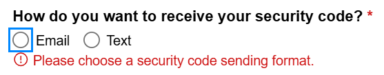
- When using a checkbox or radio button group, put
aria-describedbyon the<fieldset>tag. The error message will be read by the screen reader once the first element in the group receives focus.
Important: Do not use role="alert" on inline error message containers. Using role="alert" causes screen readers to immediately and automatically announce all error messages in sequence upon form submit, which is disorienting and confusing for users.
Visual Identifiers for Error Messages
Using a red error icon in addition to red text for error messages is considered best practice. Don’t rely on color alone to indicate error messages. Users who are color blind may not be able to identify the error message based on color alone, also, when using a high a contrast theme (i.e., Night Sky theme in Windows) the error text and icon will be white.


Showing error messages on form submit
For your form validation to deliver the best user experience, validate your form on submit. Form submit should be triggered by activating the "submit" button.
When writing error messages, always include a suggestion that tells the user how to fix the problem. For example:
- Don't write: "The date of birth field is invalid."
- Write: "The date of birth field is invalid. Please use the format MM/DD/YYYY."
Describing how to resolve the error is both a best practice and a WCAG requirement under Error Suggestion.
Important: avoid showing error messages using the JavaScript "blur" event which occurs when a field loses keyboard focus or after the user tabs off the form field. This is important especially for larger forms containing more than one field. Using on "blur" validation can be very disorienting and confusing for screen reader users since the error message is announced after the user tabs off the field. Some screen reader users have partial vision and rely on assistive technology to supplement their ability to see. The visual and assistive technology experiences should always match and be consistent.
Removing errors after they have been fixed using the JavaScript "blur" event
After the user fixes the error on an input field and the field loses focus by either clicking elsewhere on the screen or tabbing off the field, the error message should be removed. Also, any ARIA attributes used to indicate that the field has an error should be either removed or set to “false” (i.e., aria-invalid="false").
Developing your form validation
This section covers the JavaScript patterns used in the Accessible Form Validation CodePen example (external link).
Submit button markup
Your submit button must include type="submit" for robust cross-browser support:
HTML
<button type="submit">Submit</button>JavaScript for error messages and ARIA state
Use JavaScript to add and remove error message content and to update ARIA attributes in response to validation. The CodePen example includes complete HTML, CSS, and Vanilla JavaScript to get you started.
JavaScript to add and remove error message text:
// To add an error message
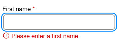
document.querySelector('[data-error-for="firstName"]').innerHTML = errorIcon + ' <span>Please enter a first name.</span>';
// To remove an error message
document.querySelector('[data-error-for="firstName"]').innerHTML = "";JavaScript to add and remove aria-invalid:
// To indicate a field is in error
birthDayInput.setAttribute("aria-invalid", "true");

// To clear the error indicator after correction
birthDayInput.setAttribute("aria-invalid", "false");
Optional JavaScript to add and remove an error border CSS class:
Adding a red border to fields in error state is not a WCAG requirement. The CodePen example includes the CSS class ads-errorBorder commented out for teams whose design system uses this pattern. If the error border style is used, make sure its border width matches the default border width to prevent layout shifts.
// To add the error border class
lastNameInput.classList.add("ads-errorBorder");

// To remove the error border class
lastNameInput.classList.remove("ads-errorBorder");
css
select.ads-errorBorder,
input.ads-errorBorder {
   border-color: #cd0d0d;
}
Descriptive error messages
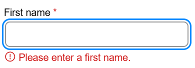
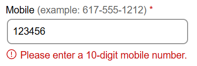
Show a descriptive error message below the field or group that references the field label name and the type of error. The aria-label="error:" on the error icon prepends "Error:" to each message for screen readers.
- Empty field example: "Please enter a first name." Screen reader output: "Error: please enter a first name."
- Formatting error example: "Please enter a 10-digit mobile number." Screen reader output: "Error: Please enter a 10-digit mobile number."
Moving focus to the first field with an error on form submit
After the form is submitted and validation errors are detected, move keyboard focus to the first field or element with a visible error message.
- The first
<input>,<select>, or<textarea>element that has an error receives focus.
- For checkbox or radio groups, the first checkbox or radio button in the group receives focus.
Focus indicators must meet the 3:1 non-text contrast requirement (external link). A focus indicator is typically applied using CSS outline properties (external link). You can use outline-offset (external link) to add space between the element and the outline.
To learn more about global CSS styles visit Global CSS focus outline for page templates.
CSS styles, reflow, and resize text
The following CSS best practices are applied in the Accessible Form Validation CodePen example (external link). You can find the complete implementation in the CSS panel of the CodePen.
Use at least 16px (1rem) font-size, a non-serif font, and at least 1.5 line-height for all text including labels and helper text.
Use global CSS box-sizing to ensure consistent width behavior on select and input elements:
*, *::before, *::after {
   box-sizing: border-box;
}
Use CSS flexbox layout to structure form element groups:
.ads-flexLayout {
   display: flex;
   gap: 2rem;
   align-items: flex-start;
}
Use media queries to stack form elements in a single column for smaller viewports including browser zoom, tablets, and mobile devices. Set the breakpoint earlier than strictly necessary to also support text resize at 200%.
Always test your implementation using browser zoom, text resize, and mobile emulation.
Media query CSS
@media screen and (max-width: 1023px) {
   .ads-flexLayout {
      flex-direction: column;
      gap: .5rem;
   }
}
Use CSS min-width on form input fields — do not use width or max-width:
select,
input[type="text"],
input[type="email"],
input[type="file"],
input[type="date"],
input[type="search"],
input[type="month"],
input[type="url"],
input[type="tel"],
textarea {
   min-width: 280px;
}
Use CSS padding and line-height on input fields — do not use height:
select,
input[type="text"],
input[type="email"],
input[type="file"],
input[type="date"],
input[type="search"],
input[type="month"],
input[type="url"],
input[type="tel"],
textarea {
   border: 2px solid #949494;
   padding: .5rem;
   line-height: 1.4;
   min-width: 260px;
   border-radius: .5rem;
}
Use a border color that meets the 3:1 contrast requirement. The example above uses #949494 on a white background, which meets the WCAG 2.1 SC 1.4.11 Non-text Contrast (Level AA) (external link) 3:1 requirement.
Optional: The CodePen example includes a commented-out error border CSS class ads-errorBorder for teams that use a red border as part of their error indicator style. This is not a WCAG requirement. If used, ensure the error border width is the same as the default border width to prevent layout shifts.
CSS error border color
select.ads-errorBorder,
input.ads-errorBorder {
   border-color: #cd0d0d;
}
Testing your form
As a developer or tester, you can perform the following checks to ensure your form is accessible.
Testing responsive layout
Test your form using browser zoom up to 400% to guarantee proper “reflow” of all content and use the browser’s developer tool to emulate mobile devices and tablets to ensure your content layout works for all test cases (desktop, tablet, mobile, browser zoom up to 400%).
Resize text and text spacing
Allow for ample space in your design to accommodate users to resize text (external link) to 200% and for custom text spacing (external link) using the text spacing bookmarklet (external link).
Testing only using the keyboard
Tab through the form and make sure every element has a visible focus indicator (should be a rectangular shape around the element) that meets the 3:1 contrast requirement. Make sure you can choose an option when activating a select dropdown using the arrow keys. Test your radio buttons (use arrow keys to select a radio button) and checkboxes (use spacebar to select a checkbox).
Important: when activating the submit button and inline errors are shown the focus indicator needs to get moved to the first field with an error.


Testing using the Google developer tool
Use the Google developer tool (external link) to inspect your rendered code to verify ARIA references and state changes (i.e., aria-required, aria-invalid, aria-describedby, etc.). You can also inspect CSS and verify color contrast for text, borders, and focus outlines using the WebAIM contrast checker (external link).
Testing using the ANDI tool
Using the ANDI tool (external link), you can test how a screen reader may announce your labels, helper text, and error messages.
Testing using a screen reader
Screen reader testing to be performed by accessibility subject matter experts
Additional Resources
For help including design reviews, code reviews, or additional training contact the ACCESS team using the ACCESS team’s intake form.
- Accessible Form Validation CodePen example (external link)
- WCAG 2.1 Success Criterion 1.3.1 Info and Relationships (Level A) (external link)
- WCAG 2.1 Success Criterion 1.3.5 Identify Input Purpose (Level AA) (external link)
- WCAG 2.1 Success Criterion 1.4.1: Use of Color (Level A) (external link)
- WCAG 2.1 Success Criterion 1.4.3: Contrast (Minimum) (Level AA) (external link)
- WCAG 2.1 Success Criterion 1.4.4: Resize Text (Level AA) (external link)
- WCAG 2.1 Success Criterion 1.4.10: Reflow (Level AA) (external link)
- WCAG 2.1 Success Criterion 1.4.11: Non-text Contrast (Level AA) (external link)
- WCAG 2.1 Success Criterion 1.4.12: Text Spacing (Level AA) (external link)
- WCAG 2.1 Success Criterion 1.4.11 Non-text Contrast (Level AA) (external link)
- WCAG 2.1 Success Criterion 2.4.3: Focus Order (Level A) (external link)
- WCAG 2.2 Success Criterion 2.4.11: Focus Appearance (Level AA) (external link)
- WCAG 2.1 Success Criterion 3.3.1: Error Identification (Level A) (external link)
- WCAG 2.1 Success Criterion 3.3.2: Labels or Instructions (Level A) (external link)
- WCAG 2.1 Success Criterion 3.3.3: Error Suggestion (Level AA) (external link)
- WCAG 2.1 Success Criterion 3.3.4: Error Prevention (Legal, Financial, Data) (Level AA) (external link)
- WCAG 2.2 Success Criterion 3.3.7: Redundant Entry (Level A) (external link)
- aria-required attribute (external link)
- aria-invalid attribute (external link)
- W3C Form Instructions examples using aria-describedby (external link)
- W3C HTML input “autocomplete” Attribute (external link)
- MMDN HTML attribute: “autocomplete” (external link)
- Accessible Success Message CodePen Example using aria-describedby (external link)