Getting started
Depending on how you deliver your content — documents, video, websites or applications — there will be different criteria to consider to keep your content accessible. There are some over-arching accessibility concepts that will be true regardless of delivery method, and this page introduces those concepts.
Color

Color is frequently part of how we communicate. Bright colors might be used to get attention, or as an alert or warning. It's important that those colors aren't the only thing conveying meaning in a digital environment. Many users can't see or differentiate the colors, and assistive technology can't communicate the colors. It's also important that colors have proper contrast with their background, particularly for text, to make sure that your content is legible for users with low vision or colorblindness.
Let's think about stop signs for a minute. Stop signs are one of the most important signs on the road. There are three consistent attributes for a stop sign:
- A bright red color
- The word STOP in white on a dark red background
- An octagon shape
The red draws attention, the word stop is in high contrast and tells you what to do, and the shape is unique from other road signs. If you can't read the word "stop," or can't see the color red, you still have other attributes to rely on to help you understand the meaning.
This exemplifies the two most important concepts for color and accessibility: contrast and not using color alone.
Make sure whenever you use color, whether it's for alerts, status, data visualizations, or other purposes, that color is supplemental to the content.
Document and page structure

Whether you are building content in a document, Mass.gov, or a website, structure is very important. Use tools within the authoring application you are using to format things like titles, headings and lists. The first thing to remember is to always follow proper heading structure. This helps screen reader users to understand the organization of your content, and to navigate with shortcuts. When building a web page, landmarks can be used in addition to headings to increase accessibility.
Think about how you find information in a book, large document, or web page. First, you search for the content you want, and when you find an appropriate title, you browse through that content to see if it contains what you need. In a book or document, that might be by looking through the table of contents. On a web page, visually you might skim through by noting the headings with larger text . Depending on where content is placed visually — right in the middle of the page, off to the side, or in a footer at the very bottom — typically determines its importance.
But what if you can't see the screen? Then does the size of the text, or the location of the content on the left or right tell you any information? If the content is properly structured with titles, headings and landmarks, that information is passed to assistive technology like screen readers, and makes your content more understandable and navigable.
Alternative text for images
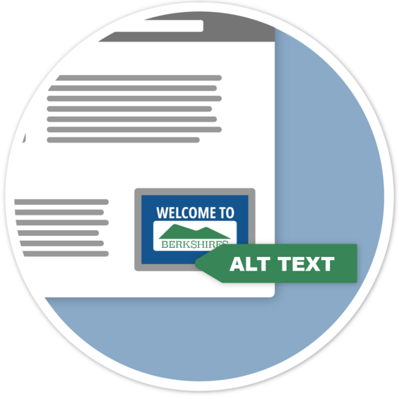
While they say a picture is worth a thousand words, if you can't see the image, it's only as good as its text alternative (alt text). Alt text can be added to an image in Office documents, PDFs, Mass.gov and HTML.
When a screen reader user navigates to an image, the screen reader software will announce the description provided in the alt text. If you do not provide alt text, it will instead announce the image file name, which is unhelpful. It's important that every meaningful image has alt text. What that alt text is might be different depending on the purpose of the image.
When you add an image to your content, what is the purpose? Are you trying to illustrate a concept, tell a story, grab attention, or just to make something look more decorative? Appropriate alt text will be different depending on the meaning, and it can be just as important to mark something as decorative if it has no meaning to prevent confusion.
Content and typography
Text is our simplest form of communication, but it's very easy to make it unclear or even difficult to read based on stylistic choices. A few simple considerations can ensure our text is easily read and accessible.
To make text content accessible, use plain language for clarity, and choose clear fonts with good contrast. Also avoid visual and directional language, such as "the green button on the right." Some users will not be able to see the screen, so positions and colors won't be helpful. To be more inclusive, it is also best to avoid sensory language like "see" and "listen," and instead use terms like "find," "explore," or "review."
It's also important to make sure that abbreviations are explained before they are used. It may seem that some abbreviations are common like "RMV," but that abbreviation changes from state to state, so never assume an abbreviation is clear. Always state the full text before using the abbreviation for the first time, such as "Registry of Motor Vehicles (RMV)."
Similarly, links should always be explained, and not be abbreviated or generic like "learn more." You should always inform the user where the link is going.