Content and typography
Text is our simplest form of communication, but it's very easy to make it unclear or even difficult to read based on stylistic choices. A few simple considerations can ensure our text is easily read and accessible.
Content
In addition to using plain language, to be more inclusive, try to avoid "sensory language." Some people navigating your content won't be able to see, hear or click. Using "select" instead of "click" is also appropriate since many people will be accessing your content on a mobile device. Instead of using phrases like "see your account" or "listen to a podcast about finding a job," use interchangeable words like:
- View
- Review
- Explore
- Find
- Discover
Also be careful of visual or directional language. Don't use phrases like "select the blue trashcan on the right" as some people won't be able to identify that. Also, based on whether your content is viewed on desktop or mobile devices, it's possible content could shift and not be "on the right." Instead say "select the delete button, which is the blue trashcan."
Abbreviations
All abbreviations should be defined the first time they are used in your content. If you are referring to the Registry of Motor Vehicles (RMV), it's important to state the full name before using the abbreviation, "RMV." RMV may seem like a very common abbreviation, but it's possible that it could mean other things based on different industries. RMV is also not interchangeable between states, as some states use Division of Motor Vehicles (DMV) or Motor Vehicle Commission (MVC). Never assume an abbreviation is common enough to not spell it out first.
Link writing
There are many examples of bad links all over the internet. The most common bad links use phrases like:
- Click here
- Read more...
Why are these bad? Someone using a screen reader can navigate by jumping between links on the page when scanning the content. If they come across six links that only have the title "click here," they won't know where those links go without navigating backward and listening to the block of content surrounding the link.
Avoid using entire URLs as well, as in:
https://www.mass.gov/topics/early-childhood-education-care
Links like that are a lot to listen to from a screen reader perspective, and links to external sites might contain a mix of letters and numbers that don't mean anything.
Instead, all links should be descriptive. This can be done in Office applications, email, Teams, PDFs and HTML. Links should be phrased to describe the destination, such as:
- Learn more about early childhood education
- Find a fishing spot
- Sumner tunnel restoration and closure
Typography
To make text as legible as it can be, we want to consider several things:
- Text must have proper color contrast with its background
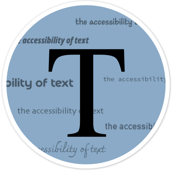
- Avoid using an image of text instead of live text
- Use Sans-Serif fonts for body text (sans serif is easier to read on screens, Serif is fine for headings or titles)
- Base text size should be:
- 12pts (Word)
- 18pts (PPT)
- 16px (Web)
It is also recommended to avoid the use of all capital letters for passages of text. Words have certain shapes to them when spelled in lower case letters. That shape can help people with dyslexia or other reading issues identify words more clearly. It can also make it more challenging for readers whose primary language uses characters other than the Latin alphabet.
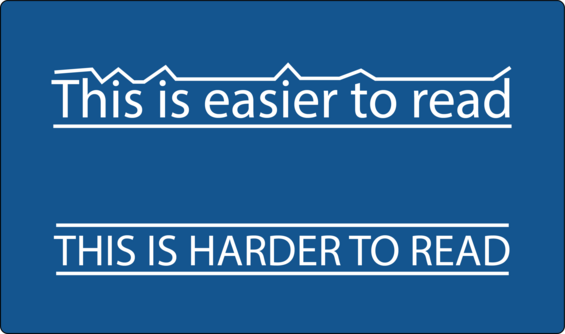
Note the shape that occurs in the line at the top of the lowercase phrase, while the capitalized phrase loses the change in angles and becomes rectangular.