Electronic Medical Record Support for Public Health (ESP)
Electronic Medical Record Support for Public Health (ESP) is an open-source software application that enables the Massachusetts Department of Public Health (DPH), Bureau of Infectious Disease and Laboratory Sciences (BIDLS) to receive automated electronic reports of select infections and syndromes. It also provides authorized BIDLS staff access to deidentified, population-level summary health information from participating clinical practices in a secure, transparent, and controlled fashion. ESP was developed and implemented by the DPH in collaboration with the Harvard Medical School Department of Population Medicine (DPM) at Harvard Pilgrim Health Care Institute, Commonwealth Informatics Inc (CII), and clinical partners. ESP software is open source and is compatible with different electronic health record systems. Information about ESP, including code and technical specifications is available and information about DPH’s use of ESP for infectious disease reporting is also available.
Massachusetts Platform for Analyzing and Graphing Infections (MAGIC)
The Massachusetts Platform for Analyzing and Graphing Infections (MAGIC) is the web-based, interactive tool for visualization of aggregate, deidentified ESP data. MAGIC provides timely, high-level summaries and analyses of specific health measures of interest to public health practitioners and others charged with population health management in BIDLS and participating clinical sites.
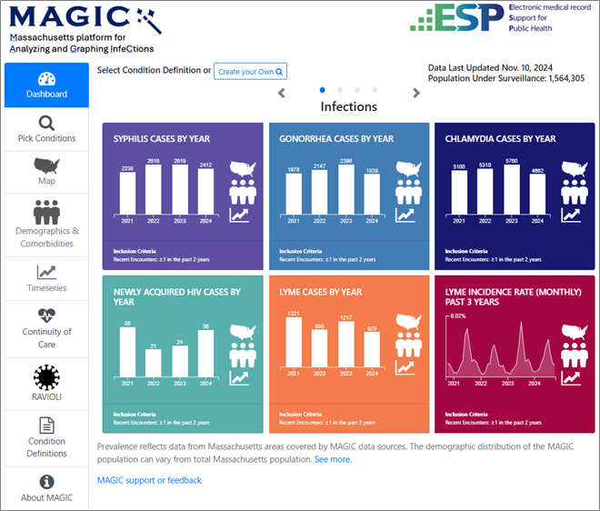
Dashboards
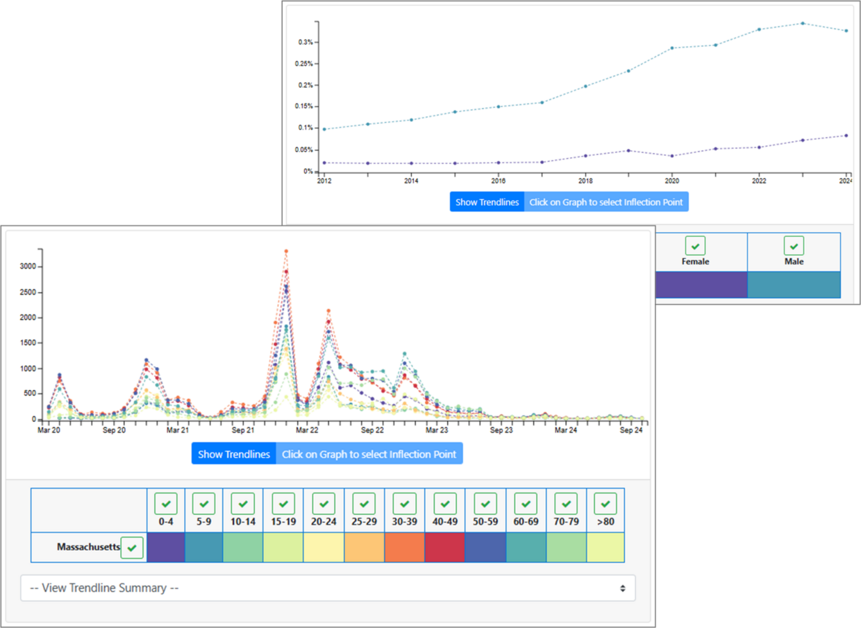
Dashboards offer quick, at-a-glance views of a subset of the infection, vaccination, screening, and STI prevention outcomes included in MAGIC. From each tile, users can click on the map, people, and graph icons to navigate to the Heat Map, Demographics & Comorbidities, and Timeseries modules, respectively. There, time periods can be changed, and data can be filtered and/or stratified by any number of population characteristics and outcomes.
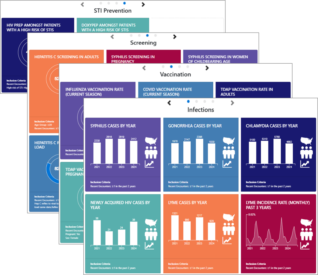
Pick Conditions
While a limited number of outcomes of particular interest are displayed in dashboards, users can select the Pick Conditions menu to view maps, demographics, and timeseries graphs for any outcome available in MAGIC. (See “List of outcomes currently available in MAGIC” for a complete list of outcomes.)
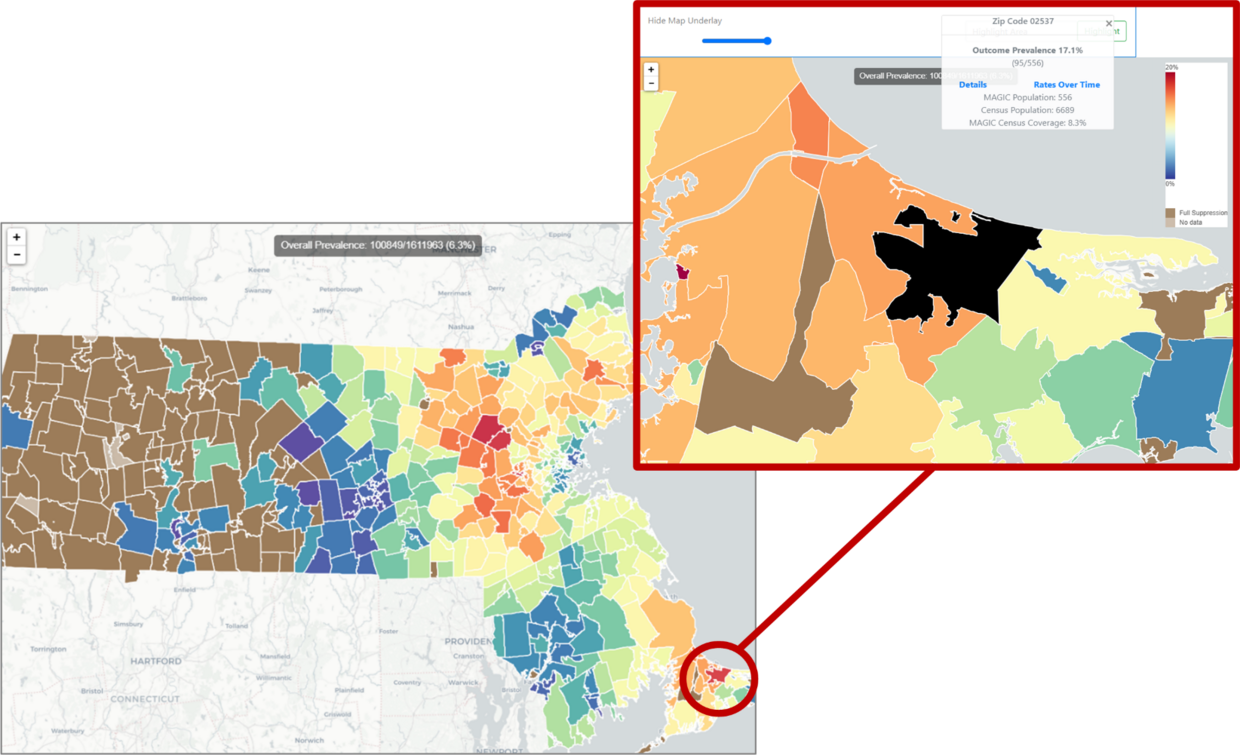
Heat maps
Heat maps can be used to view outcome rates geographically. Data can also be filtered for specific population characteristics and viewed for different time periods. Users can zoom in and click on specific zip codes to view prevalence for the selected outcome.
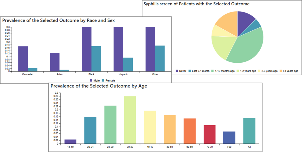
Demographics and Comorbidities
The Demographics and Comorbiditiesmodule allows users to stratify outcomes by population characteristics such as age, race and ethnicity, gender, and other outcomes. Data can also be filtered by these characteristics and viewed for different time periods.
Timeseries
Users can create Timeseries graphs for any outcome, which can be further stratified and filtered. Data can be aggregated and viewed by month or by year, and can be viewed as patient counts or as incidence rates.
Continuity of Care
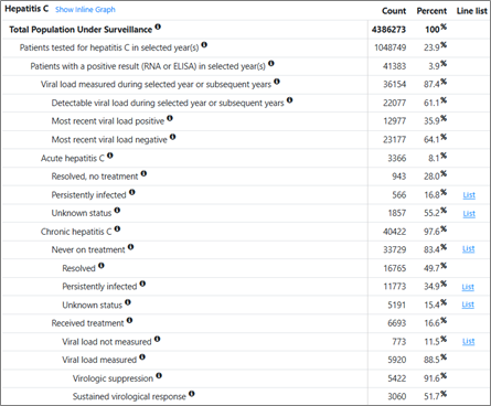
Continuity of Caredisplays summarize patient engagement and retention in care indicators and enable generation of patient level information for select conditions to support clinical management. “Line lists” containing patient-level information will only be accessible to users at the practice level through their facility-specific ESP server and only to those individuals granted specific access by their agency’s designated account approver.
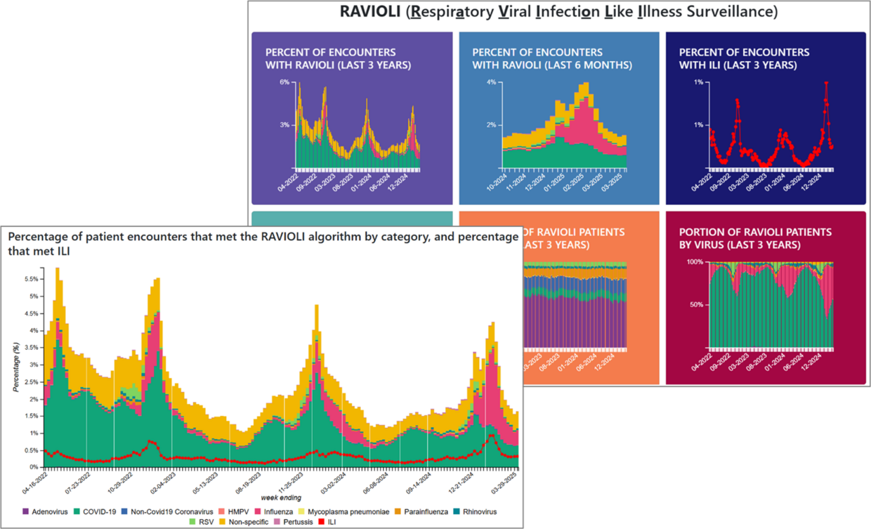
RAVIOLI (Respiratory Viral Infection Like Illness)
The RAVIOLI, or Respiratory Viral Infection Like Illness, surveillance modulecombines common respiratory conditions and syndromes into a single view allowing users to assess respiratory illness more holistically. The RAVIOLI dashboard offers quick access to some common queries, and users can also filter and stratify data in any one of these displays. Data are updated weekly offering near real-time monitoring.
Accessing MAGIC
Access to MAGIC is restricted to individuals with a username, password, and an authentication app to generate one-time second passcodes. Access by staff within participating practices is approved by a designated account approver at each practice. Only aggregate level information is viewable through MAGIC. All users can view combined summary data from all participating practices. Practice-specific data, however, are only viewable to staff at the specific practice. Authorized DPH users are able to view practice-specific data for all participating facilities. This allows DPH to examine trends by site, an important feature for understanding patterns in care, patient characteristics, etc. Note that project staff at CII and DPM can also see data stratified by site, as authorized by DPH, consistent with their role in the development and implementation of the system.
Prospective users from participating practices should email DPH-BIDLS-ESPMAGIC-Communication to request an account. DPH staff will approve requests for new accounts with that practice’s designated approver and then reach out to new users to get them on-boarded.
Limitations and Additional Notes
Population coverage in ESP and MAGIC reflects patients receiving care through participating clinical practices. As such, it should not be considered a perfect representation of Massachusetts' population at a statewide, community, or zip code level. Data in MAGIC are unadjusted.
Condition detection is based upon custom algorithms. These use a combination of vital signs, diagnosis codes, lab test orders, lab results, immunizations, and/or prescriptions in order to detect conditions. The specific logic for each condition is available.
The "encounters" used to construct denominators for analyses are those which had any one of the following items documented in the EMR: vital sign (blood pressure, height, weight, temperature), diagnosis code, prescription, laboratory test, or immunization (i.e., "clinical encounters").
The COVID-19 pandemic substantially impacted healthcare utilization in general and the data underlying MAGIC and ESP specifically. During the pandemic period patient interactions with a participating practice may have been exclusively COVID-19-related (e.g., testing or vaccine) and such patients have no other clinical information or history. Therefore, time series data that includes the COVID-19 pandemic period should be interpreted with this in mind.
Data may be incomplete for individuals who seek care with multiple participating clinical practices and/or from healthcare institutions outside of the ESP/MAGIC network. Patients who seek care at multiple clinical partners in the network are not de-duplicated.
Geographic data are based on patients’ current zip code as documented in their EMR data. Heat maps only highlight zip codes in which MAGIC covers at least 100 patients (i.e., if your denominator is specified as patients with ≥1 encounter in the last 2 years and there were less than 100 such patients per the specified locale, the data will not be reported in the map view). In addition, data in the heat maps, bar graphs, and time series are suppressed if less than 5 patients meet the criteria for the numerator.
Please note that the screenshots and data included in this document are intended to be illustrative of the various features available in MAGIC and should not be used or interpreted otherwise.
List of outcomes currently available in MAGIC
Infections
- Anaplasmosis
- Babesiosis
- Chlamydia
- COVID
- HIV
- Hepatitis A
- Hepatitis B, acute and chronic
- Hepatitis C, acute and chronic
- Gonorrhea
- Lyme
- Syphilis
- Tuberculosis, latent and active
Screening
- Chlamydia
- HIV
- Hepatitis B
- Hepatitis C
- Hepatitis C reflex to viral load
- Gonorrhea
- Syphilis
- Syphilis in pregnancy
- Tuberculosis
Vaccination
- COVID
- Hepatitis A
- Hepatitis B
- Influenza
- TDaP
- TDaP in pregnancy
STI Prevention
- High risk for STI
- DoxyPEP
- PrEP
Downloads
-
Open PDF file, 1014.46 KB, About ESP and MAGIC (English, PDF 1014.46 KB)