What is a footer?
A footer is a block of information at the bottom of a webpage or application screen. When someone reaches the end of a page, the footer is where they look for information on who runs this service, how to get help, and privacy and policy details.
How to use the footer
Use a footer when you need to:
- Provide supporting navigation (for example, help, contact, or about links)
- Surface required legal or policy information (such as privacy, accessibility, or terms)
- Reinforce site identity and ownership
- Offer secondary actions that don’t belong in the main navigation
- Create a consistent end point for long or content-heavy pages
Do not use a footer:
- As a replacement for, or to repeat primary navigation
- To introduce critical tasks or calls to action that users should see earlier
- On highly focused, time-sensitive flows where extra navigation could distract users (for example, a step-by-step form or transactional confirmation screen)
Footer examples
Footers can meet a variety of content needs. Keep in mind, the content on mobile stacks vertically. We recommend only including high priority links and information.
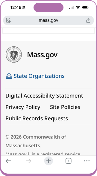
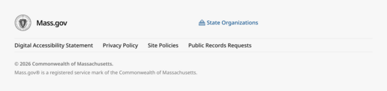
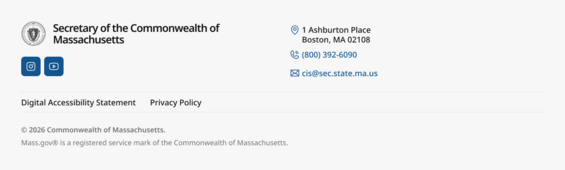
Mass.gov
This footer is automatically applied to all pages that are authored using the Mass.gov Content Management System (CMS).
Design reference, these footer updates are currently in development
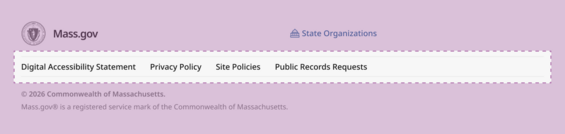
Mass.gov subdomains
A Mass.gov subdomain is a digital experience that includes Mass.gov in the web address, but isn’t authored using the Mass.gov CMS.
Example: servicename.mass.gov
Design reference for the DPPC footer implementation that is currently in development
Department or agency logo usage
Agency logos can be included next to the State Seal.
Use a PNG or SVG file format that will allow for transparency and scaling to maintain the visual quality. Avoid using a background color unless it’s part of the design.
If the logo includes text that must be read, the text contrast rules apply:
- 4.5:1 for small size text
- 3:1 for large text (18pt regular or 14pt bold)
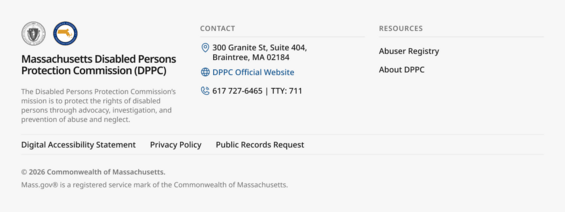
Non-Mass.gov footer examples
A non-Mass.gov footer refers to official Commonwealth sites or applications that do not include Mass.gov in the web address. These are most often seen for state agencies that are using the state.ma.us domain, or other web addresses use .gov, .edu, or .org.
Example: agencyname.state.ma.us
Non-Mass.gov footers are not required to follow the Massachusetts Design System, but are welcome to use these resources.
Footer elements
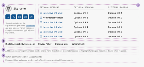
This image represents the footer component that is available for customization in Figma.
- Section 1: The organization identity area, including the state seal, site name, and social media icons
- Section 2: The optional supporting columns for links or contact information
- Section 3: The footer utility navigation banner, with links to the digital accessibility statement and site policies
- Section 4: The optional supporting details area
- Section 5: Site copyright information
Please note: the smiley faces are placeholder icons that should be swapped with the correct icon to meet your content needs.
1. Organization identity

State seal and service, product, or agency name (required)
These elements are required and must be presented in the same position across all footers. They should be used to link people back to the ‘home’ or landing page associated with the current web address. For example, for residents viewing a page about a particular service on Mass.gov, the state seal and site name should both navigate the user to Mass.gov.
Social channels (optional)
Links to official social media channels or subscriptions. These should only be used if they are actively maintained, and can be presented in any order.
Short description (optional)
An optional short description which can be used to share more information with constituents about the service or state agency they are engaging with.
2. Optional supporting content columns
The optional supporting content columns can be used to provide contact information and quick links to helpful content. The column ordering can be changed based on your content needs. It is not required to offer 3 columns in this area of your footer. In general, keeping footers smaller is a great approach to keep the experience focused.
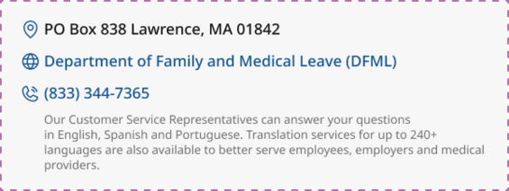
Contact information
Contact information can be included to provide an address, phone number, or other ways for constituents find and reach out to your organization. The information can be included in any order.
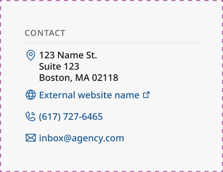
Supporting text descriptions are also available if additional details will help folks understand how or when to reach out to your organization.
External link icon
Links included in the footer that open in a new window must include the external link icon. External links must also announce that they are opening in a new window for screen readers.
Supporting navigation links
Supporting navigation links should only be used when there are helpful resources that are not shown in the primary navigation.

3. Required footer utility navigation banner
The footer utility navigation banner is used to share standardized “trust and accountability” links, such as include Privacy Policy and Digital Accessibility Statement. These appear consistently in the footer to help people understand how the service handles their information, what accessibility commitment it meets, and where to go for details or support.

Digital Accessibility Statement (required)
The Mass Digital team at EOTSS has implemented a unified Digital Accessibility Statement for all subdomain sites, including Executive Department websites and web-based applications.
This unified accessibility statement:
- Establishes a consistent, public-facing accessibility commitment
- Aligns with the Commonwealth’s enterprise digital accessibility policy (WCAG 2.1 AA)
- Supports trust, clarity, and centralized accessibility feedback handling
Additional trust and privacy links (optional)
The footer utility navigation banner can accommodate multiple links.
Examples include:
- Public Records Request
- Data Sharing Agreement
- Site Policies
4. Optional supporting details
The supporting details content is occasionally used to display required funding or other disclaimer information to meet legal requirements.

5. Required copyright information

This footer text is a legal attribution notice that communicates two things:
- Copyright ownership: “© 2026 Commonwealth of Massachusetts.” indicates the Commonwealth claims copyright for the site content (or applicable materials) for that year.
- Trademark/service mark protection: “Mass.gov® is a registered service mark of the Commonwealth of Massachusetts.” states that the Mass.gov name/mark is legally registered and identifies the Commonwealth as the rights holder, helping prevent misuse or confusion about the brand.
Design and development implementation details
For design
Designers creating footer components within the Figma Enterprise account can use prebuilt components. These can be customized to meet your content needs.
If you're not designing within the EOTSS Figma Enterprise account, but are using Figma, email the design system so we can share the design assets with you.
For engineering
Developers who are creating or iterating on a footer with access to Figma and the ability to apply all custom styling should reference the footer component documentation in Figma. Use dev mode to identify the tokens that have been applied. If you don't already have access to the CSS variables file that maps to our design tokens and would like to use this resource, reach out to the design system team so we can share the resource with you.
If you do not have a design partner or access to a dev seat in the Figma Enterprise account, we have created a detailed design spec that you can reference for your implementation. Your column margins and gutter may differ, so we recommend that you follow the spacing that best aligns with your content.
If you're looking to implement the official footer but do not have the ability to apply the custom styling because you are using a low or no code platform for your application, the design guidelines should be implemented as closely as possible within the platform constraints. At a minimum, a link to the Digital Accessibility Statement must be available.