What do we mean by ‘clear over clever’
Good content design helps people quickly find what they need and understand what to do next. This is especially important for government content that guides constituents through critical services like SNAP and unemployment benefits.
It can be tempting to create content that centers our organization. However, government content should reflect the constituent’s priorities. Branding, storytelling, and complex design choices can introduce jargon and unnecessary visuals, creating confusion and making it difficult for constituents to understand what to do next.
Here are a few ways “clever” can make content harder to understand:
- Using lots of interactive features when simple text would work just as well
- Focusing on “telling a story” when most constituents just want to get something done
- Choosing brand names that obscure what a website domain or product is for
- Adding visuals that look nice but don’t help people complete a task
- Using marketing language like “world-class” or “cutting edge” instead of plain facts
When you adopt the “clear over clever” principle, you put the constituent’s needs first. You prioritize your audience’s goals over content that looks flashy.
You don’t need to design government content to grab attention. You just need to write and design content in an easy-to-understand way so your audience can achieve their goals.
Why choose simple, minimal designs for government content
Here are some reasons to prioritize simple, minimal design over complex, visually busy content:
- Reduce cognitive load: Clear content is easier to understand, especially when constituents are learning something complicated or trying to complete a task.
- Build trust: Direct, easy-to-understand content helps constituents feel confident enough to act.
- Ensure accessibility: Clear content helps everyone access and use services and information, regardless of education level or ability.
- Minimize errors and legal challenges: Clear content helps prevent misunderstandings, missed deadlines, noncompliance, or legal issues.
- Easier to scan: Content focused on a single message and goal is more effective than busy designs that compete for attention. This is especially critical for web pages, since people tend to scan online.
- Easier to maintain: Clear content is easier to update, saving time and reducing errors over the long term.
The Mass.gov publishing platform supports a “clear over clever” approach to content design. It encourages organizations to strip information down to its essentials: headings, text, and links.
How to do it
Know your constituents and their goals
People who interact with government want something specific. They aren’t interested in browsing through content with lots of visuals or interactive elements like they might find on a commercial website. Most people spend less than 1 minute on a government webpage.
Focus anything you publish on the questions:
- Who is my audience?
- What do they want to learn or do?
Then write your content to answer these questions.
Example audiences and purposes
- Samatha knows that MassHealth is changing because of a new law. She wants to know if that affects her benefits.
- Tom has a fishing license. He wants to learn how to print it.
- Jose knows there’s a law about paid medical leave. He wants to know how that works with his paid time off benefits.
- Helen has filed her state taxes. She wants to see when she’ll get her refund.
- Henry is starting a new business. He wants to register his business with the state.
Prioritize the most important information
Remove unnecessary words and anything else that doesn’t support the core message or task. A mission statement might be important to your organization’s stakeholders. However, it’s likely irrelevant to a constituent who just wants to apply for benefits or find out if they’re eligible.
Keep the focus on what a constituent is trying to learn or do instead of making them wade through internal mission or process language.
Example: Content that's not relevant to a constituent
John has very poor vision, even with glasses. He wants to know if he can get a driver’s license. He finds a page about the Registry of Motor Vehicles’ (RMV) medical standards for drivers. This is the first thing he reads on the page:
Medical Affairs is responsible for setting the RMV's policies and procedures regarding physical qualifications for operator licensing. Medical Affairs sets its policies in accordance with recommendations made by the registry’s Medical Advisory Board (MAB).
All John wants to know is can he get a driver’s license. He has to scroll down the page to find that information.
Focus on the task, not the brand
You may have brand names for some of your services that everyone in your organization understands. Constituents, however, may not. Leading with a brand or clever name forces constituents to work to decode it before they can take any action. Instead, lead with the task a constituent can complete, or the information they will find.
Example: Brand name that doesn't clearly say what it means
eLIPSE is the licensing platform for real estate agents, but the name doesn’t help people understand what they can do there. Realtors can go there to apply for, renew, or print their licenses, but they have to learn the brand first before using the service.
To make it clearer for residents, write and design around tasks first:
- Lead with the purpose: “Apply for or renew a license online”
- Define the brand, then de-emphasize it: After the first mention, prefer “the online licensing system” over repeating “eLIPSE” in every sentence
- Use plain action words: "apply,” “renew,” “pay fees,” “upload documents”
Write conversationally, as if you were talking to a person. Use plain language, writing in active voice with short sentences. Choose simple words over more complex ones — “use” instead of “utilize,” for example. This doesn’t mean dumbing down the content. You can still use necessary technical terms or jargon but add definitions to explain what they mean.
Limit the number of components and design elements you use
Every extra design element makes content a little more complicated. Content that's too complicated just gets in the way of what a constituent is trying to do. Too many images, callouts, logos, and interactive elements make people work harder to figure out what matters, what’s optional, and what to do next. That confusion is the opposite of clarity.
Remove as many distractions as you can to help constituents understand your content faster. Use short sections, clear headings, and bullets to make pages more scannable.
Use visuals that convey meaning
Only use images and graphics that clarify, rather than distract from, what you're writing about. Avoid decorative images and graphics that don’t convey meaning. Unnecessary images can push key content down the page. This is important to consider since most people visit Mass.gov on their phones.
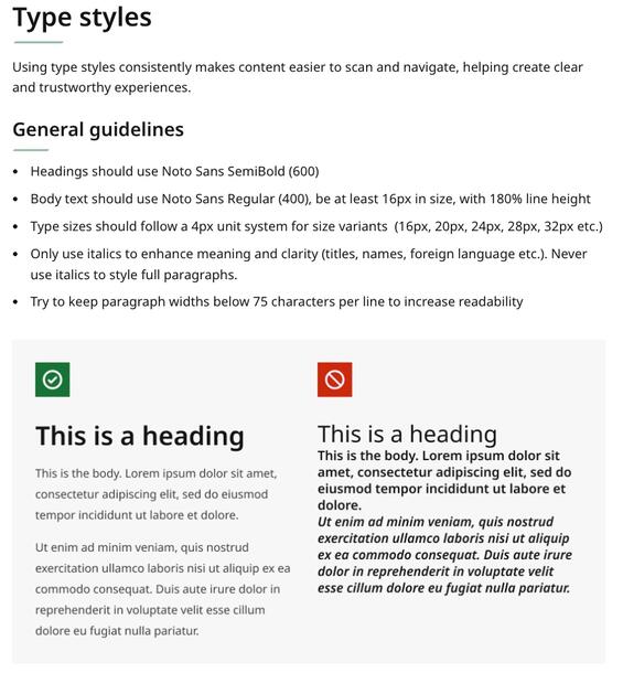
This page from the Massachusetts Design System outlines guidelines for headings and body text. The graphic illustrates those guidelines, giving the reader a concrete example of what the typefaces and sizes look like.