Making accessible PowerPoint slide decks
Microsoft PowerPoint is an incredibly flexible tool used to create presentation slide decks that can be shared for a variety of purposes. Often presented by a person during an event, they can also be used as stand-alone resources for review or as documents describing the steps of a process. Though there are accessibility considerations when presenting slide decks at an event or meeting, the accessibility of the slide deck itself is also important. We offer additional recommendations to consider when presenting your slide deck to an audience, however this resource focuses on the accessibility of the PowerPoint document itself.
Requirements in brief
- Check Accessibility using the built-in Accessibility Assistant
- Each slide must have a unique title
- Text must meet color contrast requirements
- Fonts should be clear, easy to read, and at least 18 pts
- Link text must be descriptive and unique
- Images must have alt text or be marked as decorative
- Tables must have a single header row or column or both. Tables must not have merged, split, nor empty cells
- Charts and graphs must follow data visualization accessibility guidelines
- Videos must follow video guidelines
- Animations and transitions should be kept to a minimum and should not contain blinking, flashing, rotating, or looping elements
- Proper reading order must be set and slide footers marked as decorative
- Do not convert to PDF
Additional Resources
-
Open PPTX file, 11.61 MB, PowerPoint Accessibility Practice Document (contains accessibility errors) (English, PPTX 11.61 MB)
Microsoft Accessibility Assistant for PowerPoint
Automated accessibility checkers are only able to capture about 20-30% of the potential accessibility errors that might be present in your document, app, or website. That’s why manual accessibility testing is always required, even if an automated scan shows no errors. Luckily, the Microsoft Accessibility Assistant for PowerPoint is one of the better automated accessibility checkers available; it catches closer to 40-50% of the potential accessibility errors in a slide deck.
To access the Accessibility Assistant in Microsoft PowerPoint, navigate to the Review ribbon, select Check Accessibility, and select Check Accessibility again in the dropdown. The Accessibility Assistant will open in the right sidebar of the PowerPoint window.
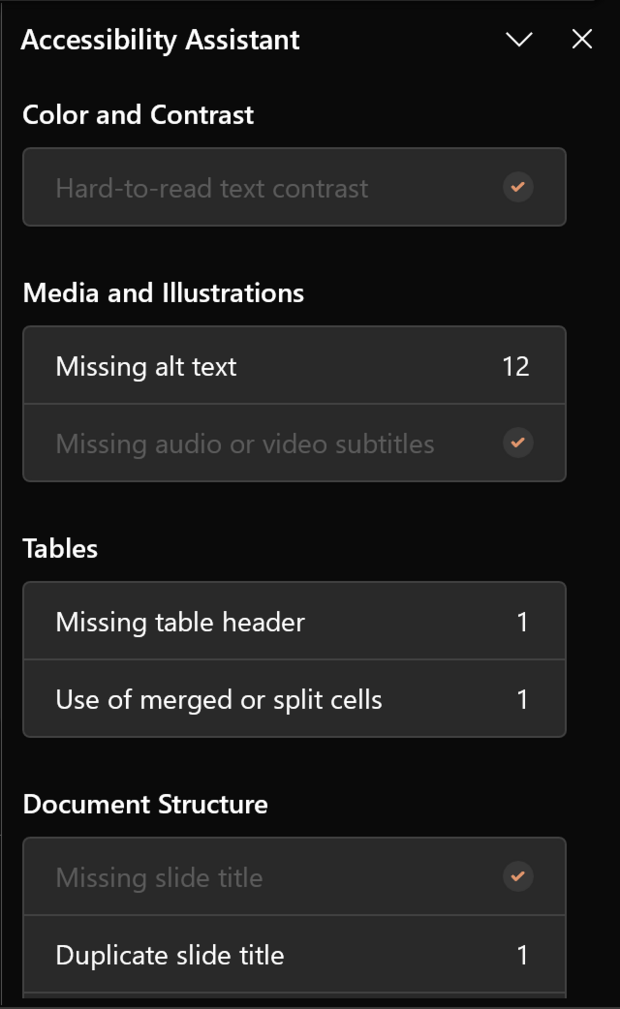
Keep the Accessibility Assistant running in the background as you create the slide deck. Make sure to fix all of the errors it identifies before conducting the manual accessibility checks as outlined in the Microsoft PowerPoint Accessibility Testing Checklist.
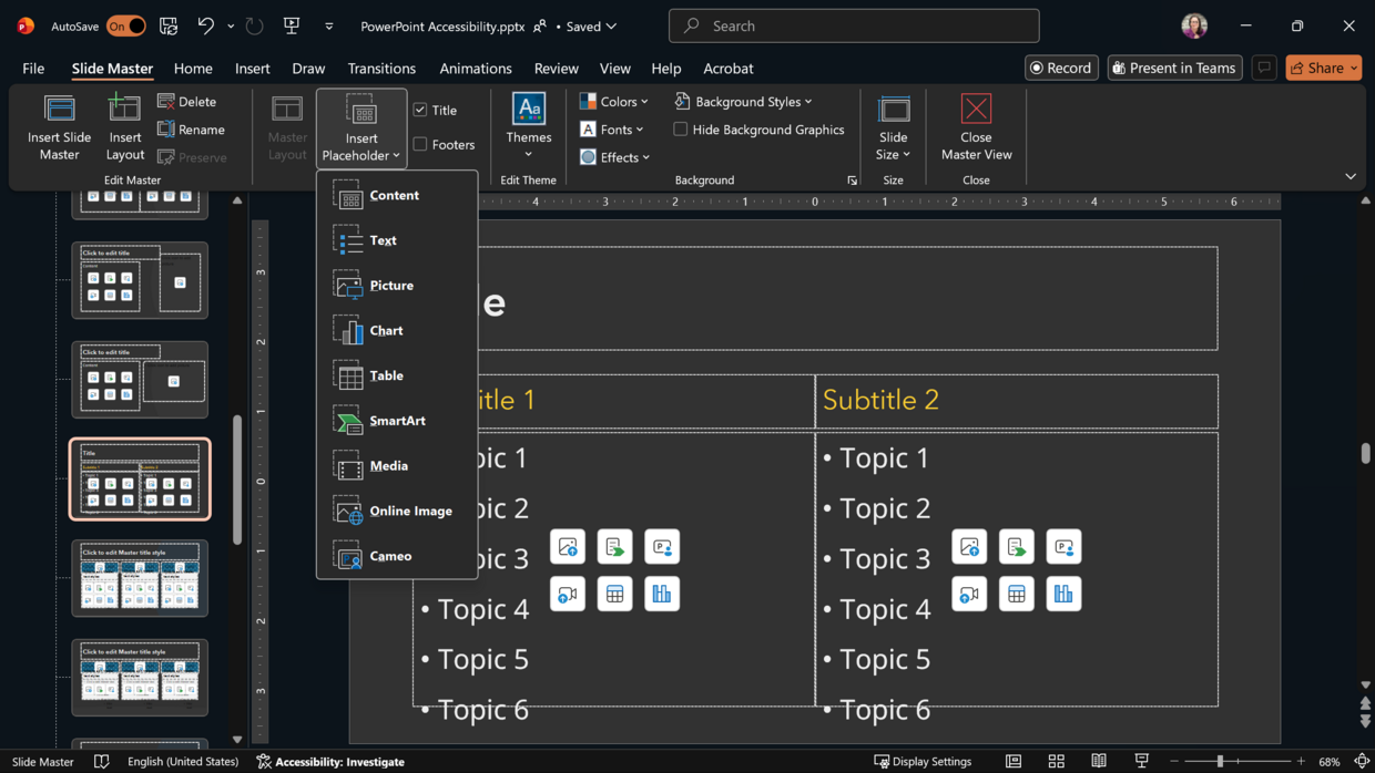
Slide masters and layouts
If you’re creating a PowerPoint slide deck from scratch, choosing a theme might be a familiar step in your process. Slide deck themes often include coordinated fonts, colors, and slide masters with different layout options and decorations. Slide masters with different layouts allow for consistent reading order and design throughout the slide deck and use content placeholders to organize the potential content on the slide. If you’re choosing a pre-made theme, make sure the fonts are legible and adhere to color contrast requirements.
If you create your own slide masters, ensure legible fonts, adhere to color contrast requirements, and make sure to mark any background or decorative elements as decorative. Insert Placeholders for potential content in slide masters rather than text boxes. Each master layout will automatically include a Title placeholder, so you only need to add content placeholders to the slide master. Adjust the reading order of the Placeholders in each of the slide masters and mark any footer information as decorative before closing and beginning your slide deck. Remember that any images or text added directly to slide masters will not be accessed by assistive technology like screen readers and will not appear in the reading order of the slide.
Text considerations
Microsoft PowerPoint offers a lot of flexibility in terms of layout, including placement of text on slides either using Placeholders or by adding text boxes. That flexibility, however, requires careful consideration and a few constraints when creating slide decks that inform, inspire, and are also accessible.
Slide titles
Unlike traditional Microsoft Word documents, PDFs, or webpages, slides and slide decks don’t have heading structures. Slide titles act as navigation landmarks in place of headings throughout the slide deck, and there are no heading levels. This makes slide titles incredibly important for accessibility. Each slide in the deck needs a slide title, and each slide title must be unique.
If the content requires multiple slides on the same topic, consider the following examples that ensure each title remains unique:
- Slide Title, continued
- Slide Title, 1 of 3
- Slide Title: Subtopic
Important Note: If the slide is a full-size image or video, the slide title can be placed behind the image or video so that it visually doesn’t appear on the slide but is still available to assistive technology like a screen reader.
Fonts and colors
Choosing fonts for a slide deck can be either incredibly frustrating or a fun and sometimes distracting part of slide design. As a general best practice, choose sans serif fonts that are clear and easy to read for both slide titles and body text. Any text on your slides, including slide titles or body text, should be at least 18 pts. Learn more about content and typography accessibility practices.
Slide text should also adhere to color contrast requirements for accessibility (e.g., 4.5:1 contrast ratio between text and its background). This is important to keep in mind when choosing a background color or design for the slide deck as well as the font color. If your slide background includes multiple colors or images behind text, you must test the color contrast of each font color against any background colors.
Links
Hyperlinks should follow accessibility best practices, especially if a slide deck is meant to be read and shared. This means that URLs should be hidden behind meaningful link text that can be understood out of context of the slide. Avoid vague link text like, “Click here,” or “this link.” Consider including shortened URLs for slide decks meant to be presented live or QR codes with a shortened link for in-person presentations. Learn more about accessibility considerations for live presentations.
Images
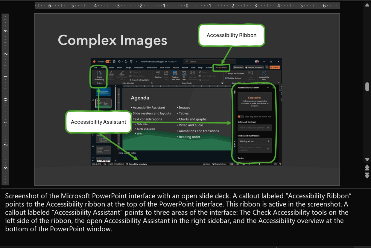
Just as in any document, website, or app, images in PowerPoint slide decks require alternative text or to be marked as decorative. This is fairly straightforward for single images or graphics intended to help illustrate a point in a presentation or as decoration on a slide, but can get complicated if the layout of the images is meant to help explain a process or include directions for a tool.
For example, sometimes slide decks contain screenshots of an app or website with callout text boxes to explain different components, and arrows, circles, or boxes placed over the screenshot to highlight different parts. Visually, this configuration makes sense and provides helpful visual reminders. However, for those using assistive technology like a screen reader to access the content, adding alt text to every arrow, circle, or highlight could get confusing or frustrating and may provide too much overwhelming detail. Instead, when creating complex graphics with PowerPoint, group the non-text objects and provide alt text to the object group. Leave callout text boxes out of the object grouping and remember to include them in the reading order of the slide. If a more detailed explanation is required than is allowed in the alt text, consider adding a longer description to the Notes section of the slide (and including text such as, “Expanded description available in the Notes” in the alt text to support navigation) or including that description in a separate slide. For ease of navigation with the second option, consider adding links between the two slides so that the reader can easily navigate between the two.
As another reminder, it’s important to avoid images of text in a slide deck, just as it should be avoided in most other contexts. Unless an image of text is representative of a resource and is not meant to be read, use live text on your slides rather than images of text.
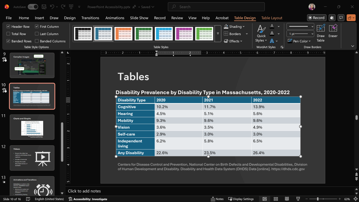
Tables
As with Microsoft Word documents and Excel documents, tables in a PowerPoint slide deck should be simple and should contain data only. Tables should never be used to format the placement of images, text, or other elements on a slide. Simple tables have one header row or header column (or both), contain no split or merged cells, and avoid blank cells. In other words, each row in the table has the same number of columns, and each column has the same number of rows.
Charts and graphs
Charts and graphs are a great way to provide a visual representation of data in a presentation. They’re easy to create and edit using the built-in Chart tools in Microsoft PowerPoint. As you create charts and graphs for a presentation, keep accessibility at the forefront of the design:
- Provide proper color contrast between chart or graph elements.
- Avoid using color alone to convey meaning (labeling charts and graphs directly rather than using a key can help).
- Provide alt text for the chart or graph to describe the general trend.
- Provide text alternatives (often the table of data used to create the chart or graph) for charts and graphs that contain important data points that aren’t conveyed elsewhere in the slide deck.
Charts and graphs created within PowerPoint are automatically grouped. Once your chart or graph is complete, provide alt text for the group. Remember, alt text should convey the general trend or takeaway from the chart or graph and should be no more than two sentences. Text alternatives in a separate slide or in the Notes section of the slide have no limit and should include all relevant data and details.
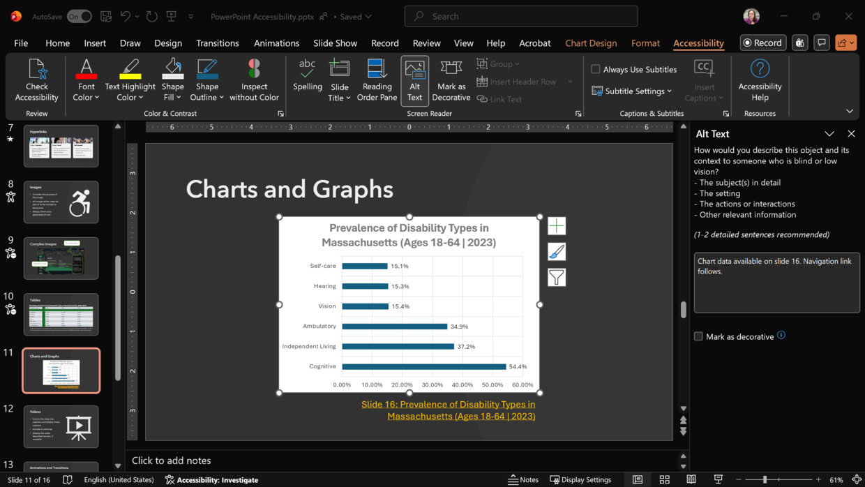
Learn more about data visualization accessibility.
Videos
Often we don’t create the videos we include in presentations; we share others’ videos to illustrate concepts or provide context. Whether embedding a video into a PowerPoint slide deck or linking to a video from a slide, make sure the video follows accessibility guidance and best practices.
- Provide closed captions. Open captions are acceptable if closed captions aren’t available.
- Ensure the video has a transcript available that includes all speaker identification, text on screen, and any relevant visual descriptions.
- Include audio descriptions when needed and add the audio described version of the video to your slide deck.
Learn more about video accessibility.
Animations and transitions
Animations and transitions can provide a visually engaging way to introduce motion into a presentation or emphasize key pieces of a story. They can also be incredibly distracting for some people with disabilities, and at worst can actually cause harm. Learn more about flashing, blinking, and sinusoidal motion and how they can affect people with photosensitivity and vestibular disorders.
In general, minimize the number and types of animations and transitions added to a slide deck, and avoid blinking, flashing, rotating, or looping. For example, it’s fine to add a brief fade transition between all of the slides in a deck and a fly in animation for each bullet point. It becomes problematic, however, if each transition between slides is different or the bullet points use different or overly energetic animations when they appear. When animations and transitions are used well, the audience may not even notice them. Make sure your content is the star of the show — not the slide deck itself.
Reading order
Because each slide in a deck can be customized in terms of layout and content and are rarely linear, checking and adjusting the reading order of each slide is one of the most important final steps before sharing.
To find the Reading Order Pane in Microsoft PowerPoint, navigate to the Review ribbon, open the Check Accessibility options, and select Reading Order Pane. The Reading Order Pane will open in the right sidebar of the PowerPoint window. Adjust the order of the objects on your slide from top to bottom in a logical sequence.
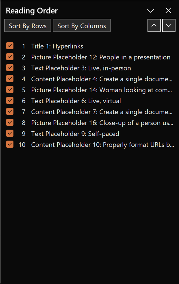
Important Note: Unticking the checkboxes in the Reading Order Pane also marks them as decorative for assistive technology like screen readers, meaning the content will not be voiced if the checkbox next to the content is unticked. We recommend marking repetitive structures of your slide deck, such as slide numbers and other slide footer information, as decorative throughout the slide deck.
Another way to check the reading order of your slides and ensure that all relevant content is included in the reading order is by accessing the Outline View of the slide deck. This view eliminates all visual content and presents just the text content in the defined reading order. To access the Outline View, navigate to the View ribbon in Microsoft PowerPoint, and select Outline View. The Outline View will replace the Normal view of the slides on the left sidebar of the PowerPoint window. If any text in this view is missing, repeated, or out of order, fix it in the Reading Order Pane before continuing.
A note about PowerPoint to PDF conversion
Though it is possible to remediate (make accessible) a PowerPoint document that was converted to or saved as a PDF, we do not recommend this practice. PowerPoint slide decks are non-traditional documents and therefore do not have the same heading structure as a traditional document like a Word document. PDFs created from PowerPoint files require significant work in Adobe Acrobat Pro in order to make them accessible, even if you follow all of the accessibility recommendations in this resource.
Additional recommendations for presenting live
Beyond considering the accessibility of the slide deck itself, live presentations using slide decks also require accessibility considerations. If you don’t plan on sharing your slides after your presentation, that doesn’t mean you should ignore accessibility entirely. Color contrast, font legibility, and simplifying the visual structure of slides are just as important when presenting live as when an individual accesses the slide deck on their own.
Keep accessibility in mind as you plan your live presentation, and consider the following:
- Describe important images during the presentation. If you’re not comfortable describing those images live, consider printing out the alt text you created for your deck to have available during the presentation as a reference.
- Ensure the videos in the presentation have closed captions and provide a brief description of the actions in the video if an audio described version isn’t available.
- Avoid phrases like, “As you can see…” Incorporate more inclusive language and use phrases like, “What we have here…”
- Speak slowly and clearly and utilize pauses during the presentation. This is especially important when sign language interpreters are present but also helps people who have language processing disabilities and other cognitive disabilities.
- Minimize the amount of text on each slide. We often use slide decks to help us remember our talking points during a live presentation. However, it can be incredibly difficult (if not impossible) for an audience member to both read the slide and listen to the person speaking. Minimizing the amount of text on a slide helps reduce the cognitive load for the audience so they pay attention to the content and can retain the information shared.
- Consider creating a summary document with the key points and links from your slides as an alternative to sharing your full slide deck. This can be a great strategy if your slide deck contains a lot of hyperlinks or resources but can also be helpful for slide decks that utilize a lot of visuals and not a lot of text. A document with a list of resources and the main talking points per slide can be a more effective review of the content in this case than a copy of the slide deck.