What design tokens are
Design tokens give the design system a shared place to store values like color, typography, spacing, radius, and motion. They help teams stay consistent and make it easier to track and update design decisions over time. Because tokens are reusable, a change can be applied across many components and patterns at once, such as updating a color theme or adjusting spacing for smaller screens.
How tokens work
Tokens replace one-off design choices with a defined set of reusable values. For example, instead of choosing a custom corner radius each time, designers can use a system token like radius-SM or radius-MD. This helps components feel consistent and gives teams a shared set of options to use across designs.
Some tokens also describe purpose. For example, a token may define a border color for an error message or a background color for a primary action. These purpose-based tokens help designers and developers understand not just what a style looks like, but how it should be used.
Why they matter
Using tokens in both design and development helps products stay aligned as the system evolves. Tokens make updates easier to manage, reduce inconsistencies, and give designers and engineers a shared language for visual decisions.
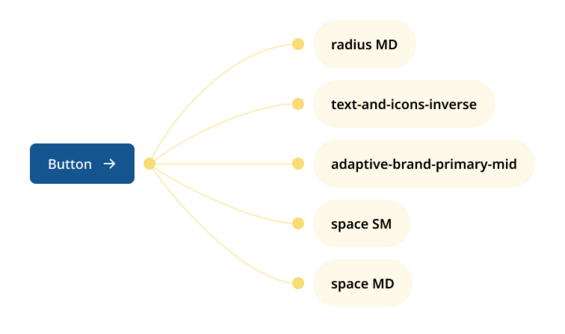
Figma to CSS variable mapping example
| Element | Figma variable | CSS variable |
|---|---|---|
| Button corner radius | corners / radius MD | var (--mds-radius-md) |
| Button background fill (default) | background / adaptive / brand / primary-mid | var (--mds-background-adaptive-brand-primary-mid) |
| Button horizontal padding | spacing / space MD | var (--mds-space-md) |
| Button vertical padding | spacing / space SM | var --(mds-space-sm) |
How to use the design system tokens in practice
For designers
If you have a full-seat role in the EOTSS Figma Enterprise account, you can apply the design system’s tokens and use the core component library in your working files. The components in the library are built with the token set, which makes it easier to create consistent designs across projects.
For developers
The design tokens are available as an npm package in the Massachusetts Design System GitHub repo. The package includes the system’s shared values for things like color, typography, spacing, radius, and elevation. It forms the foundation for the Massachusetts Design System code packages, and it can also be used directly in projects if you are not using the global styles package.
If you have a developer role in the EOTSS Figma Enterprise account, you can also view the implementation details applied to design elements, which can help when translating designs into front-end code.
Maintenance
Using npm packages helps the Massachusetts Design System team version, update, and release resources in a consistent way. The team maintains the Figma tokens and CSS variables so they stay aligned over time.
If you have any questions or feedback, email the design system team.
Using the Massachusetts Design System tokens with third party platforms
Applying Massachusetts Design System tokens to an existing platform, such as Salesforce or another third-party system, requires careful consideration. These platforms may have their own structure, limits, and customization options. The tokens may not map to them in exactly the same way as a custom-built product.
If your team is considering this kind of implementation, we would like to learn from your experience. Talking with teams early helps us create better documentation, guidance, and resources for future teams working with third-party platforms. Please email the design system team if you are exploring this path.