Cover page design choices
StoryMaps provide six different cover option choices when designing a StoryMap. Use the following considerations to ensure your cover page provides a welcoming and accessible starting point for readers. In the table below, “Yes” indicates that the setting is configurable for that cover type, while “Fill” or “Fit” indicate your options when placing media (e.g. a background image) on the cover of your Story.
| Cover Type | Add cover image or video | Switch panel placement or width | Change panel size | Change media background color | Solid color behind title block | Media placement |
|---|---|---|---|---|---|---|
| Minimal | Yes | N/A | N/A | N/A | Yes | Fill |
| Full | Yes | N/A | N/A | N/A | N/A | Fill |
| Side-by-side | Yes | Yes | Yes | N/A | Yes | Fill |
| Card | Yes | Yes | Yes | Yes | Yes | Fit |
| Split | Yes | Yes | N/A | Yes | Yes | Fit |
| Top | Yes | N/A | N/A | Yes | Yes | Fit |
Consideration when designing an accessible cover to your Story are
- Select a short and engaging title.
- Include a 1-sentence description that will help draw the reader in.
- Ensure your cover image is high resolution.
- If the image is not decorative, add alternative text.
- Do not include video or any content that auto-plays on the cover (e.g. a GIF)—this may be disorienting and violates WCAG success criteria. All video content must include user start and stop controls.
- When selecting a cover type, ensure that your cover text is easily readable and has a high contrast with the background. Cover text includes title, description, author, and publication date.
- When selecting the Full cover type, additional configurations will be required to place a background between cover text and the image. Consider the following examples demonstrating the Full cover type.
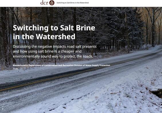
A StoryMap showing a default Full cover page without additional modification. With no background between the text and image, the text is very hard to read.
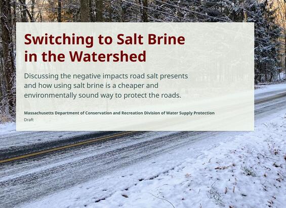
A StoryMap with the default Full cover page and an additional semi-transparent background between the cover text block and background image, increasing the contrast and readability of the cover text.
Headings
Proper heading structure aids assistive technology users in proper page navigation. It is important that headings are structured logically to provide these users with an intuitive way to read content on the page. A logical heading order is considered to be: H1 > H2 > H3, etc.
- Typically, a document (like this) would only receive one H1 heading, however in StoryMaps H1 headings are used to denote sections within the quick navigation menu, which means multiple H1 headings may be required to support this functionality.
- Always start with a H1 heading.
- Do not use a heading style to achieve a desired look. Headings support logical navigation by assistive technologies, such as screen readers.
- Think of headings as the outline of your narrative. When starting a new section, it is okay if the heading order does not directly follow the last heading used to close out the previous section.
- For example, if the previous section closed on an H4, then the new section may begin at H2, following the appropriate narrative structure.
In StoryMaps, the quick access menu (indicated with a red rectangle) is tied to headings throughout the Story. This is a break from traditional heading structure guidance for documents, where only one H1 heading should be present.
Content blocks
Including media like maps, images, video, or in-line audio clips in your content blocks are a great way to add richness to your Story. There are certain considerations that must be kept in mind when adding this type of content to your Story to ensure it is accessible to all. Refer to the recommendations below for the different types of media and to ensure you follow alternative text recommendations. Review the following recommendations on how to configure each type of content block for accessibility.
Basic content blocks
- Text—add text blocks to build your Story’s narrative. Refer to the Text and Heading sections for full details on how to ensure the text within your StoryMap follows accessibility best practices.
- Separator
- Use separators to break up sections of your Story.
- The styling of separators is defined by the selected StoryMap theme.
- Buttons
- Use buttons to link to external content.
- The styling of the button is defined by the selected StoryMap theme.
- Ensure you use clear button text that tells the reader where the button goes or what it does.
- Never use “Click here” or “Learn more”.
- Instead use descriptive text like “Find recreation opportunities” or “Learn more about the Watershed Protection Act”.
- Code
- Use this block type to share code snippets.
- This feature is better suited for short code blocks.
- Screen readers will read the entire contents of the code block to a reader.
- Ensure your code is well commented so that users can understand what each section does.
- Select the code language and enable line numbers.
- Provide a short description of what the code does within the StoryMap narrative.
- Use this block type to share code snippets.
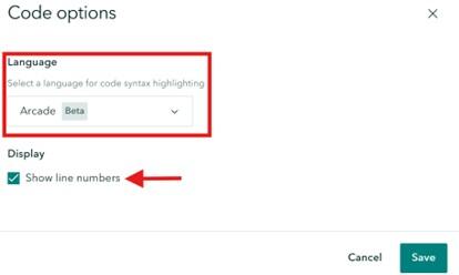
When adding a code block, be sure to select the proper code language. Enable line numbers to aid in navigating the code. If you provide references to the code within the narrative, this can help users quickly reference what you’re referring to.
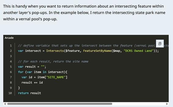
A code block has been added to the StoryMap body. A short description of the code has been added to the narrative before the code block. Within the code block itself, the Arcade language has been selected, and the code snippet has been added.
Data visualization content blocks
- Maps
- Please refer to the appropriate GIS accessibility guidance page when including maps within your StoryMap.
- Web map accessibility guidance
- Static map accessibility guidance
- Provide a detailed caption for your map. If using a sidecar, please ensure the narrative for the slide describes the map.
- Provide descriptive alternative text for your map. Please refer to the recommendations within the Alternative Text section.
- Enable the map legend. Please do not set the legend to be open by default as it hides other map tools.
- Enable the search option. This provides readers with an alternative way to interact with the map.
- Please refer to the appropriate GIS accessibility guidance page when including maps within your StoryMap.
- Express Maps:
- Please refer to the web map accessibility guidance page when creating express maps for use within a StoryMap.
- Color Contrast
- Ensure all features have appropriate color contrast with the selected basemap. If possible, select a color from the StoryMap theme options.
- If adding a text overlay, ensure the background color and text color meet contrast ratio requirements.
- Pop-ups
- These are optional.
- If needed, make sure the name and description follow all text guidelines.
- If adding an image, ensure that alternative text guidelines are followed.
- Charts:
- There are four types of charts to choose from:
- Column
- Bar
- Donut
- Line
- When configuring a chart, ensure that the following configurations are set:
- Data: fill in the data to be visualized.
- Avoid acronyms and abbreviations when adding categories.
- Ensure each column has a clear and meaningful heading.
- Settings
- Select colors for each series using the theme’s options, when possible.
- If you use custom colors, ensure that contrast requirements are met.
- If the contrast requirements have not been met, a warning icon will pop up next to the color selection, as shown below in Figure 7 next to the ‘Cats’ series color choice.
- Ensure all selected colors pass colorblind testing with Colorblindly. All series colors should be clearly distinguishable from one another.
- Provide an informative chart title, category axis title, and value axis title so that readers have a clear understanding of the data being displayed.
- Enable chart legend.
- Select colors for each series using the theme’s options, when possible.
- Options
- Always add the data source.
- Add a descriptive caption, which can be used to help screen reader users understand the contents of the chart.
- Data: fill in the data to be visualized.
- Always provide a table alternative for charts, as these are typically more easily read by screen readers.
- There are four types of charts to choose from:
- Infographics:
- Select from four layout options:
- Basic
- Stacked
- Compact
- Titled
- Provide readers with a value and description. Include an optional icon. Avoid abbreviations or acronyms.
- Use recommended theme colors, ensuring the icon, number, and font have a high contrast ratio with the background.
- Select from four layout options:

This example infographic uses the “Compact” layout option. This includes an icon, number, and description. The colors used for each can be customized when configuring the content block.
- Tables:
- Never take a screen capture of a table and insert it into a StoryMap as an image. This cannot be read by a screen reader.
- Always use the table element to display tabular data. Ensure to have headings on your tables.
- Ensure each cell included within the table contains one piece of information. Do not leave blank or empty cells. Instead, consider using a ‘0’ or “N/A” to indicate no data. Tables support up to 8 columns and 13 rows.
- Provide a descriptive caption for your table.
- Follow all text guidelines when formatting table headings and values.
Media Content Blocks
- Images:
- Ensure selected images are high resolution so they appear crisp and clean.
- Avoid using images of infographics when possible.
- Infographics can be visually overwhelming, and screen readers are unable to read aloud words included within the graphic.
- Use the built-in infographic, table, or chart content blocks within the StoryMap designer instead.
- If an infographic is required, describe the infographic within the narrative of your Story.
- Avoid using images of tables. Instead, use the built-in table content block (described in the previous section).
- Follow all alternative text recommendations.
- Select from the position options to determine how your image is presented within your Story.

Select from 4 to 5 different placement options when adding an Image to a StoryMap (depending on the orientation of the image—vertical versus landscape). The selected placement option will always be shown in dark blue. There are two placement options that support text wrapping (left or right) and two placement options that support in-line images (small, medium, or large [landscape only]).
- Image Gallery:
- Select from three layout options:
- Dynamic squares
- Jigsaw
- Filmstrip
- Each option can have its width set to appear small, medium, or large. This will change how each option appears within the Story.
- Ensure selected images are high resolution so they appear crisp and clean.
- Follow all alternative text recommendations.
- Select from three layout options:
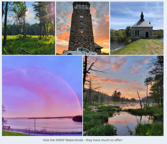
An Image Gallery using the “dynamic squares” layout set to “small”.
An Image Gallery using the "dynamic squares" layout set to "medium". This will appear centered within the narrative.
An Image Gallery using the "dynamic squares" layout set to "large". This will span the entire width of the page beyond the edges of the narrative.
- Videos:
- All videos should include a start and stop option. Do not enable a video to automatically start playing. Leave this control to the user.
- All videos must contain Closed Captioning.
- Closed Captions should match the cadence and language used within the video.
- Videos featuring sounds, like those made by animals, should include the sound as text to give readers a possible idea of what it sounds like. Learn more using this resource from the Described and Captioned Media Program.
- The Story builder allows you to upload a VTT caption file so that captions will play directly on the video when it's viewed in the Story.
- All videos should include a transcript.
- Transcripts should provide a readable version of the video.
- A built-in transcript field is available in the Accessibility tab of the video's options; if that field is filled in, a transcript icon will appear in the playback bar for that media. Clicking on that icon will expand the media into full-window mode, with the transcript text appearing next to or below the media.
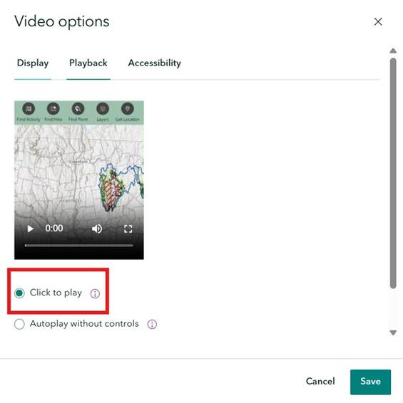
When configuring video settings, select the Playback tab and ensure "Click to play" is selected (indicated by the red rectangle above). This provides a reader with start and stop controls, meeting WCAG guidelines.
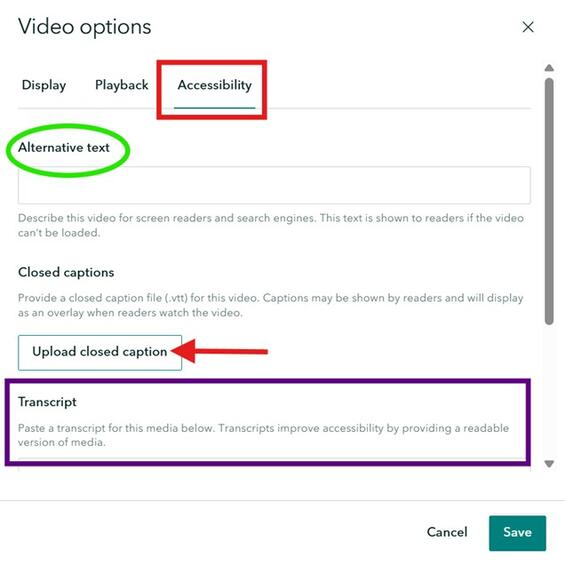
When configuring video settings, select the Accessibility tab (indicated by the red rectangle above) to set the video’s alternative text (highlighted in the green oval), upload a VTT closed captioning file (indicated by the red arrow), and write (or paste) a video transcript (highlighted with the large purple rectangle).
- Audio:
- Audio should provide users with a start and stop option. Do not enable audio to automatically start playing; leave this control to the user.
- Audio must include a transcript. Audio clips featuring sounds, like those made by animals, should include the sound as text to give readers a possible idea of what it sounds like. Learn more using this resource from the Described and Captioned Media Program.
- Embed. There are two options for embedding content:
- Display as card. Configure display options by
- Adding custom card details—provide a custom title for the embedded content and a helpful description.
- Uploading a custom thumbnail to display on the card.
- Display as an interactive embed
- Configure options for large screens by
- Not enabling “Include a button on the embed to open live content in a new tab”.
- Not enabling “Allow readers to directly interact with this content”. This provides your users with control over the interaction and allows the embedded content to be skipped more easily by assistive technology users.
- Configure options for small screens:
- Set to “Card”.
- Add custom card details—provide a custom title for the embedded content and a helpful description. Upload a custom thumbnail to display on the card.
- Refer to Figure 15 for an example of what this looks like.
- Configure options for large screens by
- Display as card. Configure display options by
The “Display as card” option will add a concise section to your Story as demonstrated above. Customize this card by adding a more descriptive content title and description, so readers understand what this is and why they might want to open it. Upload a custom thumbnail to display on the right side of the card. This will display to a user regardless of how they are viewing the Story (e.g. desktop vs. mobile).
The “Display as interactive embed” option will add the full application or webpage directly into your StoryMap. Provide the reader with control over interacting with the embed by not enabling the “Allow readers to directly interact with this content” option in the embed content block’s settings.
- Swipe:
- Allows for a comparison between two images or two maps.
- Follow all alternative text recommendations.
- Provide each individual map with short alternative text.
- Provide the overall swipe element with short alternative text.
- Provide a detailed map caption or description within the narrative to ensure an equitable experience for non-sighted users.
- Timeline:
- There are three layout options:
- Waterfall
- Single side
- Condensed
- Each “step” in the timeline supports an image (optional), a title (time or date), and a description.
- Follow all alternative text recommendations.
- There are three layout options:
Immersive Content Blocks
- Sidecar:
- A great way to provide narrative and media content side-by-side.
- Supports the addition of many media types in the “main stage”. Refer to each content block details above when adding different media to a sidecar.
- Some specific considerations:
- Embed—there are no display options comparable to embedding content outside of a sidecar that allow the option to not enable “Allow readers to directly interact with this content”.
- The entire app will be read out by a screen reader when the user is not given the choice to only interact with the embed when activated. This may be overwhelming.
- Due to this limitation, avoid embedding an app into a sidecar when possible.
- Charts—the same screen reader issues persist when adding charts to a sidecar. Avoid the addition of charts to a sidecar when possible.
- Embed—there are no display options comparable to embedding content outside of a sidecar that allow the option to not enable “Allow readers to directly interact with this content”.
- Map Tour:
- There are three options when building a Map Tour:
- Start from scratch
- Upload photos (geo-tagged photos required)
- Start with a feature layer
- Select from six layouts:
- Media focused
- Map focused
- List
- Grid
- Categorized List
- Categorized Grid
- Location Details
- Ensure each location has a title and description. Follow all text guidelines.
- When “Start with a feature layer” is selected, the title and description can be set to populate from a dynamic attribute field.
- Photos are optional but encouraged. Ensure that alt text guidelines are followed.
- If all locations do not have at least one photo, do not use the “Media focused” option.
- When “Start with a feature layer” is selected, alternative text can be set to populate from a dynamic attribute field.
- Ensure each location has a title and description. Follow all text guidelines.
- There are three options when building a Map Tour:
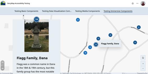
This example map tour was created using an existing hosted feature layer and uses the “map focused” layout option. Each tour point’s title and description are connected to attribute fields within the hosted feature layer. Each image is an attachment to the feature, and its alternative text is dynamically populated from a selected attribute field.
Text and reading
This section covers general text requirements and best practices. Review specific element sections in this document for more-pointed text requirements. Visit the Commonwealth's Digital Accessibility Fundamentals page on Content and Typography for general text size and style information.
- A sans serif font is used when selecting your font of choice in the theme builder.
- Always underline links. Do not use the dotted line or highlighted background options within the StoryMap theme builder for link style.
- Limit the use of bolding.
- Use bold text sparingly to call out important facts, figures, or statistics.
- Do not use bolding for figure captions.
- Limit the use of italics for emphasis.
- Do not use all capitalized letters.
- Using all capitals can make text difficult to read for people who are neurodivergent (e.g. dyslexia).
- Using all capitals removes the variation in letter shape and size and can make it more difficult to distinguish between letters.
- All capitalization also gives a sense of "yelling".
- Text spacing is supported without loss of content or functionality if resized appropriately. In the StoryMap theme designer there are only two options for adjusting the spacing of the text within a section: “Spacious” and “Compact”. We recommend selecting the “Spacious” spacing style as the more accessible option between the two.
- Keep blocks of text to a few sentences each to convey your Story.
- Use natural language, as if you were talking to your audience. This naturally creates sentences that are neither too long-winded, nor too short and choppy.
- Use lists whenever it makes sense. Lists allow readers to more easily skim content and can be a helpful way to organize content for screen reader users.
- Be sure to always use the built-in list options (bulleted or numbered), rather than writing in numbers yourself.
- The built-in list options generate code that is recognized by screen readers to help relay the content.
- Unusual words: A mechanism is available for identifying specific definitions of words or phrases used in an unusual or restricted way, including idioms and jargon.
- Abbreviations:
- A mechanism for identifying the expanded form or meaning of abbreviations is available.
- Generally, abbreviations should be defined at least once, and all subsequent uses of that abbreviation is acceptable.
- Reading Level:
- Reading level should be between grades 6 and 9.
- When more advanced words are necessary, please define them, or provide supplemental content.
- Pronunciation: A mechanism is available for identifying specific pronunciation of words where meaning of the words, in context, is ambiguous without knowing the pronunciation.
- Be descriptive:
- When writing headings, buttons, or links ensure they are concise and descriptive. Never use “Click here” or “Learn more”.
- Always describe what a link or button will do (e.g. “Read more about loons” or “Learn more about StoryMap Accessibility”).
- References: When including references, avoid in-text citations that use superscript numbers that correspond to the reference section. For example: “This fun fact is cool.1” would be read out by a screen reader as “This fun fact is cool. One”. A screen reader user might be left wondering “one what?”.
Alternative text
Alternative (alt) text serves to provide users who have visual impairments or use assistive technologies with a description of the map, image, or other type of media. It should serve the equivalent purpose as the visual. Writing good alternative text is important, as it ensures that all visual content within your Story is accessible and understandable to all users, regardless of disability status.
Writing alt text can be very subjective—depending on what information is around the map, you might need to be more or less descriptive in your alt text. Generally, alt text is limited to 125 characters, although it can be longer for maps or graphics. If you have space to include a caption or detailed map description below or around your map, the alt text can be shorter. Writing alternative text is subjective and takes practices. For help getting started writing alternative text, check out the GIS accessibility resources page, or get started by reading an article from Perkins School for the Blind.
The ArcGIS StoryMaps builder has a field to add alternative text to maps, images, videos, audio clips, maps, embeds (like embedded apps or forms), and whole map tour blocks. It’s important to add alt text for all media. Use the following guidelines to get started:
- For maps:
- Alternative text should provide a text equivalent experience for non-sighted users.
- Alternative text should preserve the original intent, meaning, or nuance of the map. Keep the following in mind when writing alternative text:
- Include a description of what is shown on the map with a focus on the map’s key layers. These are the layers that are required to understand the purpose of the map.
- Describe the geographic area of interest—where, specifically, is this map focused?
- Describe any key patterns or takeaways being shown on the map—these descriptions should drive home understanding of what the map is showing.
- Be aware that visual cues, like references to color, can be hard for users who rely on assistive technology.
- Captions:
- All map content should receive a caption.
- Captions should never match alternative text. Generally, alternative text is limited to roughly 125 characters. Captions, or map descriptions, can be more detailed and robust, and should provide additional details to the viewer, such as those outlined above.
Review the following example of “good” versus “bad” alternative text for the map in the following figure. If a map is not able to have a caption or map description in the surrounding narrative, then the “good” alternative text example might be appropriate. If there is space for a caption or map description in the surrounding narrative, the “good” alternative text would likely be overkill.
- “Bad” alternative text: A map showing population density.
- “Good” alternative text: A map showing population density across Massachusetts using US Census block groups. Each block group represents the number of people per square mile. Highest population density areas are around metro Boston, Worcester, and Springfield. Within the Division of Water Supply Protection watersheds, which are located in central Massachusetts, the more western Quabbin and Ware River Watersheds have lower population density than the more eastern Wachusett and Sudbury Reservoir watersheds.
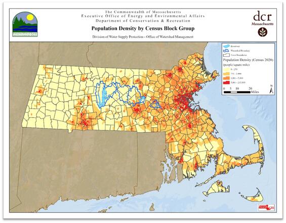
This static map shows population density across Massachusetts using US Census block groups and is included to complement the above demonstration of “good” versus “bad” alternative text.
- For images:
- Decorative image. If the image is purely decorative or aesthetic, alternate text should be omitted, as this creates audible clutter for a screen reader and user to navigate. To be considered decorative, the image should meet the following criteria as defined by WCAG:
- Serves only an aesthetic purpose to provide visual enhancements, decorations, or embellishments.
- Provides no information.
- Has no functionality, beyond aesthetics.
- Non-decorative image. If the image or graphic is critical to supporting the narrative of your StoryMap, alternative text must be provided. This group of images can be broken up into further categories:
- Informative images: These types of images convey a simple concept or information that can be conveyed to a user in a short phrase or sentence. This phrase or sentence should convey the meaning or content of what is being displayed, without being a literal description of the image. In some cases, a literal description is required; however, this is only when the image is all, or a large part, of the information being conveyed.
- Images of text: These types of images are strongly discouraged. Generally, images of text are intended to be read. But because assistive technology cannot read text contained in an image, it is best to avoid this whenever possible. If an image must contain text, then the alt text must contain the same text as shown in the image.
- Complex images: These image types contain substantial information that can't be conveyed in a short phrase or sentence. Complex images generally include: graphs, charts, diagrams, illustrations (where surrounding text relies on user understanding of presented image), and maps. For complex images, the alt text must provide two parts:
- A short description to identify the image and (if needed) where the long description can be located.
- A long description which provides the essential information conveyed by the image.
- Groups of images: If a group of images is used to convey one piece of information, only one of the images requires alt text to describe the entire collection, while the other images have a null alt text attribute.
- Image maps—This special type of image allows a user to make a selection within a defined area(s) of an image. In this situation, both the entire image map requires alt text to describe the entire image, and each clickable or selectable element needs alt text to describe the action that will be initiated by clicking or selecting.
- Captions:
- All media (image, video, audio) content should receive a caption.
- Captions should never match alternative text. Generally, alternative text is limited to about 125 characters. Captions can be more detailed and robust, and are a way to provide additional details to the viewer.
- Decorative image. If the image is purely decorative or aesthetic, alternate text should be omitted, as this creates audible clutter for a screen reader and user to navigate. To be considered decorative, the image should meet the following criteria as defined by WCAG:
Add alternative text to media within a StoryMap using the following steps:
- Add your media to the StoryMap.
- Hover over the media and select the gear from the context menu that appears.
- Toggle over to the “Accessibility” tab.
- Enter your alternative text.
- Save your changes in the bottom right corner of the dialog.

To add alternative text to any media included within a StoryMap, hover over that content block and select the “Options” gear (indicated by the red rectangle above) from the context menu that appears above the block.
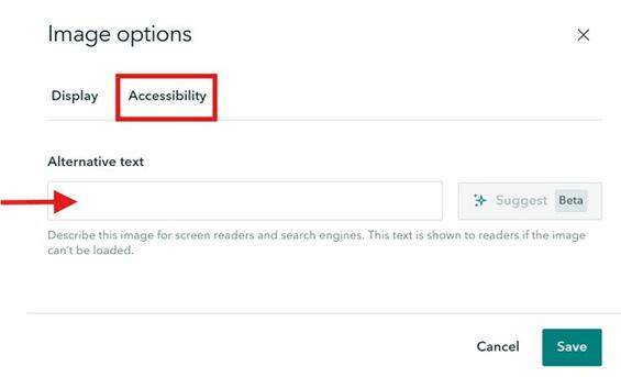
Once the “Options” dialog is open, toggle over to the “Accessibility” page (indicated with a red rectangle above) to enter alternative text.
Embedded content
Please refer to recommendations within the Embed sub-section within the Media Content Blocks section.
Alternative data formats
Providing data in alternative formats allows users to determine how they want to consume information. If possible, provide data in multiple alternate formats and allow users to “choose their own adventure”. Whatever alternative data format is provided should not lose the original intent, meaning, or nuance of the data. Alternative data formats are required for maps, tables, charts, etc.
StoryMap Collections
StoryMap Collections can be used to bring together a collection of StoryMaps and other shared ArcGIS content. They can serve as nice wrappers for multiple related items. Please review the following accessibility considerations when creating a Collection. There are currently (as of August 2025) some important considerations when designing Collections due to these accessibility limitations.
- Cover Design
- Currently, no cover design is fully accessible. Keyboard users can focus and select the “Get Started” button to jump into the first item in the Collection; however, if they focus on any individual item on the landing page, they cannot select that item.
- Journal is most appropriate for a Collection with under five items.
- Grid or Magazine is most appropriate for a Collection with over five items.
- Navigation
- Currently, the “Compact” navigation option is fully keyboard accessible.
- “Compact” navigation also provides users with a tooltip display for the next content item’s name.
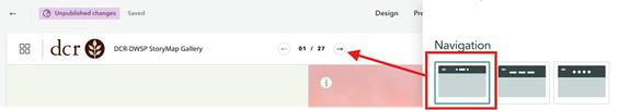
The "Compact" navigation option is fully keyboard accessible and provides users with a tooltip that displays the next content item's title. This is also a great way to present lots of content (this example has 27 StoryMaps within the collection).
- Cover content
- Provide the Collection with a short, descriptive name.
- Provide a one-sentence summary of the Collection to “grab” a reader’s interest.
- Update the author’s name, if needed.
- Provide a short description that provides any additional information or context a reader needs to understand or use the Collection.
- Items
- Provide each item (StoryMap or other ArcGIS content) with a short, descriptive name.
- Provide each item with a unique image.
- StoryMaps added to a Collection will use the image from the individual StoryMap’s cover.
- Other AGOL content will use the thumbnail from the Item Details page.
StoryMap Briefings
StoryMap Briefings are akin to Power Point, but with more GIS integration and features. They can be used for presenting information in a slide show-like format to an audience. All best practices outlined above should be followed when adding content to a Briefing. In addition, each slide should receive a unique and descriptive slide title to ensure the table of contents is useful and easy to navigate. This can be accomplished using the following steps:
- Click the Slide Actions and select “Slide options”.
- Enter a display title and then click Save in the lower right corner.
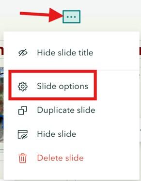
The Slide Actions panel when expanded allows Creators to rename each slide by selecting “Slide options” (denoted by the red rectangle).
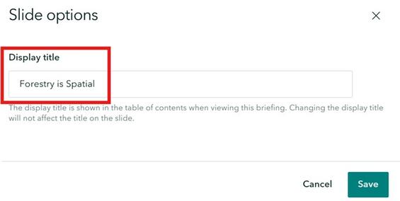
A screenshot of the “Slide options” accessed through the Slide Action’s tab. Provide each slide with a unique display title (denoted by the red rectangle). This shows in the table of contents.
Checklist
-
Open PDF file, 322.17 KB, StoryMaps Accessibility Checklist (English, PDF 322.17 KB)
| Date published: | April 10, 2026 |
|---|