Basemap selection
Basemaps provide additional context and meaning to the data being displayed in your map. They are designed to sit in the background and serve as the "foundation" of any map and should support the data being displayed. A basemap should not confuse or clutter your map. When the basemap is too cluttered, this can cause additional accessibility issues.
There are several accessible basemaps available from Esri within the Basemap Gallery. Just because a basemap is labeled with the word "accessible", does not mean your map will inherently be accessible. Your datasets and selected symbology, in addition to the selected basemap, will impact the overall accessibility of your map.
Select a basemap that supports your map without overwhelming it. Avoid selecting a basemap which contains colors that compete with the symbology of key data layers within the map (e.g. if one of your key layers leverages an aqua-green symbol color, selecting the Enhanced Contrast Basemap–Light version is probably not a good idea, as this will conflict with the basemap colors showing green spaces).
Below are some suggestions to get you started:
- If data featured in the map uses lots of symbols or colors, consider muted basemap options:
- Light Grey Canvas
- Human Geography Map
- If detailed street data (and other reference features) are needed for context, and you have little data to overlay on the basemap, consider one of the Enhanced Contrast basemaps—they come in dark and light versions.
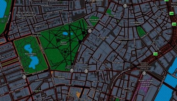
A dark-colored Enhanced Contrast Basemap uses a white and grey backdrop and generally lighter colors to highlight important areas like the waterbodies in the Common and Public Garden.
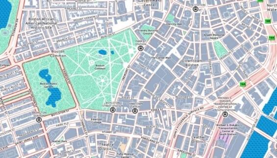
A light-colored Enhanced Contrast Basemap uses a white and grey backdrop and generally lighter colors to highlight important areas like the waterbodies in the Common and Public Garden.
- Use a greyscale layer effect to dampen the basemap (this works best with the light version).

This Grayscale Effect is set at 50%, dampening bright colors of the light Enhanced Contrast Basemap.
Grayscale Effect is set to 75% to dampen bright colors even more than the 50% effect.
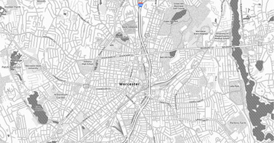
This map with Grayscale Effect at 100%, removing all but essential colors (e.g. highway icons) from the map.
- Vector Style Editor can be used to clean up any vector basemap by reducing reference features shown, or by changing/removing colors (beware when changing colors to avoid conflict between the symbology of your key data layers and the basemap).
- Be sure to test your map symbology and basemap selection using the Color Vision Simulator tool in ArcGIS Pro.
- Open your web map up in ArcGIS Pro to use the Color Vision Simulator on the View ribbon. This allows you to select a colorblind filter to apply to your screen and see how your map would look to a user who is colorblind.
- This is a great place to start, however this does not test for all variations of color vision deficiencies. Learn more about all types of color vision deficiencies.
- Ensuring that features are distinguishable from one another, and that the color schemes work in these three simulated color deficiencies, generally means that you have made it most of the way to a visually accessible map.
- Colorblindly, a free add-in for the Chrome browser, allows you to simulate all color deficiencies for your web map directly in your browser window. There is also a Firefox add-in, Let's Get Colorblind, however this only works for testing web applications, not for web maps.
- Open your web map up in ArcGIS Pro to use the Color Vision Simulator on the View ribbon. This allows you to select a colorblind filter to apply to your screen and see how your map would look to a user who is colorblind.
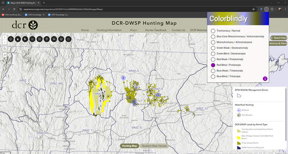
Screenshot demonstrating Colorblindly—a free Chrome browser add-in—is used to toggle between the different types of color deficiencies to simulate what different users may see, better informing design decisions. This example shows what the DCR-DWSP Hunting Map would look like to people with protanopia (blindness to red).
Layers
There are many strategies which can be used to help focus your map. These principles and ideas not only make a map more accessible to people who are neurodivergent, but they can also help clarify the narrative your map is trying to convey to all users.
- Filtering is the most fundamental way to focus a map on a specific area or topic of interest. By narrowing down the data in a map, it can declutter the visualization and focus attention to the topic or area of interest. Consider the maps below—the goal is to show the percent of poverty within the Houston, TX area. Which map does this better?
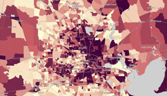
Percent of poverty in Houston, Texas with no filters applied, making the city of Houston difficult to locate.
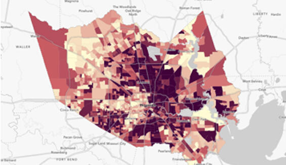
A filtered map of Houston, Texas showing the levels of poverty within the city limit areas.
- Layer Effects are a great way to make features in your map pop out. One such example is to use Drop Shadow to help your features stand out from the basemap and other reference data. Learn more about layer effects from Esri.
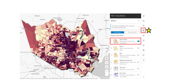
Enabling a layer effect, such as the Drop Shadow effect, can emphasize your data to better draw a viewer’s attention to the focus of the map. Effects can be accessed from the “Effects” menu, highlighted on the right side of the image by the yellow star and red box.
- Group layers can be used to facilitate the application of blend modes and masking (see below), but they can also be used as a strategy for grouping like data. This can be advantageous for interacting with the map or map legend by making it more intuitive for the audience.
- Blend modes can help when your data doesn't have an attribute field to filter by. This is especially helpful if you are working with data you do not own, and can help prevent data duplication (e.g. you don't need to republish a clipped subset of the data!). Learn more about the different uses Blend Modes can be employed for.
- Dynamically filter with blend modes.
- Locate a boundary layer with ArcGIS Online
- Create a new group layer
- Add your data which needs to be filtered and the new boundary layer to the group layer. Ensure the boundary ("filter") layer is on top.
- If needed, filter the boundary layer to your area of interest
- With the boundary/"filter" layer selected, turn on the Destination Atop blend mode. This can be found by selecting Layer Properties and scrolling down to the Appearance section.
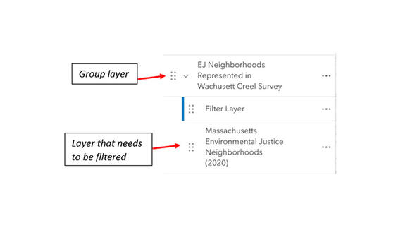
Step 3 of using blend modes to dynamically filter a layer in your map. A group layer must be created to contain the filter layer on top of (or above) the data which needs to be filtered (in this example, the Massachusetts Environmental Justice Neighborhoods (2020) data).
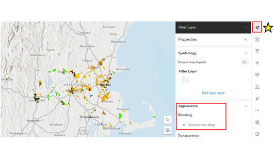
Annotated screenshot of Step 5 above. With the filter layer selected in Contents, open the layer Properties pane on the right side of the screen and select the “Destination Atop” blend mode from the Blending menu. It is important to note that for blend modes to work correctly, both layers (the filter layer and the data to be filtered) must be turned on within the group layer. In addition, any transparency applied to the filter layer will be transferred to your data.
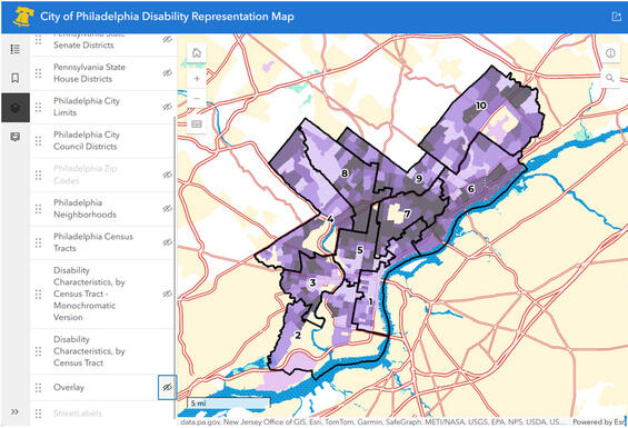
- Overlay can also help focus on important content and reduce clutter in your map. Overlays can manually be turned on or off by the user to show or hide additional information. The use of overlay provides your user with a higher level of control over what they see in the map and can be helpful for people who are neurodivergent.
A map overlay obscures the basemap of the surrounding area. Overlay is a great way to provide users of a map with control to determine how much detail they want to see.
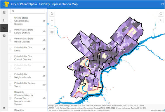
This map of Philadelphia has the overlay turned off so all of the basemap and reference data is visible.
Symbology
There are many considerations when it comes to symbology that can impact how accessible a map is. Below are some general guidelines to help in the development of accessible map layer symbology.
- Promote clarity for low vision and color-blindness
- This includes the consideration of contrast ratios, symbol size, use of textures/patterns, and more.
- Use a combination of color, size, shapes, and simple patterns/textures (this is referred to as using multiple visual variables)
- By utilizing color in combination with a simple pattern or varied shape, for example, a user will have an easier time differentiating between symbols on your map.
- The various vector symbols available in Map Viewer provide a variety of options to satisfy this; however, an even higher level of customization can occur when publishing from ArcGIS Pro or by uploading custom icons into the Map Viewer’s Style tab.
- Make intentional and purposeful symbol selections that provide a logical connection to the data and what is being communicated
- Consider simple symbol styles or icons that clearly connect with the data in some way, represent a widely accepted symbol style for a feature, or is consistent with symbol selections in other applications.
Simple symbols for boat ramps, parking areas, and hiking trails are commonly used for map icons.
- Use Esri's colorblind-friendly color ramps (suitable for continuous or discrete data)
- Ensure selected color ramps provide good contrast between data value variation, order, sequential values and categories shown in the map.
- Esri offers a variety of pre-built colorblind-friendly color ramps directly within Map Viewer. You can find these using the category filter, seen below.
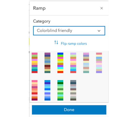
Pre-built, colorblind-friendly ramp options available in the ArcGIS Online Map Viewer. These options are suitable for use with both continuous and discrete data.
- Test map symbology using the Color Vision Simulator tool in ArcGIS Pro
- Open your web map up in ArcGIS Pro to use the Color Vision Simulator on the View ribbon. This allows you to select one of three colorblind filters to apply to your screen and see how your map would look to a user who is colorblind.
- This is a great place to start, however this does not test for all variations of color vision deficiencies. Learn more about all types of color vision deficiencies.
- Colorblindly, a free add-in for the Chrome browser, allows you to simulate allcolor deficiencies for your web map directly in your browser window. There is also a Firefox add-in, Let's Get Colorblind; however, this only works for testing web applications, not for web maps. Refer to Figure 3 for additional details.
- Open your web map up in ArcGIS Pro to use the Color Vision Simulator on the View ribbon. This allows you to select one of three colorblind filters to apply to your screen and see how your map would look to a user who is colorblind.
- Consider using the ArcGIS Developer site to develop customized colorblind-friendly ramps that match your map/application's theme and purpose.
- This site allows you to search for customized color ramps using a series of simple choices. Be sure to toggle on option 3 for ‘Colorblind friendly’!
- Use the provided hex codes to build a custom color ramp in your map!
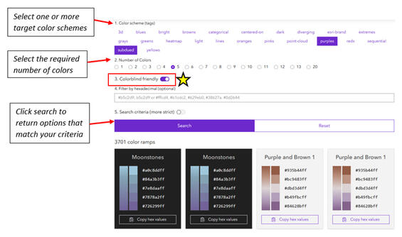
Generating a custom, colorblind-friendly color ramp on the ArcGIS Developer site. First select a color scheme, then select the required number of colors, next toggle on the colorblind-friendly option, and search! Copy hex codes to use the colors in your map.
Pop-ups
Pop-ups present relevant and ordered information to the user of a map. It is important to spend sufficient time configuring a pop-up so that it conveys clear and concise information to a user. Well-designed pop-ups not only look nice but are easy to read and comprehend. Pop-up design and specifications will be highly dependent on the purpose of the map, the target audience and the location in which the map will be used. In general, maps for the public should have pop-ups configured differently than maps for staff to use on their desktop or in Field Maps. Use these best practices to aid in the design of effective and (more) accessible pop-ups.
- Limit pop-ups to essential information only, so as not to overwhelm or confuse the user. Less is more.
- Visit the Commonwealth's Digital Accessibility Fundamentals page on Content and Typography for general text size and style information.
- Use a minimum text size of 16 px.
When using a custom Text block within a pop-up, use the text size drop-down to change the font size.
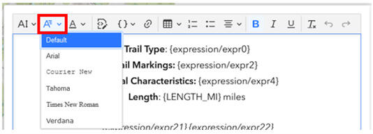
- Sans serif fonts are best.
- Examples: Open Sans, Arial, Helvetica, or find more sans serif fonts.
- Please note, this is only relevant when adding a Text block to the pop-up. Font style in the Fields List cannot be changed. The Fields List should almost never be used in a final map product.
When using a custom Text block within a pop-up, use the font style drop-down to change the font style to a Sans Serif font.
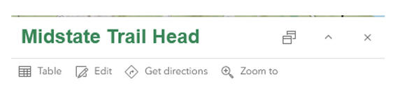
- Provide your pop-up with a meaningful title.
Use a combination of text, dynamic attribute field(s), and HTML to configure the title to look nice and provide the right information. The HTML code below is what created the green title in the screenshot image following the code.
<font face='arial'><font size='5pt'><font color='388557'>{Location_Name}</font></font></font>
This example shows how the previous HTML snippet appears within a feature’s pop-up.
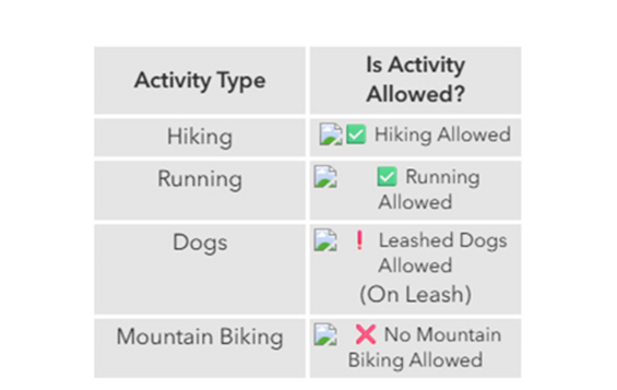
- Consider using sentence structure to convey information in pop-ups, rather than relying on the default fields list. Using full sentences may not always be feasible or practical. Sentences are generally easier for people to interpret and understand and may be appropriate when you need to convey clear and concise information to end users. In general, we encourage using sentence structure for public-facing maps.
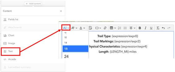
- When designing a map for use by staff in Field Maps, or when a feature layer has many attributes which need to be displayed to an end user, using sentences might not be practical (or make much sense). In this situation, use the default fields list while ensuring you adhere to best practices around making language easier to understand by removing underscores, defining acronyms, using title case, etc. Use a Text block and Arcade expressions to assist with this.
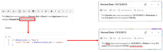
This example shows how most of the pop-up is constructed using a combination of text and dynamic attribute fields. The Arcade expression {expression/expr0} is used to create an additional sentence if the specified criteria (Sex is equal to Male) is met. The top right example is for a female, so the additional sentence built with Arcade does not appear. In the bottom right example, an additional sentence is added to the pop-up because this deer is a male.
- Add Image section(s) to pop-ups if including images.
- If using the Image block, whether the image is static or dynamic, you must add alternative text (alt text) to describe the photo if it conveys information that is important in some way. If the image is purely decorative, no alt text is required (and it is preferred that decorative images do not receive alt text). All content in the righthand screen capture below can be built using dynamic content — click the { } to the right of any field to do this.
- Ensure all non-text content has a text alternative that serves the equivalent purpose of the visual. This provides information for a screen reader to announce. It's important to note that alternative text and captions should never match.
- If using dynamic icons or images within a pop-up, be sure to include alt text for each icon or image included. Alt text is read by assistive technology and will also appear if the icon/image does not load.
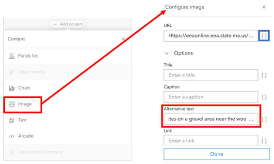
When an Image block is added to the pop-up, you can easily add alternative text—this can be static or constructed from dynamic attribute(s).
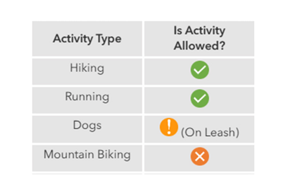
Example of a table with images that a person with vision would experience.
Example of how a pop-up with images would display if alt text was displayed and read by assistive technology.
- Consider using the custom text block with a properly formatted HTML table (as seen in Figure 20 above). This allows you to add column headers which can help users better interpret repetitive data.
- Use the “source” button in the text block configuration to build your table. Refer to Figure 21 below to see where this button is located.
- Once built, the formatted HTML table can easily be repurposed for use in other maps by copying and reconfiguring the code.
- Use color and emphasis to help important information in your pop-up stand out and/or to relate back to their associated layer symbology. Arcade expressions can aid in varying the color based on values.
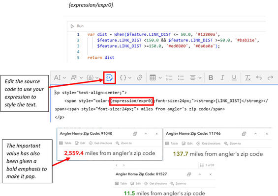
Using a combination of color and emphasis can help make information in a pop-up stand out. This example shows how Arcade can be used to assign a specific color based on attribute values, how to use the Arcade expression in the text block’s HTML source formatting, and some examples of what the pop-up looks like for an end user.
- If using the default Fields List, update all attribute field names and presented values to be displayed in nicely formatted plain language. Remove attribute fields which are required for the end user or purpose of the map.
- Replace default attribute field names through the Fields settings. Remove underscores, acronyms, and abbreviations.
- Format numeric values to include commas (as appropriate) and to reduce returned decimal places (as appropriate).
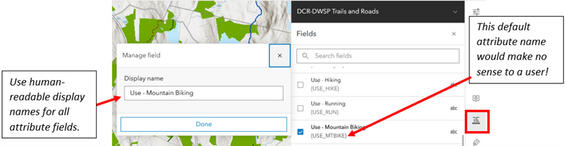
When configuring a web map to use the default fields list, ensure each attribute field that will be included has a human-readable name assigned from the Fields list. This will make your pop-up easier to read and comprehend.
Labels
The use of labels within a map can help to call out key features, can serve as reference for orienting yourself in space, can be used to provide key statistics, and more. There are a few best practices to keep in mind when designing effective and accessible labels.
- For map symbology to be fully accessible under WCAG 2.1 A and AA standards, your map must label its key features, effectively "dual encoding" the information in your map. This is the practice of encoding information through both visual map symbology and text items which communicate the same aspects of the data in concert with one another. If map data is provided in an alternative format, then only label essential information.
- Reduce use of jargon—use plain language and eliminate (or limit) the use of acronyms.
- Typography for the key features of your map should meet the following text sizes and contrast ratios:
- 9 px regular = 4.5:1 minimum contrast ratio
- 14 px bold = 3:1 minimum contrast ratio
- 18 px regular = 3:1 minimum contrast ratio
- Sans serif typography is best. Examples include Open Sans, Arial, Helvetica, or find more sans serif fonts.
- Limit use of labels to essential information and key features so as not to overwhelm the map.
- Less is more.
- Make sure to label your key layers to dual-encode their meaning to viewers. Labelling contextual/non-key layers is a matter of your own choice.
- It is important to make discerning choices when labeling as over-labeling can decrease the accessibility of your map by cluttering it with competing text.
- Use halos to increase contrast against underlying data and/or the basemap.
- Ensure you have good contrast between your font color and your halo color.
- Aim for a 4.5:1 contrast ratio!
- Reference the above guide on how the minimum required contrast ratios change depending on the font size you choose.
- If you choose to opt out of using halos to ensure adequate label contrast, make sure that the label text fill color achieves the relevant contrast ratio when measured against the darkest possible color that it could draw on top of in your map.
- Ensure you have good contrast between your font color and your halo color.
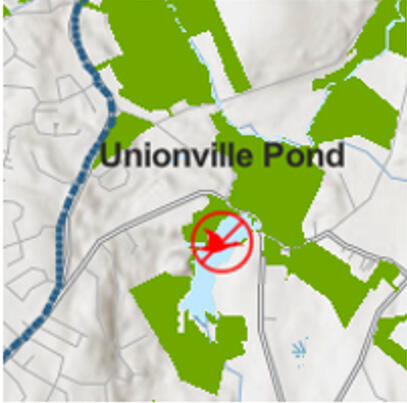
The label of "Unionville Pond" on this map has black text and no halo, making it difficult to see over the map.
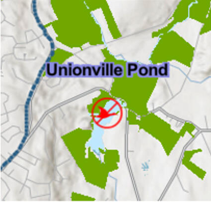
In this example, the label "Unionville Pond" has a blue/purple halo behind the black text. The contrast with the map underneath makes the label more visible, but the actual words are still difficult to read.
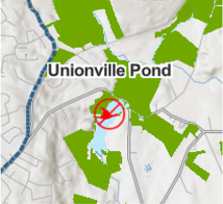
Here, the label "Unionville Pond" has a white halo, making the black text stand out from the map underneath. This makes the label much more clear to see.
- It is not always possible to label all layers in a map. In fact, trying to label everything will likely result in an inaccessible and illegible map. Instead, focus on adding meaningful labels to only the key data layers that answer your users' questions. If there are multiple key data layers, consider which are the most important to dual-encode.
- Important! Labeling in the Map Viewer is much more limited than ArcGIS Pro. If advanced labeling is required for your map, and the map or data will not change, consider publishing a vector tile layer to ArcGIS Online that only contains labels for the key features in your map. This would allow you to leverage the increased labeling control available in ArcGIS Pro; however, this would require re-creation of the vector tile layer each time the map or data changes. While we have opened a series of enhancement requests for labels, Esri has opted not to implement these requests.
Legend
Design the map legend to reinforce the user's understanding of the content being displayed in map. This can be done through clear layer and/or group layer names and the use of descriptive feature Types.
- Reduce use of jargon—use plain language and eliminate (or limit) the use of acronyms.
- Remove underscores that may be present in the layer name.
- Add descriptions to any coded values that may be present when a layer is mapped by Types.
- If using symbol groups, provide each grouping with a unique and descriptive name.
- Consider avoiding complex map symbology (such as bivariate symbology) when creating maps—these symbology types introduce a cognitive burden to readers that is rarely necessary to create accurate maps of your data.
Web map item details
A complete Item Details page not only provides any user with information, but it can also serve as a way to provide users who have visual impairments or use assistive technologies with a description of the map. It should serve the equivalent purpose as the visual.
Text and reading
This section covers general text requirements and best practices. Review specific element sections in this document for more-pointed text requirements. Visit the Commonwealth's Digital Accessibility Fundamentals page on Content and Typography for general text size and style information.
- Use at least 16px
- Large scale text (at least 24px or 19px bold) passes a contrast checker.
- Incidental text (text that are pure decoration, that are not visible to anyone, or are part of a picture that contains significant other visual content) have no contrast requirements. Note when text is part of a logo or brand name, it has no contrast requirements.
- Ability to resize text, up to 200%, is supported without loss of content or functionality.
- Visual presentation of block of text:
- Text is not justified.
- Line spacing (leading) is at least space-and-a-half within paragraphs, and paragraph spacing is at least 1.5 times larger than line spacing.
- Text can be resized without assistive technology up to 200% in a way that does not require user to scroll horizontally to read a line of text on a full-screen window.
- Images of text are only used for pure decoration or where a particular presentation of text is essential to the information being conveyed. Logotypes are considered essential.
- Unusual Words: A mechanism is available for identifying specific definitions of words or phrases used in an unusual or restricted way, including idioms and jargon.
- Abbreviations: A mechanism for identifying the expanded form or meaning of abbreviations is available.
- Reading Level: aim for grade 9 as best you can
- Pronunciation: A mechanism is available for identifying specific pronunciation of words where meaning of the words, in context, is ambiguous without knowing the pronunciation.
Checklist
-
Open PDF file, 190.27 KB, Web Map Accessibility Checklist (English, PDF 190.27 KB)
| Date published: | April 1, 2026 |
|---|