Be aware before moving forward!
Important! Currently, ArcGIS Dashboards do not support reflow or responsive design.
This is a key concept of accessible design and one of the most important Web Content Accessibility Guidelines. Reflow and responsive design impacts everyone, not just people with disabilities. It ensures an application or web page remains useable to all, regardless of screen resolution or browser zoom.
The Problem: The ArcGIS Dashboard mobile layout is only visible when a user accesses the Dashboard on a mobile device. If a user increases browser zoom to 200% or 400%, the desktop layout will be used. This is a huge accessibility issue for Dashboards that include many elements, as they can become squished and unusable.
The Solution: We strongly encourage that you build public facing “Dashboards” using Experience Builder instead of the ArcGIS Dashboard platform. As long as Experience Builder accessibility best practices are adhered to, you will be able to create an accessible Dashboard-like application.
Dashboard Theme
The Dashboard theme should be set first, before adding any elements to your Dashboard. This will ensure that color suggestions in the chart (and other) elements match with the selected theme. If designing your own theme, ensure that your “Header text color” is sufficiently dark enough so that the “Secondary header text color” (which corresponds to the Dashboard “Subtitle”) passes contrast requirements with your “Header foreground color”. Currently, the “Secondary header text color” is inherited from the “Header text color” through the automatic selection of a lighter shade. If your selected header color is not dark enough, it is likely that your “Secondary header text color” will not pass the built-in contrast checker for “Header foreground color”.
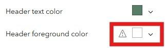
When there are color contrast issues, the theme designer will show a warning symbol near the color swatch with the contrast issue. This screenshot shows an issue with the "Header foreground color".
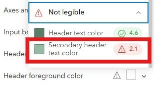
To learn more about the contrast warning, expand the color swatch with the warning, and then expand the "Not legible" section at the bottom of the color-picker window. This screenshot demonstrates how the "Secondary header text color", which is inherited from the "Header text color" as a lighter shade, does not meet minimum contrast requirements. To fix this, select a darker shade for your “Header text color”.
Heading Structure
Dashboards allow you to configure all elements so that they follow a logical heading structure. This is important as it aids users in navigating of your Dashboard. Headings are especially important for assistive technology users, as they provide a quick and easy way to logically navigate a web-based tool. Esri demonstrates how a Dashboard can be configured with a logical heading structure. Overall, Esri makes the following recommendations when designing the heading structure of your Dashboard.
- Heading 1 (H1): title of your Dashboard.
- Heading 2 (H2): a section of grouped elements or stand-alone elements.
- Heading 3 (H3): individual elements in a grouped section or heading within a List, Details, or Rich Text element.
Some general heading dos and don’ts to be aware of as you start building your Dashboards:
- Do change the heading style, such as by making the font larger or smaller, bolded, etc. Be consistent with customizations across elements.
- Never use a heading for aesthetic purposes (e.g. you want large, bolded font to make something stand out). Alter the style of “Paragraph” font instead.
The next sections will detail how to implement this in your own Dashboards.
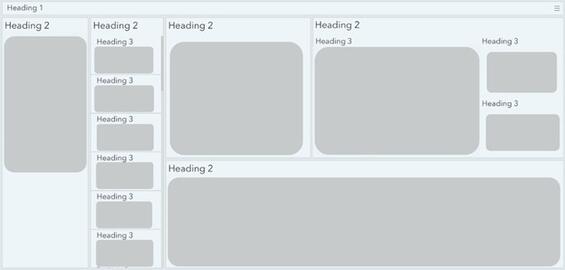
This simple graphic from Esri demonstrates how to configure a Dashboard with a logical heading structure. This aids in navigation and ensures that all users can successfully navigate the tool.
Header
Dashboards allow you to add a Header which will provide users with the title of the Dashboard, a landing space for selectors (or filters) that allow interaction with the Dashboard elements, and a place to access windows like “Help” and “Contact Us” from an overflow menu.
Adding the Header is important because this provides your Dashboard with its only H1 heading. The title should be short, descriptive, and to the point. If using a subtitle, place it below the title. This will automatically be set to H2. At minimum, a Dashboard must have a header with a title.
We recommend adding two windows to the header’s overflow menu. A “Help” window, and a “Contact Us” window. This will allow users to easily access help to learn how to use the Dashboard and provide them with important contact information without taking up space on the main layout. This is especially important to ensure mobile layouts remain uncluttered and easy to use.
Finally, add an appropriate logo to your Dashboard using a URL. Please note the URL must end in an image file format such as ".png" or ".jpg". At this time, you cannot upload a custom logo to your Dashboard at this time. When using a logo, be sure to provide a link to the landing page of your agency or business.
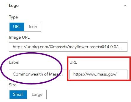
When adding a logo, add a label (or tooltip) and a URL to your agency’s or business's landing page. In the image above, refer to the purple oval to see where to add a label, and the red rectangle for where to add the URL.
Please be aware that adding a label to the logo does not apply alternative text to the logo—this serves as a tooltip. Because logos do not require alternative text, this error can be ignored during the accessibility audit process.
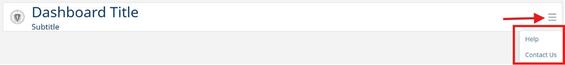
An example header with a title, subtitle, and overflow menu with two windows—Help and Contact Us (refer to red rectangle above). Access the overflow menu using the hamburger icon (refer to red arrow above).
Element Headings
Each element added to your Dashboard should receive a title. This can be configured for each element using the “General” settings. Place a short, descriptive title within the “Title” text box at the top of the Header section. This will automatically be configured as a H2 heading, ensuring screen reader users can navigate the Dashboard using the heading structure.
When adding an element to a Dashboard, configure the “Title” (refer to purple oval above) under the element’s General settings (refer to red rectangle above). This will appear at the top of the element and is configured as an H2 heading.
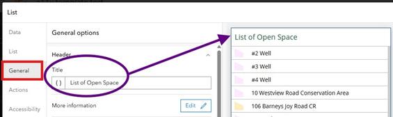
If elements are grouped within a section, the “parent” element should receive an H2 heading and any nested (“child”) elements should receive an H3 heading. Here is an example of how this has been implemented for a List element:
- The List element receives the title “Open Space in Worcester, MA”—this is a H2 heading.
- When configuring the list contents, the {field/SITE_NAME} attribute is highlighted and changed from “Paragraph” to “Heading 3”. The styling tools are then used to reduce the font size and make it bold.
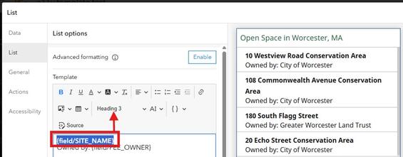
This screenshot shows how to add H3 headings to nested elements with a list by selecting the appropriate text and changing the heading style from “Paragraph” to “Heading 3” (refer to the red rectangle and arrow above). The H3 heading style has also been altered to reduce the font size and make it appear as bold.
Design Considerations
This section reviews design considerations for each element type that can be added to a Dashboard. Please review these best practices before getting started.
It is best to keep all Dashboard elements on one page without stacking elements or using collapsible sidebars. This helps support users with cognitive impairments and provides a better experience and understanding for everyone. Additionally, keep in mind that a majority of people view websites on mobile devices. For example, over 70% of constituents access Mass.gov using a mobile device. It is important to determine elements required for public Dashboards to ensure that they all fit on one page.
Mobile Layout
Always build a mobile layout for your Dashboard. This is especially important for public-facing Dashboards, since a majority of people visit websites on mobile devices. When designing a mobile layout:
- Include the same Dashboard header as used in the desktop design.
- Copy over elements from the desktop layout to speed up configuration.
- Only include key Dashboard elements.
- Follow all element best practices as outlined below.
Important! Please remember that ArcGIS Dashboards currently does not support reflow or responsive design.
The following series of images gives examples of what a Dashboard looks like at different screen resolutions, and is intended to serve as a demonstration of the limitations of reflow and responsive design in Dashboards as of December 2025.
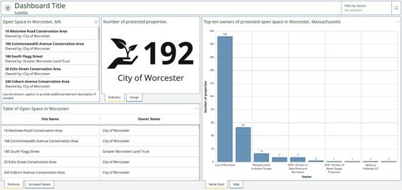
Dashboard view 1 of 4. This dashboard is designed and viewed on a large, external monitor. All elements are visible and usable.
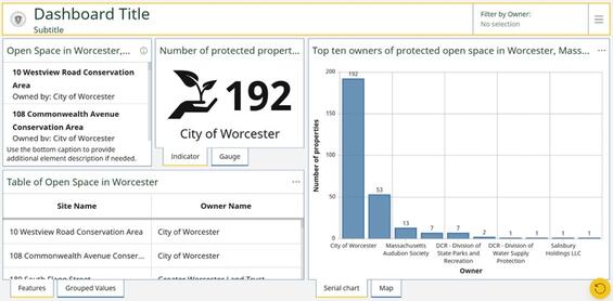
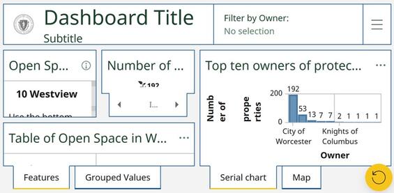
Dashboard view 2 of 4. The same Dashboard viewed on a small laptop monitor. The elements are smaller and harder to get information from, particularly the list on the top left and bar chart on the right.
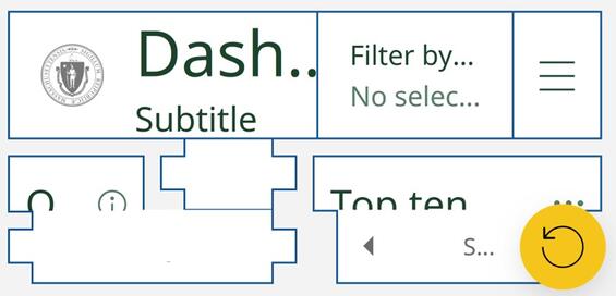
Dashboard view 3 of 4. The Dashboard is viewed on the same small laptop monitor, but now with browser zoom increased to 200%. All elements are hard to navigate and interpret and do not provide useful information, making this unusable. For reference, 200% browser zoom corresponds with the “Tablet” layout in Experience Builder.
Dashboard view 4 of 4. The browser zoom has now been increased to 400% on a small laptop monitor. All elements are now hard to see and do not provide useful information to the user get information from, making it fully unusable. 400% browser zoom corresponds with the “Mobile” layout in Experience Builder. Even though Dashboards do have a “Mobile” layout, that layout is never shown on a desktop computer.
Selectors (Filters)
Selectors, also known as filters, allow users to interact with the elements of a Dashboard. When adding selectors, ensure they are all available in the same location (e.g. the header or the sidebar).
Selectors should:
- Have a short, descriptive title that clearly demonstrates the purpose.
- Include choices written in plain language that are easy to understand.
- Have the “None option” enabled, set to “No selection” as the default selection.
- Have the “Show search” option enabled when more than five options are available.
- Have the “Show reset” option enabled.
- Optionally use an icon, as long as it has a clear connection to the purpose of the filter.
When adding Selectors, keep the following considerations in mind:
- Limit the number of Selectors in the Header to four or less in desktop view. This ensures that the Dashboard title and Selectors can all fit comfortably.
- When more than four Selectors are required, add them to the sidebar. Please refer to the Sidebar section (below) for more specific guidance on adding an accessible sidebar to your Dashboard.
Important! Selectors do not support an accessible name. Ensure that the filter name and display text are clear and concise to convey the purpose of the selector to a user.
Sidebar
A sidebar is a great option for adding selectors to your Dashboard. When a Dashboard must contain more than four selectors, add them to the sidebar for the best layout. To ensure accessibility of your sidebar, do not enable the “collapsible” feature; instead leave the sidebar so that it is always visible. This helps support users with cognitive disabilities and provides a better experience and understanding for all users.
Sidebars should:
- Have a short, descriptive title that clearly demonstrates the purpose.
- Have an accessible name added.
- Meet all contrast requirements.
- Have any text added (e.g. top or bottom caption) meet text sizing requirements.
Maps
Any map(s) included within the Dashboard should follow the GIS guidance for web maps.
Follow these recommendations when adding a map:
- Under Settings, enable Search, Legend, Initial view and bookmarks, and Zoom in/out.
- Under General, provide a title.
- When using Map actions, please follow Esri’s guidance for map actions in public Dashboards.
- Add an accessible name to communicate what the map is and its purpose in a succinct way.
Charts (serial and pie)
Dashboards allow you to select from and add two types of chart elements—serial chart (bar or line) or pie chart. Do not add your chart too early! Ensure you have set your Dashboard’s theme before adding either type of chart element. This will ensure that the default color suggestions provided within the element have a high enough contrast while also complementing the theme.
Charts are a great way to reinforce trends or understanding of the data being displayed; however, it is important to keep the following in mind to create a chart that is both accessible and useable.
- Increase the default text size:
- Under the “Chart” tab, set the font to 12px (minimum)—this controls values shown on each axis.
- Under “Category axis” and “Value axis” tabs, set the font to 14px (minimum)—this controls the X and Y axis title size.
- Use labels:
- Ensure X and Y axis labels are visible.
- Adjust axis label placement so all series are labeled and so that labels do not conflict (e.g. overlap). This is most important for the “Category axis”. There are four placement options you can select from to ensure labels fit properly.
- When coded values are displayed (for the “Category axis”), override the display label to ensure the chart is labeled in plain, easy to understand, language.
- Avoid relying on color only to communicate information. This is especially important when displaying the series by category.
- Enable series labels.
- Use a visible legend in concert with series labels to provide multiple ways to interpret the information shown on the chart.
- Limit use of many colors within charts—this can be overwhelming or introduce confusion.
- Make sure selected colors are colorblind-friendly. Consider using the ArcGIS Developers site to develop a custom, colorblind-friendly palette.
- Select colors that complement the Dashboard’s theme.
- Avoid colors with bright or conflicting hues.
- Have a short, descriptive title that clearly demonstrates the purpose.
- Add an accessible name.
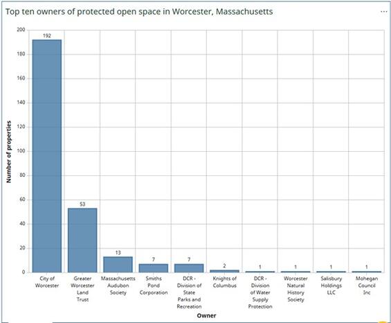
This sample bar chart is an example of accessible design. This chart has been configured with informative axis titles. Category axis labels are placed to prevent overlap and series labels are enabled (the number shown above each bar) to better communicate information to the user.
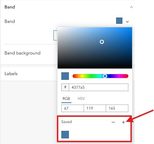
Save custom theme colors used in various Dashboard elements so you can easily use them elsewhere in the Dashboard, creating continuity across Dashboard elements.
Indicators
With proper configuration, Indicators are a great way to provide quick statistics to users.
Indicators should:
- Never use just a number alone.
- Have a short, descriptive title that clearly demonstrates the purpose.
- Use “Bottom caption” if additional text is needed. Keep this text short, descriptive, and to the point so that it remains readable and is not cluttered.
- Have complimenting icons, if included.
- All icons are automatically marked as decorative.
- Icons are optional.
- Have all colors meeting minimum contrast ratio requirements if using Advanced Formatting to change the Indicator text color. Use theme colors if possible.
- Add an accessible name.
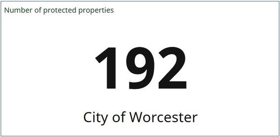
This Indicator shows how to use a title, value, and bottom text to create a concise, clean, informative, and accessible Indicator within a Dashboard. This configuration ensures that the Indicator’s title shows up as a header to aid screen reader and other assistive technology users with quick navigation of the Dashboard. The title serves as the H2 heading.
Gauge
A Gauge is a great way to visually showcase progress towards a goal. For example, you can use a Gauge to show how many culverts have been inspected, or to show how many Indicators went into a vulnerability score.
Warning! During screen reader testing using both JAWS and NVDA, it was discovered that Gauges are not read out correctly. Users are unable to get a full understanding of the information available in the visualization. We recommend using an Indicator instead of a Gauge until this enhancement is implemented. If a Gauge is necessary, be sure that the title and bottom text is descriptive enough to clearly convey the meaning of each number value.
Use the following guidelines to ensure that your Gauge is as accessible as possible:
- Have a short, descriptive title that clearly demonstrates the purpose.
- If additional text is required, use the “Bottom caption”. Keep text short, descriptive, and to the point, yet informative enough to clearly convey the values presented in the Gauge element. This will help ensure the Gauge does not become overly cluttered and remains readable, as well as understandable to screen reader users.
- Ensure text color meets minimum contrast requirements.
- Ensure the band color meets minimum contrast requirements and works with the selected theme. Selected band color(s) should pass all Colorblindly filters.
- Value configurations:
- If data is best displayed as a percentage, toggle that option on. If data is best displayed as a value, ensure decimal settings are configured.
- When appropriate, add a value prefix or suffix. Be aware that this can make the Gauge cluttered and hard to read. This should only be used when necessary.
- Add an accessible name.
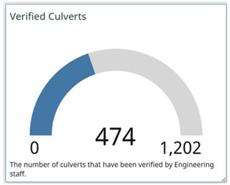
This example of a gauge displaying raw value. During testing, some screen readers added additional audio to what is displayed in the gauge, causing confusion in users.
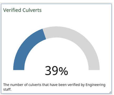
This example of a gauge displays percentage complete. Whichever display configuration is chosen, make sure the bottom text explains what the gauge is being used to display.
List
Use the List element to present consistent and ordered information to your Dashboard. A List is a great way to initiate an action with the Dashboard—for example, if a user selects an item from the list, the map can zoom to that feature.
Use the following guidelines to ensure that your List is accessible to all:
- Configure proper element heading structure by:
- Adding a short, descriptive title to clearly demonstrate the purpose.
- Configure the List so each item has a H3 title. This will aid with List navigation for screen reader users.
- Ensure text follows all text guidelines. Ensure all text meets minimum contrast requirements for the selected text size.
- Ensure any non-decorative images include alternative text.
- Add an accessible name.
- If using Advanced Formatting:
- Ensure that all custom colors meet minimum contrast ratio requirements. Use theme colors if possible.
- If building a custom HTML layout, ensure that HTML best practices for accessibility are followed. The Commonwealth Accessibility Office also has HTML training resources available!
Table
The Table widget is a great way to easily provide the data included within your Dashboard in an alternative format. When configuring your table, it is best to keep things simple. If you use advanced formatting for values, proceed with caution.
The following guidelines can help in developing an accessible table:
- Have a short, descriptive title that clearly demonstrates the purpose.
- When displaying grouped values, enable “Summary” row for clarity. Also, provide “Summary” row label that describes the summarized value.
- Under “Table” settings, set the size to “Large”.
- Ensure the header is visible.
- Provide each column heading with a clear, human-readable label.
- Avoid the use of jargon and acronyms.
- Use proper case and spacing (e.g. remove underscores from between words).
- When configuring “Values”:
- Avoid center-alignment of values.
- Limit the use of bold text decoration for values.
- If using Advanced Formatting, do not rely only on visual elements to communicate data (e.g. varying rows by color).
- Under “General”, provide the table with a title.
- Add an accessible name.
Details
The Details element is tied directly to the selected data source’s pop-up configuration. If the data source refers to a layer within a web map, the pop-up settings will be inherited from the web map. If the data source is referencing the hosted feature layer directly, the pop-up settings will be inherited from the default pop-up configuration.
Make sure all pop-up best practices outlined in GIS accessibility guidance for web maps are followed, that a short, descriptive title is present, and an accessible name has been added.
Tip! Use the “Render only when filtered” option to ensure that details are only visible with a relevant selection.
Rich Text
This section covers general text requirements and best practices. Review specific element sections in this document for more-pointed text requirements. Visit the Commonwealth's Digital Accessibility Fundamentals page on Content and Typography for general text size and style information.
- A sans serif font is used when selecting your font of choice in the theme builder.
- The color contrast ratio between text and background color should be at least 4:5:1, except when large-scale text (at least 18 pt regular or 14 pt bold) is in use, then the color contrast ratio can be 3:1.
- Always underline links and have the link text in a color different from the surrounding text.
- Use bold text sparingly to call out important facts, figures, or statistics.
- Limit the use of italics for emphasis.
- Do not use all capitalized letters.
- Using all capitals can make text difficult to read for people who are neurodivergent (e.g. dyslexia).
- Using all capitals removes the variation in letter shape and size and can make it more difficult to distinguish between letters.
- All capitalization also gives a sense of "yelling".
- Keep blocks of text to a few sentences each to convey information.
- Use natural language, as if you were talking to your audience. This naturally creates sentences that are neither too long-winded, nor too short and choppy.
- Use lists whenever it makes sense. Lists allow readers to more easily skim content and can be a helpful way to organize content for screen reader users.
- Dynamic lists should always be developed using the List element.
- Be sure to always use the built-in list options (bulleted or numbered), rather than writing in numbers yourself. The built-in list options generate code that is recognized by screen readers to help relay the content.
- Unusual words: A mechanism is available for identifying specific definitions of words or phrases used in an unusual or restricted way, including idioms and jargon.
- Abbreviations:
- A mechanism for identifying the expanded form or meaning of abbreviations is available.
- Generally, abbreviations should be defined at least once, and all subsequent uses of that abbreviation is acceptable.
- Reading level:
- Reading level should be between grades 6 and 9.
- When more advanced words are necessary, define them, or provide supplemental content.
- There are a variety of tools available online to assist with determining reading level, like the Hemingway Editor.
- Pronunciation: A mechanism is available for identifying specific pronunciation of words where meaning of the words, in context, is ambiguous without knowing the pronunciation.
- Be descriptive:
- When writing headings, buttons, or links ensure they are concise and descriptive. Never use “Click here” or “Learn more”.
- Always describe what a link or button will do (e.g. “Read more about loons” or “Learn more about Dashboard Accessibility”).
- References: When including references, avoid in-text citations that use superscript numbers that correspond to the reference section. For example: “This fun fact is cool.1” Would be read out by a screen reader as “This fun fact is cool. One”. A screen reader user might be left wondering “one what?”.
- When adding images to rich text, ensure each image has alternative text. Add this by clicking the alt icon when configuring the image (refer to figure 8 for more information).
- Have a short, descriptive title that clearly demonstrates the purpose.
- Add an accessible name.
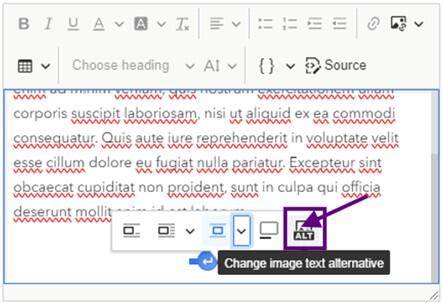
To add image alternative text within the rich text element of a Dashboard, select the image and choose the ALT icon (last option on the right) from the context menu. Refer to the purple square and arrow in the image for visual help.
Embedded Content
Generally, embedding content should be approached with caution. Embedding content introduces an added layer of complexity when testing Dashboards for accessibility. Even if the content to be embedded is accessible, that does not mean it will remain accessible once embedded within a Dashboard. Esri clearly states that they cannot guarantee accessibility of embedded content.
Where possible, we discourage using embedded content with a Dashboard. If this is a requirement, more extensive testing may be needed to ensure accessibility requirements are met. When configuring embedded content, always add an accessible name.
As an alternative to embedding content, consider adding a URL to the Dashboard header so users can access the content directly.
Messaging Users
“No Data” Message
When a Dashboard contains interactive elements that rely on a selector, it is important to add “No data” messaging to users. This will be returned if an option is chosen from a selector that has no matches in one or more Dashboard elements. It is important to configure this so that users have a better understanding of why no information is being shown.
To configure a “No data” message for an element, select the “No data” tab found under “General” in the element’s general settings. To create the “No data” message, edit the “Label” with the appropriate text. The text provided in the “Label” text box will then appear when no data is available for a selection.
Please refer to the Text section above and follow those guidelines when developing your “No Data” message.
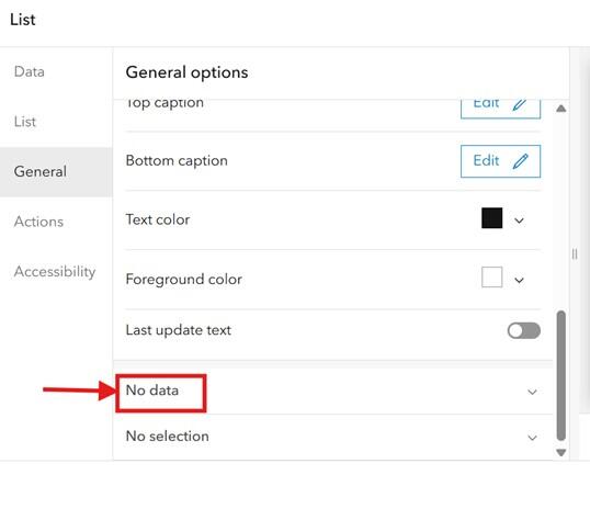
Within a list element, select "General" on the left side navigation, then select "No data". This is outlined in red and has a red arrow in the image.
“No Selection” Message
Sometimes, Dashboards are configured so that one or more elements will not contain data until a selection has been made. In this situation, it is important to add a “No selection” message to the element that explains what action a user needs to take in order to see information in the element.
To configure a “No selection” message for an element, select the “No selection” tab found under “General” in the element’s general settings. To create the “No selection” message, edit the “Label” with the appropriate text. The text provided in the “Label” text box will then appear when a selection has not been made to guide the user towards the appropriate action to view a selection.
Please refer to the Text section above and follow those guidelines when developing your “No Data” message.
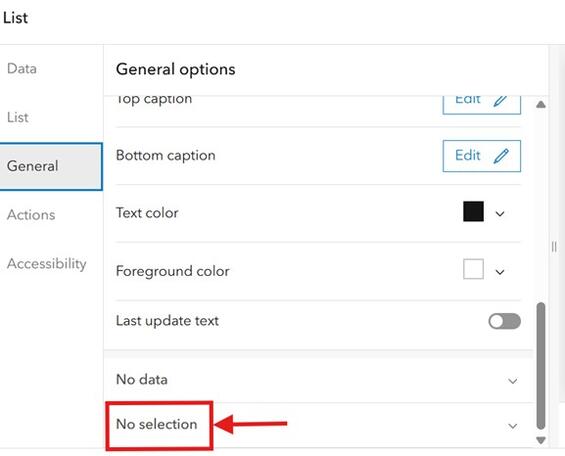
Within a list element, select "General" on the left side navigation, then select "No selection". This is outlined in red and has a red arrow in the image.
To configure a “No selection” message for a Category element, toggle on “None option” located under the “Selector” tab under general element options. Then fill out the “Label for none” text box with the appropriate text.
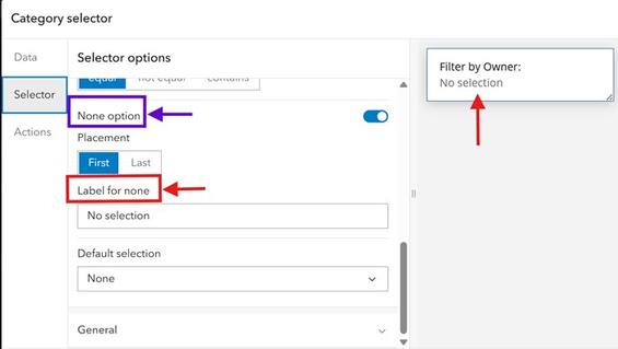
Within the Category selector, select "Selector" in the left navigation. Toggle on the "None option", which is outlined in a blue box and has a blue arrow in the image. The red rectangle highlights the label field you must fill in with an appropriate message. The “No selection” message will then appear underneath the filter category when no selection has been made, as shown in the sample on the right side of the image with the upward pointing red arrow.
Source and Summary Data Downloads
Dashboards allow “Source” and “Summarized” data downloads for elements that have been included within the Dashboard. These options can be enabled from each element’s “General” tab. Please follow the guidelines below before enabling either of these options within your Dashboard.
- For public-facing Dashboards:
- Consider enabling “Summarized data download”.
- This is a great way to provide the data in an alternative format. However, you must own the data and enable “export” on the feature layer to enable this feature.
- Be sure to configure your data’s attribute table to read in plain language, using simple titles, eliminating acronyms and abbreviations when possible.
- Do not enable “Source data download”.
- For most audiences, this would provide too much data for them to parse through and answer their questions.
- Be sure to provide appropriate contact information within the “Contact Us” window with instructions to access the data in an alternative format.
- Consider enabling “Summarized data download”.
- For internal Dashboards:
- Enable “Source data download” if needed to support internal workflows. This facilitates a user interacting with the data on their own terms.
- Enable “Summarized data download” if needed.
- For either option, be sure to configure your data’s attribute table to read in plain language, using simple titles, eliminating acronyms and abbreviations when possible.
Accessibility Features
Dashboards allow you to add an accessible name to each element within your Dashboard. This will serve as the aria-label for the element and is read out by screen readers when the element is focused. This should be added for all elements of a Dashboard.
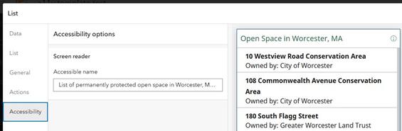
Provide an accessible name for each Dashboard element. This should be a short description specific to the data featured in the element. It should clearly describe to the user what they can expect from using the element. In this example, the accessible name for the list is, "List of permanently protected open space in Worcester, Massachusetts."
Understanding Tab Order
- Top-level navigation
- Moving between panels or visual elements.
- Navigates left to right, top to bottom.
- Second-level navigation
- Moving within a specific panel or element.
- Once a panel or element receives focus, use enter to interact with the panel or element. Then use tab, arrows, or enter to explore and interact with the data in that panel or element.
- Dashboard keyboard shortcuts:
- Tab moves focus forward between panels, elements, and interactive features such as buttons.
- Shift+Tab moves focus in the opposite direction.
- Enter activates a link or button and selects.
- Arrow keys move between data points, categories, or values within an element or selector.
Checklist
-
Open PDF file, 224.33 KB, Dashboard accessibility checklist (English, PDF 224.33 KB)