A11y Settings
New Applications
When editing a fixed layout in Experience Builder, turn on both A11Y settings in the designer before you start to configure the application. The first setting, “Auto-calculate element tab orders in fixed layouts”, will automatically reorder your widgets in the Outline panel based on a desired tab order (keyboard navigation) experience. If you do not turn on this A11Y setting, tab order follows the order widgets/elements are added, which could prove to be problematic for accessibility. The second setting “Enable accessibility settings for each widget” will allow you to provide a custom accessible label for each widget that can be read by screen readers.
- Both A11Y settings need to be turned on manually, from the lower right corner of the builder, as shown below:
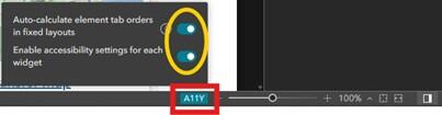
The A11Y settings are in the lower right corner of the Experience Builder designer. These must be turned on manually each time you create a new Experience. Turn it on before adding anything, including widgets, to your canvas for best results.
- Desired tab order and why it matters
- When navigating a web page or application using a keyboard or assistive technology (such as a screen reader), logical tab order is important. It ensures the user steps through the application starting with the header and then moves from left to right down the page (e.g. "reading order").
- The first A11Y setting (“Auto-calculate element tab orders in fixed layouts”) ensures logical tab order is built into Experience Builder applications. Without this enabled, the tab order might jump around the screen, depending on the order in which widgets were added into the Experience.
This screenshot demonstrates what logical tab order might look like when navigating a Dashboard. The first tab would read the header and then move logically though the rest of the Dashboard content from left to right.
- Accessible labels and why they should be added.
- Within Experience Builder, the accessible label is text that will be read out to screen reader users. Although the terms “accessible name” and “accessible label” are often used interchangeably, there are important differences to be aware of. Learn more about accessible names and labels from WebAIM.
- The A11Y setting called “Enable accessibility settings for each widget” should be used to provide an accessible name for widgets like:
- Web maps
- Embedded content (other apps, Survey123 forms)
- This A11Y setting should not be used for widgets that already have an equivalent setting that provides names to screen readers, like:
- Buttons
- Text
- Images
- Widgets within the widget controller
- Layout elements (like rows, columns, widget controllers, etc.)
- The accessible label should be limited to 125 characters or less, and should be a short, precise description of the element.
Existing Applications
Additionally, in a previously configured Experience Builder application you have the option to turn on the A11Y settings retroactively.
Auto-calculate element tab orders in fixed layouts
Important! Element order will not automatically adjust for widgets or elements included in your Experience layout. To force the widgets to reorder, you will have to click on the widget or element to select it and trigger the auto-calculation by making a change to the element, such as shifting its location slightly (e.g. by 1 px).
Even with the A11Y setting turned on you have the option to manually re-order the elements if you determine there is a more optimized tab order. You can achieve this by arranging the widgets with the “bring to front” or “send to back” setting in the outline pane.
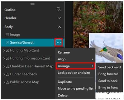
To manually reorder widgets for a more optimized tab order, click the ellipsis (…) to the right of the widget in the outline pane. Select "Arrange", and then either “bring to front” or “send to back”.
Steps to turn on A11Y and create optimal tab order:
- Open the Experience Builder application in edit mode and turn on the A11Y setting in the lower right corner. You can tell that A11Y is enabled because it will become highlighted in blue.
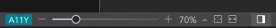
Once enabled, the A11Y setting is highlighted in blue to indicate that it is "on". Enabling this setting does not automatically make the Experience follow logical tabbed navigation.
- Select a widget or element on the page and make a minor change to trigger the auto-calculation. A simple way to do this is to move the widget.
- Select the widget, then use your left arrow key on a keyboard to move the widget 1px to the left.
- Then use your right arrow key on a keyboard to move the widget back 1px to the right.
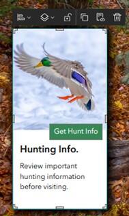
In this example, a card in the Experience has been selected. You can tell it is selected because the entire card is selected, has the toolbar above it, and you can see the "adjust" corner/edge selectors around the card.
- Make a similar minor change to all widgets/elements on the page.
- The Outline pane will be readjusted to reflect the adjusted optimal keyboard navigation order.
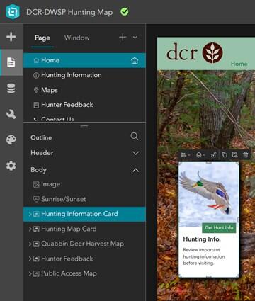
Now that the card position has been adjusted using the arrow keyboard keys, a subtle change can be seen in the outline of the application. The "Hunting Information Card" is now shown above or before the "Hunting Map Card".
- Repeat for the tablet and mobile layouts.
- Repeat for each page of your application.
- Save and publish the Experience Builder application.
Enable accessibility settings for each widget
Once “Enable accessibility settings for each widget” is enabled, you will need to manually review the Experience to add an accessible label to each element that requires one.
Steps to turn on A11Y and add accessible labels:
- Open the Experience Builder application in edit mode and turn on the “Enable accessibility settings for each widget” setting under the A11Y settings in the lower right corner.

Open the A11Y settings dialog in the lower right corner of the Experience. Toggle on the second setting "Enable accessibility settings for each widget". These must be manually enabled for each new Experience, and should be done before adding any widgets.
- Select a widget on the page and add an appropriate accessible label at the bottom of the Content pane on the right. Only add accessible labels for web maps, embedded content, and tables.
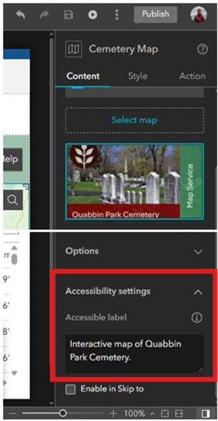
From the Contents pane, add an accessible label for the selected widget. Here, a web map is selected, and the accessible label is “Interactive map of Quabbin Park Cemetery”.
Windows (Splash Screen)
There are many Window (splash screen) options within Experience Builder. Only information for explored options will be included here. To determine if other types of Windows are accessible, rigorous testing is necessary. Windows can contain many types of elements (image(s), text, buttons, links, etc.); ensure that all elements follow best practices for that element type to create a fully accessible Window.
Important! Only Fixed mode Windows can be used as splash screens that open with a dedicated page of an Experience.
Best practices for splash screens include:
- Include a way to exit the Window via a “X” in the upper right-hand corner. This will prevent keyboard traps. A keyboard trap is when there is no way to navigate away from or exit content on a webpage (WCAG criteria 2.1.2).
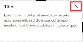
Include an “X” in the top right corner of your splash screen to ensure users can easily exit.
- Provide alternative ways for the user to close out of the splash screen if enabling the setting “Click outside to close Window”. Use the "Interaction" options in the Splash Screen configuration to add an "OK" button, or provide an "X" to close out. Keyboard traps can become problematic with the "click outside this window to close" option, pictured below.
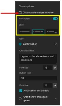
If enabling the option to allow users to click outside of the splash screen to exit, be sure to include an alternate way to exit for keyboard users, ideally with an "X" (close) button. This will ensure that your splash screen does not become a keyboard trap.
- Refrain from placing any contact information such as phone number, email, or address in the Splash Screen if users are unable to return to this window once they close it out.
- Add a button to re-open the Splash Screen. This is handy if your Splash Screen contains instructions on using the application, or other information the user might want to see again.
Add a button within your application to enable users to reopen your splash screen. This is especially important if your splash screen contains instructions a user might want to go back to. You can also set this up to ensure that your splash screen always opens on the Introductory section.
Carousel (Fixed)
Carousel splash screens, in their default configuration, are not a good choice for accessibility because there is autoplay/automated scrolling through each view included within the Window. WCAG has criteria in place which states there needs to be a control to start/stop autoplay of audio or video, which is not currently included for the Carousel-type window in Experience Builder.
Important! To make the Carousel splash screen accessible, the creator will need to disable the Autoplay feature entirely.
Using keyboard navigation, users are able use the "X" to close the Window, the navigation arrows on either side of the Window to move between views, and the bubbles along the bottom of the Window to move between views. The close function (or "X") must be added on each page of the carousel to ensure full accessibility.
Users who navigate web content using a keyboard can close the splash screen from any page and proceed through sections using either the arrow icons (< or >) located on the left and right or by using the bubbles along the bottom of the Window.
Alert (Fixed)
Alert is a simple Fixed Window splash screen that can be easily navigated using keyboard navigation. Out of the box, this splash screen is configured to contain an image, title, text description, two buttons "OK" and "Cancel", and an "X" (in the upper right corner) to close the Window. These elements can be customized or removed to create an accessible Window.
If image(s), link(s), or other elements are included within this Window, ensure that best practices for that element type are followed to ensure that the Window is fully accessible.
In this example, the Alert Window has been altered to remove any button-based interaction. Instead, users can exit by clicking the "X" in the upper right corner.
Pages
There are three types of page options available within Experience Builder—full-screen, scrolling, and grid. Esri recommends using full-screen and scrolling pages to build accessible apps and refraining from using grid pages, as these are not accessible.
Full-screen
These types of pages use a fixed layout where the contents of the page (widgets and other elements) exist at absolute positions. When a full screen page is navigated using a keyboard, or when it is read by a screen reader, the tab order follows the order in which elements were added to the canvas. When first starting out in a new Experience, enable the A11Y option (lower right corner of the builder) to automatically enable a logical tab order for all widgets on the page. Turning on the A11Y toggle is the first step in creating a new accessible Experience.
Important! When creating a full screen page, enable the A11Y option before you add any widgets or elements to the screen.
When designing full-screen Experiences, try to avoid using absolute sizing (pixels/px) when sizing any elements within your Experience. This will prohibit elements from "reflowing" as users apply zoom to a screen and may cause accessibility issues, like truncated or partially obscured text.
Using the percentage (%), auto, or stretch options will allow elements to flexibly resize and ensure all content can be seen, even at 400% screen zoom.
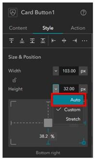
When styling elements on Full-screen pages, avoid using absolute sizing (pixels/px) when sizing any elements within your Experience. The use of pixels prohibits elements from "reflowing" as users apply zoom to a screen and may cause accessibility issues.
Scrolling
These types of pages are arranged into a series of content blocks and screen groups. Here, keyboard and screen reader navigation will follow a logical reding order by default without the requirement of enabling the A11Y setting. There are several pre-configured scrolling page options available; however, you can also start from a blank scrolling template and build it manually. Beware—this could lead to unforeseen accessibility issues!
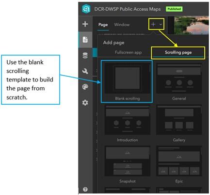
There are pre-configured scrolling page templates to choose from; however, you can also opt to build a scrolling page from scratch using the "Blank scrolling" option, which is indicated with a blue outline. Beware when selecting this option, as there will be many accessibility considerations to keep in mind as you design.
Grid
These types of pages allow for the flexible layout of content on a page. Esri does not recommend this page type for the creation of accessible applications. Use with caution and perform testing early and often if leveraging this page type.
Widgets
Within Experience Builder, all elements that can be added into an Experience are called "widgets". This does not necessarily refer only to the tools that a user can interact with in a map (like the Filter or Map Layers widgets). The term also refers to any other element in the Experience. Under the Insert Widget menu, widgets are broken out into the following categories:
- Map centric
- Data centric
- Page elements
- Menu and toolbars
- Layout
- Section
When configuring widgets, be sure to include an accessible label for widgets like maps, tables, or embedded content. Do not add an accessible label to any other element.
To learn more about which Experience Builder widgets support accessibility, and any limitations of that support, review Esri's Experience Builder documentation. Presumably, this page will be updated as new releases of Experience Builder make their way into ArcGIS Online. An additional Esri Community post from June 2023 details some Experience Builder accessibility best practices.
Map Centric Widgets
Map
Accessibility starts at the bottom—with layers, pop-ups, and the overall design of the web map. It is critical to design an accessible application from the bottom up, which means by first creating an accessible map. Do use accessible labels with maps.
The map widget allows the user to enable a selection of map tools (e.g., zoom, home, current location, legend). The ‘in-map’ tools are not configurable by the app designer, so there are limited options to optimize their accessibility. One important accessibility guideline to keep in mind that can be applied here is the notion of predictability. To ensure that all maps are predictable and experienced by users in the same way, we strongly recommend placing your map tools in the top left corner of the map.
Select the first tool layout option when adding a map to your Experience. This will place map tools in the top left corner of your map, providing predictability to users and allowing them to anticipate where these tools will be located.
Coordinates
The coordinates widget is listed as accessible by the Experience Builder team; however, once the widget is accessed via keyboard navigation, there is no way to interact with the map to select a location to get coordinates for using keyboard controls. Only mouse-over movements can provide updated coordinates to the user. In addition, the "Copy" option is not selectable by keyboard navigation until a selection is made. Considering both factors together, it appears that the Coordinates widget is not truly accessible. This appears to be true in both Classic and Modern style options for this widget.
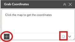
The "click to get coordinates" option, which is circled in red in the image, and the "copy coordinates" option, which is outlined in a red square in the image, are not accessible to users who depend on keyboard navigation.
Bookmark
The bookmark widget is accessible by keyboard shortcuts when configured using the "Card style". No other styles were tested. This can provide additional accessibility for users who rely on keyboard navigation to access information within the web map. Keyboard navigation of a web map is only possible when the web map is focused. Then, keyboard users can zoom in and out using the + or – keys and pan the map using arrow keys.
Depending on the map and data being displayed, bookmarks may help users derive meaningful information from the map and can make widgets, such as Print, more accessible to all users. This is especially true on mobile devices, where panning is not possible without the use of dragging movements on-screen, which may be difficult or impossible for some users. The successful use of bookmarks to increase accessibility to meaningful information through something like the Print widget is highly dependent on details such as map scale and layer visibility ranges.
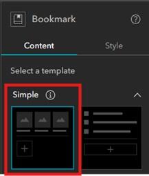
The card style bookmark template, shown in the red rectangle, is an accessible bookmark widget layout. This was the only style tested. Further testing may reveal other styles are also accessible; however, testing is necessary.
The print widget is accessible by keyboard shortcuts when configured using "Classic Mode"; however, it is unclear what level of meaningful information a user without the ability to interact with the map could get from it. Interaction with the map is possible using keyboard navigation when the web map is focused. Then, keyboard users can zoom in and out using the + (plus) or – (minus) keys and pan the map using arrow keys. Alternatively, users can interact with the map via Bookmarks and the Search widgets. Using some combination of these strategies could make the Print widget accessible and provide meaningful information.
Important! An enhancement request has been submitted to Esri and logged under ENH-000127279: Accessibility Features in ArcGIS Online Map Viewer: Identify Features using the Keyboard. Status is "Will not be addressed" as of September 8, 2025.
Map Layers
There are a handful of settings that will enable the best user experience with the Map Layers widget.
- Turn on tick boxes to control layer visibility (as opposed to the "eye" icon).
- Enable layer search.
Other settings can be enabled as needed, however they do not have a direct impact on improving accessibility. Ensure all layers in the map are named with detail and accuracy. Leverage group layers to group layers logically.
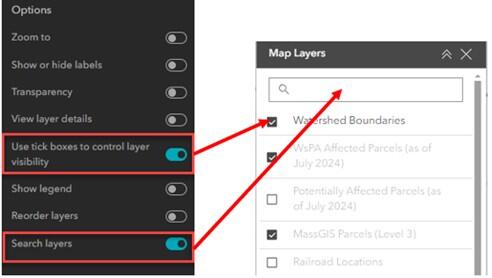
When configuring the Map Layers widget, enable the options to use tick boxes to control layer visibility and the option to search layers. Both settings improve accessibility of this widget. Other options do not directly impact accessibility.
Data Centric Widgets
Filter
The Filter widget is listed as accessible by the Experience Builder team. Please review the considerations below which you should keep in mind when working with the Filter widget. Determining which of the two Activation Styles you will select for use within your Experience is important, as this selection may greatly impact accessibility of the filter widget. The two available options are:
- Toggle switch: if using the Toggle switch, consider adapting your Experience's style settings so that when the toggle is in the ON position, a visual cue is provided to the user to indicate the filter is enabled.
- Button: if using the Button option, consider how this affects the overall design of your filter widget. If you have several filters included, this may require a user to scroll through filter options, which might not be an ideal user experience.
In addition, consider enabling the option to "exclude activation styles for single clause". This will simplify the number of interactions required by a user to enable a filter. Refer to the two figures below for an example of how this looks when the option is disabled vs. enabled.
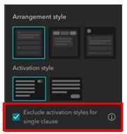
This screen capture demonstrates how to enable the setting to exclude activation for single statement filters. This reduces the number of interactions required of users.
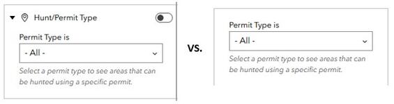
The image on the left demonstrates the two required user interactions to enable a filter when "Exclude activation styles for single clause" is disabled. First, the user would need to select the appropriate Permit Type from the drop down, and then toggle the Filter to "On". The image on the right demonstrates what this same filter looks like when "Exclude activation styles for single clause" is enabled. Now, a user is only required to select the appropriate Permit Type to see corresponding features in the map.
List
The list widget is a way to provide an ordered and interactive list of features within a data layer. There are some important considerations to be aware of when configuring a list widget, especially if using images within the list:
- Alternative text should be set so that it is connected to dynamic attribute information.
- No tooltip is present.
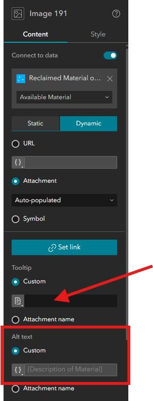
When configuring settings for an image included in a list, ensure that the tooltip is left blank (refer to red arrow above). Ensure the alternative text is configured to connect to an attribute field (refer to red rectangle). This will ensure that unique alternative text is present for each image in the list. If the alternative text should be composed of multiple attribute fields, use an Arcade expression to build your alternative text.
Important! An enhancement request has been submitted to Esri and logged as ENH-000178337: In ArcGIS Experience Builder, ensure that only actionable list elements (e.g., links or elements that perform an action) receive focus. Status is "In Review" as of July 30, 2025. Please be aware that until this is addressed, axe DevTools will flag this as an issue during accessibility audits.
Page Elements
Text
This section covers general text requirements and best practices. Review specific element sections in this document for more-pointed text requirements. Visit the Commonwealth's Digital Accessibility Fundamentals page on Content and Typography for general text size and style information.
- There is no minimum text size requirement per WCAG guidelines. We generally recommend using at least 12 pt (16 px) and larger.
- Use the same font throughout the entire application.
- A sans serif font is used.
- Apply the same font size and weight to headers and sub headers throughout the application. The text widget supports basic HTML markup (e.g. H1, H2, etc.). Use proper heading structure when implementing in your application.
- Page headings are provided in sentence case (e.g. "General information" rather than "General Information").
- The color contrast ratio between text and background color should be at least 4:5:1.
- Incidental text has no contrast requirements. The following types of text fall into this category:
- Text that is part of a logo or brand name.
- Text that is part of interactive user interface component.
- Text that are pure decoration.
- Text that are not visible to anyone.
- Text that are part of a picture that contains significant other visual content.
- Text supports reflow (zoom in the browser) up to 400%, is supported without loss of content or functionality.
- All text blocks are configured to use relative sizing (found under Style > Size).
- Images of text are only used for pure decoration or where a particular presentation of text is essential to the information being conveyed.
- Unusual words: A mechanism is available for identifying specific definitions of words or phrases used in an unusual or restricted way, including idioms and jargon.
- Abbreviations: A mechanism for identifying the expanded form or meaning of abbreviations is available.
- Reading Level: Aim for a grade 9 as best you can
- Pronunciation: A mechanism is available for identifying specific pronunciation of words where the meaning of the words, in context, is ambiguous without knowing the pronunciation.
- Text over images: If text will be placed on top of an image, ensure that minimum contrast ratios are always met by giving the text a semi-transparent background fill to the text block, as demonstrated below.
Apply a semi-transparent background fill to any text which is on top of images. Adjust the level of transparency as needed to ensure that when a user zooms in on the page, contrast requirements are met between the text and background.
Text Hyperlinks
When creating links in text or within narrative, keep the following in mind:
- Do not use "click here" or "here" as the hyperlinked text. Using this text as a link can raise questions for users of assistive technology such as:
- Where is here?
- What does this link do; where does it go?
- How does this relate to the text before or after it?
- What is its context?
- Links should be underlined. While not required by WCAG, it is best practice to underline links. WCAG does require that links have a visual indication besides color, which is typically done so with underlining the word or phrase to be linked.
- Do not underline text that is not a link.
- If text is important, but not a link, use bolded text instead. Though as a rule of thumb, keep bold text limited.
- Links should be configured to open in the current app window. Exception: if a link navigates a user to a non-secure URL (e.g. http), then you can open it in a new window.
- Phone numbers, email addresses, and place addresses should receive a link. While this is not required by WCAG, it provides a better user experience for all.
Links should be underlined and configured to open in the app window. Both of these settings can make links more accessible and more obvious on the page.
Buttons
The Buttons widget allows you to create buttons which open pages, windows, section views, scroll to a particular block on a page, or go to an external link. Buttons can also be dynamic by using the "Connect to data" option. Since buttons currently do not present themselves as links to assistive technology, using buttons as links should be avoided entirely. It’s recommended to use text hyperlinks instead. Do not use accessible labels with buttons.
Important! When possible, avoid using buttons as links entirely. Instead, create text hyperlinks. Buttons are acceptable to use when opening and closing a splash screen, or something similar. Currently, buttons used as links (to link to app pages or external content) in Experience Builder do not present themselves as a list of links to assistive technology. This makes it difficult for users of assistive technology to easily navigate apps which have been configured to include these types of buttons. An enhancement request has been submitted to Esri to request that the development team updates how buttons are coded behind the scenes to resolve this issue.
When using buttons remember the following guidelines.
- Set a tooltip. This serves as an aria-label and can be read by screen readers.
- Tooltip text should match the visible text on the button or start with the same word(s) as the visible text.
- Help buttons do not require a tooltip, as this would be duplicative with visible text.
- If there is no tooltip added, the "Text" setting will be used by assistive technology.
- If there is no tooltip and the "Text" setting is blank, the Icon filename will be used by assistive technology.
- Button text should be descriptive and unique. This is especially important if there are multiple buttons on a page. Think about the following questions when designing button text:
- Where does the button go?
- What information can you get by clicking the button?
- Enable Advanced button settings to provide sighted users with different "Default" and "Hover" reactions.
- Do not use a text decoration of underline on buttons—underlining is reserved for text links.
- This can provide additional context that the button "does" something when you click it.
- Buttons should have consistent branding and hover settings throughout the entire application.
- Ensure minimum contrast ratios between button and text and/or icon color are met in both "Default" and "Hover" states.
- Button actions to open other widgets (i.e. open sidebar) are accessible.
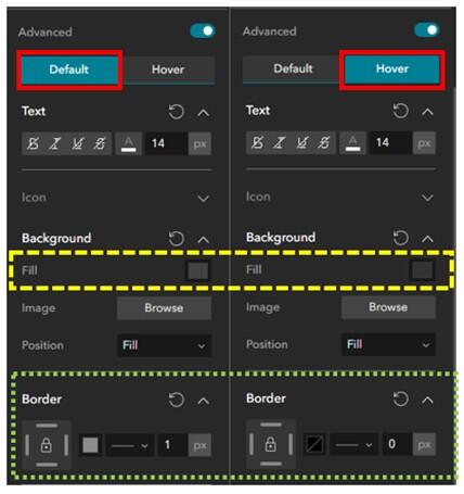
Advanced settings can be enabled and used to vary a button's default appearance from its hover appearance. These differences can be pronounced, or subtle. The solid red rectangles indicate which state is being displayed, while the dashed yellow rectangle shows a subtle variation in fill color (where the hover state's fill color is slightly darker), and the dotted green rectangle shows variations to the button border.
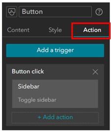
Button actions, set under the Actions configuration, are supported for accessibility. This example shows the configuration for a button action that opens the Sidebar widget.
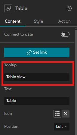
A screenshot demonstrating how you can set a tooltip for a button within Experience Builder. Ensure that the tooltip provides a helpful description of what the button does, and that it matches the visible text, or starts with the same word(s) as the visible text (which in this case is "Table").
Images
Images in Experience Builder support three different workflows:
- Decorative Images
- Non-decorative Images
- Image Hyperlinks
Depending on the type of image in your page, the alternative text, tooltip, and function of the image can impact how an assistive technology, such as a screen reader, will interpret the image within the Experience. Do not use accessible labels with images.
Image Type 1: Decorative Image
If the image is purely decorative or aesthetic, alternate text should be omitted, as this creates audible clutter for a screen reader and user to navigate. To be considered decorative, the image should meet the following criteria as defined by WCAG:
- Serves only an aesthetic purpose to provide visual enhancements, decorations, or embellishments.
- Provides no information.
- Has no functionality beyond aesthetics.
Image Type 2: Non-decorative Images
If the image or graphic is critical to supporting the narrative of your Experience, alternative text must be provided. This group of images can be broken up into further categories:
- Informative Images—These types of images convey a simple concept or information that can be conveyed to a user in a short phrase or sentence. This phrase or sentence should convey the meaning or content of what is being displayed, without being a literal description of the image. In some cases, a literal description is required, however this is only when the image is all, or a large part of the information being conveyed.
- Images of Text—These types of images are strongly discouraged. Generally, images of text are intended to be read. But because assistive technology cannot read text contained in an image, it is best to avoid this whenever possible. If an image must contain text, then the alt text must contain the same text as shown in the image.
- Complex Images—These image types contain substantial information that can't be conveyed in a short phrase or sentence. Complex images are generally: graphs, charts, diagrams, illustrations (where surrounding text relies on user understanding of presented image), and maps. For complex images, the alt text must provide two parts:
- A short description to identify the image and (if needed) where the long description can be located.
- A long description which provides the essential information conveyed by the image.
- Groups of Images—If a group of images is used to convey one piece of information, only one of the images requires alt text to describe the entire collection, while the other images have a null alt text attribute.
- Image Maps—This special type of image allows a user to make a selection within a defined area(s) of an image. In this situation, both the entire image map requires alt text to describe the entire image, and each clickable/selectable element needs alt text to describe the action that will be initiated by clicking.
Image Type 3: Image Hyperlink
Also referred to as Functional Images, these types of images are used to initiate actions rather than convey information. They can be used in places like buttons and other interactive elements. In this situation, alt text should convey the action that will be initiated, rather than a description of the image.
These types of images should have both the tooltip and alt text filled out. In this situation, the tooltip should provide the user with a description of where the link goes to help a user determine if they want to click the link. The alt text description should be concise but provide enough information to help someone determine where the link will take them. When possible, ensure that the link opens in the app window rather than a new window; please refer to guidance from the Links section for more details.
Writing Alt Text
To determine if alt text is required for an image included within your Experience, please refer to the above guidance on image types. Once the category of alt text necessary for your image type is established, please review these guidelines from Perkins on how to write alt text. In addition, please keep in mind that you should not duplicate captions that are already present when writing alternate text.
Tooltip
Screen readers cannot always read image tooltips; these are primarily for sighted readers and will "appear" as you hover over the image. Tooltips should be short, concise and always match the visible text (when applicable). For example, in the EEA accessible templates, the map contains a button to open the attribute table with visible text "Table". The tooltip should be "Table View" rather than "View Data Table" as the latter option does not match the visible text.
Embedded Content
It is possible to embed many types of content within Experience Builder. This allows you to integrate many different apps, tools, maps, etc., in one location. However, it also makes accessibility more difficult because you are layering technologies together. Do use accessible labels with embedded content.
Important! It is important to assess the accessibility of each item from the bottom up to ensure that your Experience (and everything in it) is fully accessible.
Examples:
- If you are embedding a web map into your Experience, make sure the map layers have accessible symbology (e.g., color, labels), pop-ups, legend, data (e.g., offer tabular and accessible format data download).
- If you are embedding a Dashboard that contains a web map into your Experience, first ensure the web map is accessible, then ensure the Dashboard is accessible.
- If you are embedding a StoryMap within your Experience, first ensure that any web map(s) within your Story are accessible, and the StoryMap is accessible.
Header
Experience Builder allows you to add a Header into your app which can then easily be applied to all pages of the Experience, providing users with a consistent layout design and navigation experience. A header can contain many different types of content—some examples include images, text, and a menu.
Menu and Toolbars
Menu
A menu is a great way to provide users with an easy, intuitive, and familiar way to navigate through an Experience. Menus provide an easy way to jump from page to page, or to other external resources. Menus can be designed using three different styles within Experience Builder:
- Horizontal
- Vertical
- Icon
Each of these options offers its own benefits, and some options may or may not be appropriate depending on the device size you are developing for. For example, a horizontal or vertical menu might be too large to fit comfortably on tablet and mobile device sizes. The "move to pending list" option is a great way to use different menu styles on different device sizes.
Some things to keep in mind:
- The header will always be read first by assistive technology.
- The header will always be where tabbed navigation in an Experience begins.
- Menu type may impact accessibility, especially with regards to assistive technology and tabbed navigation.
- Each menu option should behave the same way (e.g. selecting an option navigates to a new page). Predictability is important to accessible design.
- Menu content types:
- Pages are accessible to keyboard navigation and assistive technology:
- Page names are "internal" links that will show up in the menu.
- You can choose which pages to display in your menu from the left pane in the designer.
- Not accessible to keyboard navigation and assistive technology:
- Folders: Facilitate sub-menu options and can contain pages or links.
- Links: Enable connections to external websites.
- Pages are accessible to keyboard navigation and assistive technology:
- Enable Advanced menu settings to provide sighted users with different "Default", "Selected", and "Hover" reactions.
- This can provide additional context that the menu option "does" something when selected and easily communicates to the user what page of the Experience they are on.
- Ensure minimum contrast ratios are met!
- Have a “Contact Us” button in a consistent location so users are familiar with how to get help.
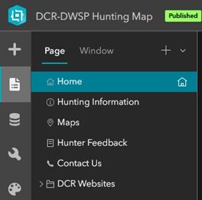
This example demonstrations what an icon-type menu may look like when used on tablet or mobile layouts. Here, the app author has opted to show selected page icons in addition to the page title (this is an optional setting).
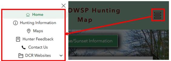
This example demonstrates an icon-type menu from a tablet or mobile layout design. Once the user opens the menu by clicking the menu icon located within the red rectangle, a list of page links will appear and allow the user to select a link to navigate to that page. In this example, the app author has also opted to show page icons.
Important! Header menus can be styled differently. There are three menu type options to select from:
- A horizontal-type menu
- A vertical-type menu
- An Icon-type menu
Menu type selections can be heavily dependent on the screen size you are designing for. For example, you may be more likely to select an Icon-type menu on a tablet or mobile screen design to save space within your header. To best facilitate focus states in tabbed navigation and assistive technology, it is important to configure the "Focus indicator" color of your Experience. This is accessed under Theme > Customize. This will ensure the focus indicator is easy to identify. This new setting, added in February 2025, enables keyboard navigation users to easily see what is focused within the header menu, regardless of which of the three styles is selected.
Wayfinding
Design decisions that help users navigate a website to find information and accomplish tasks is referred to as Wayfinding. A well-designed menu is one key method for providing users with a good wayfinding experience. If a user can't navigate your Experience Builder application, they might give up and leave before accomplishing whatever task they had initially set out to complete.
When thinking about how to create a good wayfinding experience, consider the following:
- The application title should provide a clear understanding of what the Experience is for.
- Menu titles should be short and concise, while accurately describing what a user will get or can do if they navigate to that menu option. Menu titles correspond to page names assigned in the designer.
- Menu items should behave in the same way—predictability helps ensure site navigation is easy to understand. For example, when you select a menu item, it always brings you to a new page. Using the "folder" option in your menu does not support this.
- Menu options should bring you to a page that has a heading (styles to H1) to match the menu link. It can be disorienting for a user if a menu title is different than the title of the page the menu item goes to. For example: when a menu option of "General information" is selected, the user is brough to a page with a heading of "Rules and Regulations".
- Page title, navigation menu, and headings all work together to provide a user with a good (or bad) wayfinding experience.
- Provide a Home button on every page to bring the user back to the start.
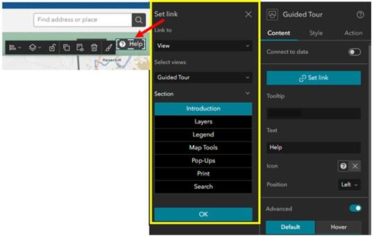
- Provide a Help button in a consistent location on every page to provide instructions for the user at any time. This is most important on "map" page(s).
In Experience Builder, menu titles (and icons) reflect the Page titles provided in the configuration pane on the builder page. Icons can be modified and customized.
- There are a limited number of built-in icon options within Experience Builder.
- You can find open-source icons for use in Experience Builder from Font-gis.
The screen capture highlights how you can alter page icons to better correspond with a page's purpose. These icons are located to the left of the page name. Experience Builder has a limited selection of built-in icons, however you can upload and use custom icons.
Advanced formatting can be used to help users differentiate between a menu option's default state, hover state, and selected state. These visual cues can assist sighted users with an understanding of where they are in the menu. These advanced settings can be enabled in the righthand menu settings pane by enabling the "Advanced" toggle. When enabling advanced formatting, keep the following guidelines in mind:
- The color contrast ratio between text and background color should be at least 4:5:1.
- There is no minimum text size requirement per WCAG guidelines. We generally recommend using at least 12 pt (16 px) and larger.
- Underlined text is reserved for links.
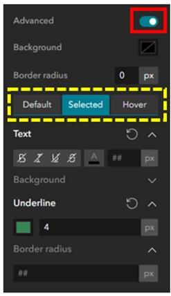
Once Advanced formatting is enabled in the menu settings pane (red rectangle on the top right of the image), there are three settings to help differentiate between states (yellow dashed rectangle above). Use a combination of text, color, size and emphasis to help differentiate states.
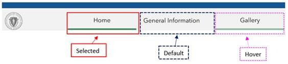
The example from the Website-style template demonstrates the three states available for configuration under Advanced Formatting—selected, hover, and default. The selected state is shown using the solid red line, the default state is demonstrated by the dashed blue line, and the hover state is shown with the dotted pink line.
Widget Controller
The widget controller is a type of container designed to organize other widgets to form a toolbar. Widget controllers can be set to appear horizontally or vertically and provide numerous settings that allow for the determination of behaviors, arrangement of the openable tool pane, appearance, and advanced formatting. Do not use accessible labels with the widget controller or widgets within the controller.
Important! Widget controllers are fully navigable with keyboard n avigation; however, some aspects of individual widgets within the controller may not be fully accessible.
When determining settings for the widget controller, consider the following:
- Location:
- We strongly recommend that all Experiences have widgets placed in the top left corner for consistency.
- Placing the widget controller in the same location across all Experiences creates a sense of predictability. Having the widget controller in a consistent location makes it easier to navigate regardless of who creates the Experience.
- Top left is generally where people direct their attention to first when navigating to a new page.
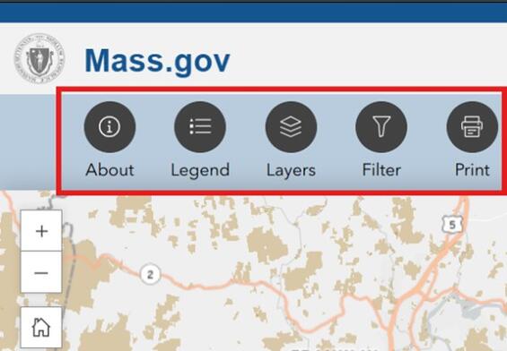
Placing the widget controller in the top left corner of all Experiences helps create a sense of predictability. This example demonstrates where this is in relation to the map. The widget controller is highlighted with a solid red rectangle
- Behavior:
- Should users be able to open one widget at a time, or multiple widgets at once? Consider layout and intended user experience—will this create unnecessary confusion?
- Should a widget be open by default when the Experience loads? Important! Widgets should not be configured to open by default when there is also a splash screen present, since it will trap users who solely rely on keyboard navigation.
- Arrangement:
- Should the widget panel (interactive portion that requires user input) be fixed for all widgets in one location, or should it float?
- Fixed panels must be placed at one of nine locations around the application window and allow the panel width and height to be set.
- Floating panels appear near the widget controller and are anchored to each widget's icon. The user can move the panel around their window.
- Consider placing the widget panel within a Row element with a set background color. The widgets will be easier to see for visually impaired users, if there is a high contrast ratio between the background and widget.
- Should the widget panel (interactive portion that requires user input) be fixed for all widgets in one location, or should it float?
This widget control controller has labels placed in a row with a solid background color, demonstrating a high contrast between the background color and widget color.
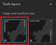
- Appearance: size of widget icon can be small, medium, large, or custom.
- Ensure widgets are large enough that icons are easily identifiable from other content on the layout.
- Widget size will vary depending on the screen size you are designing for. For example, your desktop design might use large widgets, while your mobile design might use small widgets to accommodate limited screen real estate.
- Use the custom setting for a higher level of control over button size, icon size, and spacing. This is a great way to make the widget icons larger within the button.
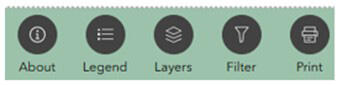
This widget controller on the left demonstrates the "large" widget setting.
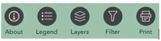
This widget controller demonstrates the "custom" widget setting. The widget icons are noticeably larger and easier to visually identify than in the previous image.
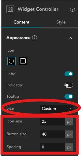
When configuring the widget controller, within the Appearance and Icon section, change the Size parameter to Custom and then manually adjust the Icon size, Button size, and Spacing until the widgets appear to your liking.
- Tooltip—this can be a helpful addition for sighted users and serves as an aria-label that can be read by screen readers.
- The tooltip corresponds to the widget name assigned within the designer.
- Ensure that each widget has a unique and clear name assigned with it, as this will show up as your tooltip.
- Label—turn on the label to make the purpose of the tool more obvious.
- Ensure the widgets have short and precise names.
- Labeling widgets may not be practical on the mobile layout, depending on the number of widgets in your app. Avoid widget labels in your mobile view if you have more than 3 widgets. With more than 3 widgets, users would need to "scroll" to see all widgets in the controller.
- Do no add an accessible label to widgets within the controller—this will not be honored by a screen reader. Instead, use the guidance above to provide your widget with a short precise name which will be read by a screen reader.
- Advanced Formatting—create distinct settings to differentiate between the default, selected, and hover appearance of widget icons.
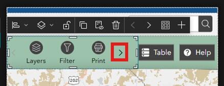
When in mobile view, not all widgets are visible onscreen. Users would need to click the right angle bracket (>) icon, indicated by the red rectangle, to see all the widgets.
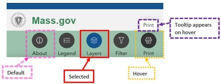
Using advanced formatting, widget icons within the widget controller can appear differently depending on the active state. Here, the default state is shown by the About icon on the far left (indicated by a double dashed pink rectangle). The selected state is shown with the solid red rectangle. The hover state is indicated with a dotted yellow rectangle. In addition, a properly configured tooltip for the print widget, indicated by dashed purple rectangle, is also demonstrated.
Layout Widgets
There are several layout widgets available within Experience Builder. These containers help to structure and organize a coherent User Interface (UI). When configuring layout widgets, do not add an accessible label. Esri provides the following breakdown on the different layout widgets:
- Accordion Widget—a layout container used to organize other widgets into a vertically stacked menu with an expanded and collapsed state.
- Column Widget—organizes content vertically.
- Fixed Panel Widget—creates a grouping of widgets which forms a fixed panel.
- Flow Row Widget—organizes content horizontally in a continuous row. This is the best option for accessibility and reflow of content.
- Grid Widget—organizes content within a customized grid.
- Placeholder Widget—a temporary widget used to save space in the UI during layout design.
- Row Widget—organizes content horizontally in a segmented row.
- Section Widget—organizes dynamic content using multiple views and allow users to switch between views.
- Sidebar Widget—uses adjacent panels to control layout and allocation of nested widgets.
Grid
Grids are not readily accessible and should be avoided. Grids can provide a problematic experience for users who rely on keyboard navigation to interact with applications if they are not configured and built correctly.
Column/Row/Flow Row
Columns are used as a container to hold text, images, maps, etc. The use of Columns and Rows are used in full-screen Experience Builder applications. You can add padding to a column to display a focus ring for widgets located inside the column.
Both Row and Column widgets can cut off content that has been constrained to fit the height (column) or width (row) of the container. Ensure that you test and adjust style settings for widgets within these elements so that content is not cut off.
Flow Row widgets should be used to organize content horizontally while allowing for dynamic reflow of widgets contained within the row. The Flow Row prevents overlap and truncation of content when a user zooms in on the screen, as may be required to support accessibility. The EEA Website-style template leverages Flow Rows in multiple locations.
Section Widgets
The section widget is a special type of layout container which allows for one or more views to be contained within the same section of an Experience. The Carousel splash screen is an example of a section widget. A section widget can contain a combination of the following other widgets: map, list, and image. Users can navigate between sections using either built in navigation, or by using Views Navigation.
Important! To ensure that sections are fully accessible, do not enable the autoplay option, as this will automatically move between each view at a set interval. WCAG has criteria in place which states there needs to be a control to start and stop audio or video, which is not currently included for the Section controls in Experience Builder.
Views Navigation
Views Navigation provides an intuitive navigation experience to sighted users, and provides proper context to users of assistive technology. Views Navigation correctly announces content changes and maintains focus within the Views Navigation (rather than kicking focus back to the page header). This represents an update to these best practices since March 2025, and are based on an accessibility test of Views Navigation with the Commonwealth’s Accessibility Office. Views Navigation should be used when multiple maps are required within one Experience.
Sidebar Widget
The Sidebar Widget is a layout container that provides two adjacent panels allowing for additional control over the layout and allocation of nested widgets. This allows a user to view collections of information at the same time. Sidebars can be placed along the side or bottom of the window. A common use for the sidebar is to contain the attribute table widget, allowing users to review data in an alternative format. The attribute table sidebar can be opened easily from a button using button actions.
Animation
Animation can refer to transitions (think like in Power Point) between elements or pages, or it can refer to GIFs and videos. Best practices include:
- Allow users to control animation by including start, stop, and pause options.
- When controls are not possible, disable animation (e.g. disable autoplay on a carousel-type splash screen).
- The use of GIFs is discouraged because they will play on a loop with no ability to stop the animation.
- Never embed videos (MP4 or from YouTube) with autoplay enabled.
- Remove content that could cause medical issues (e.g. seizures) such as content with flashes.
- Eliminate all non-essential motion—element animation should not be used.
- Most elements with Experience Builder allow the author to add Animation. These unnecessary animations or transitions can add back unnecessary motion, which can take away from accessibility, so be cautious when using the Animation setting.
- Avoid using animated symbols in a map(s) included within the Experience.
- Add warning to all animations and videos to pre-warn users before they are played.
Checklist
-
Open PDF file, 259.69 KB, Experience Builder accessibility checklist (English, PDF 259.69 KB)
| Date published: | June 2, 2026 |
|---|