Be aware before moving forward!
Important! The goal of this guidance is to give ArcGIS Online Creators a resource for creating accessible Survey123 forms. The focus of this page is on making design decisions that result in a form that can be used by anyone. We recognize that sometimes certain question types or elements are required to support data collection needs.
This document does not assess the accessibility of the Survey123 app for mobile. Testing performed during the writing of these best practices occurred primarily in the web form format. However, limited testing occurred in the Survey123 app for desktop (available from the Microsoft Store).
This document was developed using the current release of Survey123 for ArcGIS Online (as of February 2026), version 3.24.31 of Survey123 Connect, and version 3.24.22 of the Survey123 app for Windows.
A new Survey123 app is in development by Esri. When that is released and reaches parity with “classic” Survey123, we will update this document.
Other Public Survey Options
As you think about the goal of your form and the audience to which the form will be presented, consider the different options available to you. If you are a Commonwealth of Massachusetts employee, and if the form and its resulting data will have no spatial component and needs to be available to the public, consider a Gravity Form on a Mass.gov page. Connect with your agency’s web content authors to discuss this option. We also have Microsoft Forms available, which can feed data directly to a SharePoint folder. Additionally, some agencies have subscriptions for other services, like Smartsheet.
Whether you are a Commonwealth of Massachusetts employee or an employee with a different government or firm, connect with your communications specialists to learn about what survey types are available to you and what may make sense for your survey.
Survey123 Accessibility
According to Esri, listed below are the accessibility considerations to be aware of when building forms with the Survey123 platform. Some of their resources are outdated and we are unable to replicate the accessibility issues described. We have noted this. Additionally, other accessibility considerations—like heading structure—were not considered by Esri, but have been described.
- Heading structure: during our testing with the WAVE browser add-in, we discovered issues with proper heading structure if the Survey Form was not configured correctly. Here are 3 tips to make sure your Survey123 Form has a logical heading structure:
- The survey title is automatically considered H1.
- Always start your form with a group. Groups (and repeats) are automatically considered H2.
- Question labels will always be H3.
- Keyboard navigation
- Survey123 supports standard keyboard navigation.
- Certain question types are not accessible by keyboard navigation.
- Maps
- Ranking
- Range slider
- Image-map
- Signature
- Repeats—this is identified by Esri; however, during our testing, it appears as if repeats are keyboard navigable in the Web Form and not in the Field App (testing on Windows).
- Drop-down choice lists—this is identified by Esri, however during our testing, this appears to have been resolved with a more recent release of the software.
- Screen readers: Survey123 is designed to work with most common screen readers.
- During our testing using NVDA, the Survey123 Web Form responded better to a screen reader than the Survey123 Field App for Windows.
- The Survey123 Field App for Windows was unusable with NVDA during our limited testing.
- Built-in themes
- The built-in Survey123 themes follow accessibility guidelines (for color).
- The red asterisk (*) used to indicate required questions does not meet color contrast requirements.
- Captcha: Don’t enable captcha for your survey, as Captcha is not accessible.
- Multi-language surveys
- Screen reader users will not be able to select their own language when using a screen reader.
- Alternative text included within the form cannot be translated.
Form Instructions
Form instructions should always be added at the start of the form.
- If your form includes required questions, always include the following instruction above the first question in the form: “Fields marked with a red asterisk * are required.”
- If the form is multi-page:
- Provide instructions on how to navigate between pages.
- Provide the “required field” instructions at the top of each page.
- If including repeats in public forms, provide instructions on how to navigate and use the repeat directly above the repeat.
- If your form includes collapsed groups, provide instructions on how to open and navigate groups.
Survey123 Question Types
Survey123 allows Creators to design an interactive form with a variety of question types. This section will review all question types available in Survey123 (as per the current version of February 2026) and will review the accessibility of each question type. Learn more about Survey123 question types from Esri.
Important! Just because a question type is marked as being accessible, does not mean it is inherently accessible. Please follow all Question Design best practices and review the Question Appearances section to ensure that the configuration meets these guidelines.
The table below can be used to review available question types, which builder they are supported in (Survey123 Web Designer, Survey123 Connect, or Both), the form type that the question works in (Web Form, Field App, or Both) and if the question type supports accessibility (Yes, No, Sometimes, or N/A).
| Question type | Survey123 builder support | Survey123 form type | Accessible |
|---|---|---|---|
| Audio | Both | Both | Yes |
| Barcode | Both | Both | No |
| Groups | Both | Both | Yes |
| Repeats | Survey123 Connect | Both | Sometimes |
| Calculate | Survey123 Connect | Both | N/A |
| Decimal/Number | Both | Both | Yes |
| Date | Both | Both | Yes |
| dateTime | Both | Both | Yes |
| Both | Both | Yes | |
| File | Both | Both | Yes |
| Geopoint/Map | Both | Both | No |
| Geoshape/Map | Both | Both | No |
| Geotrace/Map | Both | Both | No |
| Hidden | Survey123 Connect | Both | N/A |
| Integer/Number | Both | Both | Yes |
| Image | Both | Both | Yes |
| Note | Both | Both | Yes |
| Range/Slider | Both | Both | No |
| Ranking | Both | Both | No |
| Select One | Survey123 Connect | Both | Yes |
| Likert Scale | Survey123 Web Designer | Both | Yes |
| Rating | Survey123 Web Designer | Both | Yes |
| Single Select Grid | Survey123 Web Designer | Both | Yes |
| Select Multiple | Both | Both | Yes |
| Text | Both | Both | Yes |
| Time | Both | Both | Yes |
| Signature | Survey123 Connect | Both | No |
Some accessibility caveats with question types include:
- Repeats are keyboard-accessible when used within forms designed for the Survey123 Web App. Repeats are not keyboard-accessible when used within forms designed for the Survey123 Field App.
- Calculate has "N/A" for the accessibility column because this question type has no user interaction.
- Hidden has "N/A" for the accessibility column because this question is hidden from the user.
- Range/Slider is not keyboard-accessible. Select a different question type.
- Ranking is not keyboard-accessible. Select a different question type.
- Likert Scales are designated as a question type in the Survey123 Web Designer and an appearance in Survey123 Connect for "select_one" questions.
- Signatures are designated as a question type in Survey123 Web Designer and an appearance in Survey123 Connect for "image" questions.
Question Appearances
Survey123 allows Creators to design an interactive form with a variety of question appearances. This section will review any question appearances that we know to be inaccessible or require additional considerations during configuration. This is not an exhaustive list and will be updated, as needed.
Inaccessible
- Image-map
- An image-map can be selected as an appearance for "select_one" questions within Survey123 Connect.
- The image-map is not keyboard accessible and provides users of assistive technology with no way to interact with the image or to make a selection.
- Additional limitations:
- Image-map questions only work in the Survey123 Field App.
- Image-map questions do not work in the Survey123 Web App. Instead, the user will see a static image and a choice list ("select_one").
When a survey with an image-map question is opened in the Survey123 Web App (browser), the image is static and can’t be clicked. Instead, a choice list is provided below the image-map. In this situation, use a choice list.
- Signature
- The signature appearance can be selected as an appearance for image questions within Survey123 Connect or added as a standalone question type in the Survey123 Web Designer.
- This violates WCAG, as it requires the users to perform special gestures or motions to complete the question.
Accessible with proper attention
- Minimal
- When using this appearance with "select_one" or "select_multiple", check that the longest option(s) for your dropdown selection is not clipped once selected. The entire word or words should be visible.
- This appearance is best suited for questions where the choice list is greater than five options.
Question Design
Spend adequate time and attention when addressing question design in your Survey123 form. This will ensure that the form is easy to use, provides helpful contextual clues (like hints and error resolution), and has clear choice lists. Use the guidelines below to get started.
- Label
- Each question should have a short, concise, and clear label.
- The label is the first text a user will see when encountering a question in the form.
- This can be configured in both the Web Designer and Survey123 Connect.
- Follow all text guidelines.
- Hint
- Each question should have a hint. Hints should:
- Provide context to the user about what is expected of them for each question.
- Provide an example of the information they should fill in. For example, if the question is asking about someone’s ideal day, then the hint could be something like, “Describe your ideal day. What activities would you do?”
- If you want the information in a specific format, consider providing an example (e.g. 111-111-1111 for a phone number). Using input masks and regular expressions (regex) can also help with data input and data validation.
- Follow all text guidelines.
- This can be configured in both the Web Designer and Survey123 Connect.
- Each question should have a hint. Hints should:
- Guidance hint
- This appears and works differently depending on how the end user is accessing the survey:
- Survey123 Field App Form—this appears visually as a light bulb icon to the left of the Hint. This is not keyboard accessible.
- Survey123 Web Form—this appears visually as a collapsed “Details” section under the Hint. This is keyboard accessible, and can be accessed by a screen reader.
- Guidance hints are only available when designing a survey using Survey123 Connect.
- Only use when necessary, if additional context is required that cannot be provided in the Hint alone. Guidance hints should follow all text guidelines.
- This appears and works differently depending on how the end user is accessing the survey:
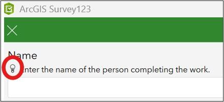
When a form is opened in the Survey123 Field App, questions with a Guidance hint will have a lightbulb icon to the left of the Hint. When the lightbulb is selected, the Guidance hint is displayed in a pop-up window. During testing with NVDA, we were unable to access this information in the Survey123 Field App.
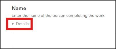
When a form is opened in the Survey123 Web App, questions with a Guidance hint will have a collapsed “Details” section below the Hint. When expanded, it shows the Guidance hint below the “Details” text.
- Required questions
- If your form includes required questions, always include the following instruction above the first question in the form: “Fields marked with a red asterisk * are required.”
- If you have a multi-page form, ensure this instruction is included at the top of each page.
- This can be set in both the Web Designer and Survey123 Connect.
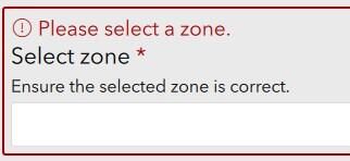
- Required question error messages
- This can only be set in Survey123 Connect.
- All required questions must have a "required_message".
- It is best practice to also include a red error icon, in addition to an error message.
- This message should:
- Follow all text guidelines.
- Identify both the question and the expected response to the required question.
When a user submits a form In the Survey123 Field App, but skips a required question, an error message is displayed with a red error icon. The entire question is also outlined with a solid red box.
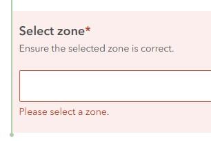
When a user submits a form in the Survey123 Web Form, but skips a required question, an error message is displayed below the question prompt. The entire question area is also shaded light red and outlined with a solid red box.
- Constraint messaging
- If using a constraint for a question within your form, ensure appropriate constraint messages are set. Do this using the “constraint_message” column within your XLSForm.
- Constrain messages should:
- Follow all text guidelines.
- Be clear and concise.
- Describe what the constraint is so that the user can input the information correctly. For example: Only 4 photos allowed per log entry.
- This can be configured in both the Web Designer and Survey123 Connect.
- Choice lists
- All choice options should:
- Be written in plain, easy to understand terms.
- Not include the use of acronyms or jargon.
- Not include underscores.
- Be sentence case.
- Follow all other text guidelines.
- When more than 5 choices are present, consider the “minimal” appearance.
- All choice options should:
Accessible Survey Themes
Building a custom theme will help you in making your forms accessible. If you are a Commonwealth of Massachusetts employee, consider using the Mayflower Design System to correspond with Mass.gov branding. If you are not a Commonwealth of Massachusetts employee, connect with your agency or business communications team for any branding requirements.
Add a custom theme in Survey123 Web Designer
To add a custom theme when designing a Survey123 web form, navigate to the “Appearance” menu in the designer. This is located along the left side of the designer screen. Select the custom theme option to set your custom theme.
Important! The Survey123 web form designer does not automatically check for color contrast ratios! If you create a custom theme in the Web Designer, you will need to thoroughly test selections using a testing tool like WAVE.
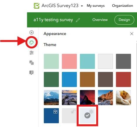
To build a custom theme, select the Appearance menu in the Survey123 Web Form designer. This is highlighted by the red circle and red arrow. Then, select a new theme to create a customized one, highlighted by the red square outline.
Add a Custom Theme in Survey123 Connect
To add a custom theme when designing a Survey123 Connect form, navigate to the “Style” menu in the designer. This is located along the right side of the designer screen.
Important! When adding HEX codes, be sure to include the hash (#) symbol so that the values are recognized by the program.
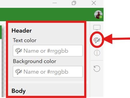
To build a custom theme in Survey123 Connect, select the Style menu in the designer. This is highlighted by the red circle and arrow. From there, you can start to customize your theme, including text and background colors.
The Survey123 Connect designer checks color contrast ratios and will provide a warning when WCAG requirements are not met.
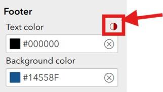
If color contrast ratio requirements are not met, an error icon will appear in red and is highlighted by the red square and red arrow. Select the error icon for more information.
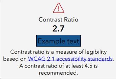
When the color contrast error warning is selected, this window appears with information on the failing contrast ratio. It also has a preview of what the colors look like together.
Images
Images can be used in your Survey123 form in a few places. Whenever using a non-decorative image, it is important to make sure it has proper alternative text.
Alternative text can be added directly when adding images in the web designer. If you are using Survey123 Connect, the “label” for the question with an image will be used as alternative text. When creating a custom “Thank you” screen in Survey123 Connect, use HTML image tags to add alternative text.
Image Type 1: Decorative Image
If the image is purely decorative or aesthetic, alternate text should be omitted. Decorative images with alternative text create audible clutter for a screen reader and user to navigate. To be considered decorative, the image should meet the following criteria as defined by WCAG:
- Serves only an aesthetic purpose to provide visual enhancements, decorations, or embellishments.
- Provides no information.
- Has no functionality, beyond aesthetics.
An example of a decorative image would be an agency logo, or the green check mark that appears when someone submits a Survey123 form.
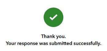
The sample submission screen, which is the default for all surveys, includes a white checkmark within a green circle. This is an example of a decorative image. Below the image are the words, "Thank you. Your response was submitted successfully."
Image Type 2: Non-decorative Images
If the image or graphic is critical to supporting your Survey123 form, such as an image being displayed as a choice within a choice list (for a "select_one" or "select_multiple" question), it must include appropriate alternative text.
This group of images can be broken up into further categories:
- Informative Images—These types of images convey a simple concept or information that can be conveyed to a user in a short phrase or sentence. This phrase or sentence should convey the meaning or content of what is displayed, without being a literal description of the image. In some cases, a literal description is required,; however, this is only when the image is all, or a large part of the information being conveyed. This type of image will typically be associated with a "select_one" or "select_multiple" choice.
- Images of Text—These types of images are strongly discouraged. Generally, images of text are intended to be read. But because assistive technology cannot read text within an image, it is best to avoid this whenever possible. If an image must have text, then the alt text must contain the same text as shown in the image.
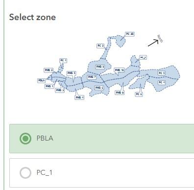
- Complex Images—These image types contain substantial information that can't be conveyed in a short phrase or sentence. Types of complex images are: graphs, charts, diagrams, illustrations (where surrounding text relies on user understanding of presented image), and maps. These should be avoided in Survey123 forms.
Writing Alternative (Alt) Text
To determine if alt text is required for an image included within your Survey123 form, please refer to the above guidance on image types. Once the category of alt text necessary for your image type is established, please review these guidelines from Perkins on the best ways to write alt text.
Text and Reading
This section covers general text requirements and best practices. Review specific element sections in this document for more-pointed text requirements. Visit the Commonwealth's Digital Accessibility Fundamentals page on Content and Typography for general text size and style information.
- The color contrast ratio between text and background color should be at least 4:5:1.
- Always underline links and have the link text in a color that has a 3:1 contrast ratio from the surrounding text.
- Use bold text sparingly for important information. Each question label will be in bold, limit use of bold elsewhere.
- Limit the use of italics for emphasis.
- Do not use all capitalized letters.
- Using all capitals can make text difficult to read for people who are neurodivergent (e.g. dyslexia).
- Using all capitals removes the variation in letter shape and size and can make it more difficult to distinguish between letters.
- All capitalization also gives a sense of "yelling".
- Keep blocks of text to a few sentences each to convey information. Use natural language, as if you were talking to your audience. This naturally creates sentences that are neither too long-winded, nor too short and choppy.
- Unusual words: A mechanism is available for identifying specific definitions of words or phrases used in an unusual or restricted way, including idioms and jargon.
- Abbreviations:
- A mechanism for identifying the expanded form or meaning of abbreviations is available.
- Generally, abbreviations should be defined at least once, and all subsequent uses of that abbreviation is acceptable.
- Reading level:
- Reading level should be between grades 6 and 9.
- When more advanced words are necessary, define them, or provide supplemental content.
- There are a variety of tools available online to assist with determining reading level, like the Hemingway Editor.
- Pronunciation: A mechanism is available for identifying specific pronunciation of words where meaning of the words, in context, is ambiguous without knowing the pronunciation.
- Be descriptive:
- When writing question labels or links, ensure they are concise and descriptive. Never use “Click here” or “Learn more”.
- Always describe what a link will do (e.g. “Read more about loons”).
Report Templates
Survey123 supports custom report templates. This can be associated with the form in ArcGIS Online and allows users to export a select record to a formatted report template.
All templates should pass the built-in Microsoft Word accessibility check before being uploaded to the form on the Survey123 website.
Important! If your report template allows users to export images or includes a map, please ensure that users are aware of alternative text requirements for images. All non-decorative images require alternative text. This cannot be built into the template and requires users to manually review and add alternative text to each image after the report has been generated.
Checklist
-
Open PDF file, 176.72 KB, Survey123 Accessibility Checklist (English, PDF 176.72 KB)