
Site Theme
Designing your site theme should be done early in the design process. Use branding associated with your organization, company, agency, etc. If your Hub is for a Commonwealth of Massachusetts agency, consider using the Massachusetts Design System to learn more about how to design a Mass.gov-branded Hub site. This includes resources on:
- Colors
- Typography
- Iconography
- Components
- Imagery
- State seal
Using the Massachusetts Design System will ensure your Hub site follows branding guidelines for all public-facing Commonwealth digital assets. Below are our recommendations for a Mass.gov-branded Hub site theme:
- Global Nav Background Color: Bay Blue, #14558F
- Global Nav Text Color: White, #FFFFFF
- Header Background Color: Platinum Gray, #F2F2F2
- Header Text Color: Berkshire Green, #32784E
- Body Background Color: Bay Blue 90% tint, #E8EEF4
- Body Text Color: Revolution Gray, #141414
- Body Link Color: Bay Blue, #14558F
- Base Font: Noto Sans. Import to Hub using this Google Fonts URL.
- Heading Font: Noto Sans. Import to Hub using this Google Fonts URL.
Site Customization with HTML and CSS
It is possible to incorporate customizations on your Hub site using HTML and CSS. Before getting started, review Esri’s supported HTML (in general and in Hub sites specifically); there are certain tags and attributes which are not supported in Esri products. Most notably, inline styles are required when using HTML to style a text layout element on your Hub site (and in many other Esri applications).
This guidance is not designed to teach you how to write HTML and CSS. We’ve compiled a list of helpful resources below to get you started:
- Customize sites with HTML and CSS from Esri
- Esri’s supported HTML
- Configure Hub site text elements with HTML from Esri
- HTML training resource list from the Commonwealth’s Accessibility Office
- CSS Tutorial from w3 Schools
- HTML Tutorial from w3 Schools
Header
Hub allows you to add a Header to your site. This header will be applied to all pages of the Hub site and will provide users with consistent layout design and navigation experience. A header can contain your logo, Hub site name, and a menu with link(s) to your Hub pages.
There are a few options to choose from when designing your Hub site’s header. The pre-configured options include a standard header (60 pixels [px] tall) and a prominent header (130 pixels [px] tall). The colors of your header will be determined by your Theme.
Custom headers can be added using the Custom HTML and CSS option. Please refer to the Site Customization with HTML and CSS section above for some resources to help you get started.
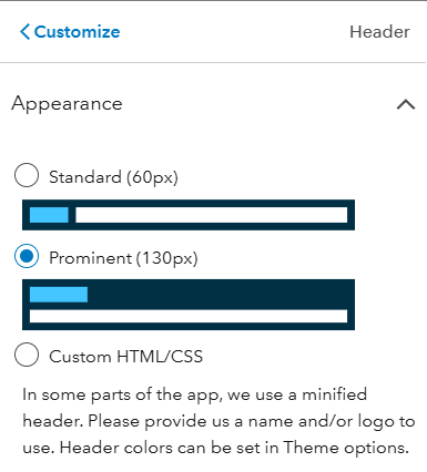
The three header appearance options to choose from when configuring a Hub site: standard (60px); prominent (130px); and custom HTML/CSS.
A custom logo can be uploaded or added from an image URL. Your logo should receive alternative (alt) text. For example, the EEA logo would receive alt text of “Massachusetts Executive Office of Energy and Environmental Affairs logo”.
Important! Esri automatically applies your Hub site URL to both the logo and site title. This may be flagged during testing with the WAVE add-in as a “redundant link.”
Having your Hub site header mimic your website header provides a consistent and unified experience for users who might by navigating between your website and Hub site.
Menu
A Menu is a great way to provide users with an easy, intuitive, and familiar way to navigate through a Hub site. Menus provide an easy way to jump from page to page, or to other external resources. A Menu is added through the Header configuration. Hub sites reflow automatically between desktop, tablet, and mobile. There is no additional configuration that will need to be done for your menu to function correctly on different screen resolutions. There are some things to keep in mind:
- The header will always be read first by assistive technology
- The header will always be where tabbed navigation in a Hub site begins
- Each menu option should behave the same way (e.g. selecting a menu option goes to a new page). Predictability is an important concept of accessible design.
- Menu content types are accessible to keyboard navigation and assistive technology:
- To existing content: this refers to other ArcGIS content which will show up as an option in the menu. This includes any shared content, including apps, maps, and data.
- Links: enable connections to external websites
- Have a “Contact Us” menu option in a consistent location so users are familiar with how to get help.
Wayfinding
Design decisions that help users navigate a website to find information and accomplish tasks are referred to as wayfinding. A well-designed menu is one key method for providing users with a good wayfinding experience. If a user can't navigate your Hub site, they might give up and leave before accomplishing whatever task they had initially set out to complete.
When thinking about how to create a good wayfinding experience, consider the following:
- The site title should provide a clear understanding of what the Hub site is for
- The page title should be the only H1 (heading level 1) used per page
- The page title configured in the Header settings will not be identified as an H1. To add an H1 title to your page:
- Add a row below your Header and Menu
- Add a text block
- Add the site title (it should match what is set under the Header settings)
- Configure that title text as H1
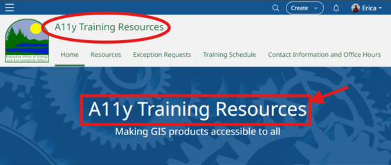
The header title (signified by a red circle) and the page title (signified by a red rectangle with red arrow) are identical. The page title is a text element configured as a heading level 1 (H1) and is contained within a row element. The header title does not receive a heading level.
- Menu titles should be short and concise, while accurately describing what a user will find if they navigate to that menu option. Menu titles correspond to page names assigned in the designer.
- Menu items should behave in the same way—predictability helps ensure site navigation is easy to understand. For example, when you select a menu item, it always brings you to a new page. Using the "folder" option in your menu does not support this.
- Menu options should bring you to a page that has a heading (styled to H1) to match the menu link. If a menu title says one thing, takes the user to a page with a different heading, and then the page title is different, this can be disorienting to a user. For example, if a menu option says, "Exception Requests", it can be disorienting and confusing when the user is brought to a page with a heading of "GIS exception requests".
- A logical page title, navigation menu, and heading structure all work together to provide a user with a good wayfinding experience.
- Provide a Home button on every page to bring the user back to the start.
Footer
A Hub site can contain a custom footer that is designed with a combination of HTML and CSS. All public-facing Hub sites for Commonwealth of Massachusetts agencies must include a footer with a Digital Accessibility Statement link. There are no pre-built footer options available with Hub. When creating a custom footer, please refer to the Site Customization with HTML and CSS section above for some resources to help you get started.
The MORIS Hub Site managed by the Massachusetts Office of Coastal Zone Management has a good sample footer. It was copied and modified for use on Hub sites and includes the Digital Accessibility Statement URL. We’ve included the HTML and CSS code below for reference.
HTML
<div class="mirror-header-theme" style="padding-bottom: 2em;">
  <div class="container">
    <div class="col-md-8 col-sm-10" style="padding-top:2em">
<table class="logo-title-alignment" style="background-color: transparent;">
<tbody><tr>
<td><img src="/libraries/mayflower-artifacts/assets/images/logo/stateseal.png" alt="Massachusetts State Seal" width="100" height="100"></td>
<td>
 <a style="vertical-align: top; color: #2D6A46; padding: 10px 10px; font-size: 18px;" target="_blank" rel="noopener noreferrer" href="/orgs/executive-office-of-energy-and-environmental-affairs"><strong>Executive Office of Energy and Environmental Affairs</strong></a><br>
</td>
</tr>
</tbody></table>
    </div>
<div class="col-md-4 col-sm-2 contact-info-alignment" style="padding-top: 3em;">
<div>
 <br>
        <p style="font-size: 18px; color: #2D6A46"><strong>© 2026 Commonwealth of Massachusetts</strong></p>
                <a href="/privacypolicy">Privacy Notice</a>
                <br>
                <a href="/%7BInsert%20custom%20Digital%20Accessibility%20Statement%20URL%20here%7D">Digital Accessibility Statement</a>
    </div>
</div>
</div>
</div>

<style>

.contact-info-alignment {
  text-align: center;  }

.logo-title-alignment {
  margin-left : auto;
  margin-right: auto;  }

@media (min-width:768px) {
   .container {
    width: 1000px;
  }
  .contact-info-alignment {
    text-align: right;
  }

  .logo-title-alignment {
    margin-left : initial;
    margin-right: initial
  }
}

</style>
CSS
.footer-color {
    background-color: #FCF7E5;
    color: #777777;
  }

.footer-color a {
    color: #777777;
}

.image-card.calcite-web .card-image {
   max-width: 50px;
   height: auto;
   margin-bottom: 30px;
}
Layout Containers and Elements
There are several layout elements available within ArcGIS Hub. Several of these layout elements help to present data, apps, maps, and so forth to end users. Additionally, there are layout containers that help structure and organize a coherent User Interface (UI), Esri’s help pages provide great resources for getting started. To get started, select “Add text and images”, and then use the menu on the left to learn about adding other layout elements.
We’ve outlined the different types of layout containers and elements below with a brief description of their purpose and use. Elements and containers that have special considerations have been described in more detail within their own sections.
Layout containers:
- Row—organizes content horizontally in a segmented row. This is the building block of your site!
- Gallery—organizes content into a grid-type gallery using existing ArcGIS content or a custom query.
- Spacer—adjusts the amount of space between elements to create a readable layout. This can be thought of as a buffer.
- Text—add text, buttons, labels, and custom code.
- Category—a way to represent data content categories using icons.
Data presentation elements:
- Application—display a supported ArcGIS application.
- Image—display an image.
- Survey—display a Survey123 form as a card or embed.
- Contact Info—add a pre-formatted contact card.
- Map—display a web map or web scene with various display options.
- Chart—create a pie, bar, line, scatterplot, or custom chart with JSON.
- iFrame—embed content from external websites.
- Summary Statistics—highlight a key metric from a connected dataset or update manually.
- People—highlight people associated with a project; requires an ArcGIS organizational account.
- Search—a way for users to search and discover Hub content.
- Video—embed videos from YouTube, Vimeo, and Facebook.
- Social Media—display Facebook or Twitter (X) content (post).
Gallery
The gallery widget provides five options for displaying a collection of content to users. Select the option that works best for your site and the content being displayed.
- Filled Grid
- Grid
- List
- Compact
- Table
Accessibility Considerations:
- Buttons
- When using the Filled Grid or Grid options, do not enable buttons. Their settings are limited and each button will include the same text. While you can change the text, it will apply to every button on every card (refer to example in figure below).
- Link text must be unique to help users of assistive technology identify what a link’s purpose is. It is best to use the card title alone as the link, as this should provide unique link text.
- Heading level
- Ensure you select the correct heading level for cards. This should follow logical heading structure and use the next logical heading level for your site or page.
- The heading level setting is nested under “Appearance”, then under “Cards”, then under “Heading”.
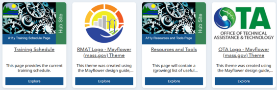
An example Gallery showing how enabling buttons does not provide users of assistive technology with unique link text. In this example, each button says “Explore”.
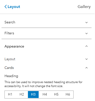
Ensure that Gallery cards are configured with the correct heading level. Set this under “Appearance” and “Cards”. This should be the next logical heading level for your site.
Text
The text layout container can be used to present text to the end user, or for custom HTML code. This section covers general text requirements. Visit the Commonwealth's Digital Accessibility Fundamentals page on Content and Typography for additional general text size and style information. To ensure that your product meets WCAG guidelines pertaining to text, please review the following criteria:
- There is no minimum text size requirement per WCAG guidelines. We generally recommend using at least 12 pt (16 px) and larger.
- Use the same font throughout the entire application.
- A sans serif font is used.
- Follow logical heading structure throughout your site. There should be:
- One H1 heading per page. This should be your title.
- Logical progress from H1 > H2 > H3 > H4, as an example.
- Heading levels should be consistent in font size and weight throughout the site. For example, all H1 headings should look the same. The text widget supports basic HTML markup (e.g. H1, H2, etc.). Use proper heading structure when implementing on your site.
- Page headings are provided in sentence case (e.g. "General information" rather than "General Information").
- Avoid using tables to structure content within your site. Reserve tables for simple data presentation only. If adding a table, use the “header toggle” option when configuring a table within a text block.
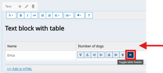
When adding a table within a text block, ensure you toggle the table header option, indicated by the red square and red arrow above.
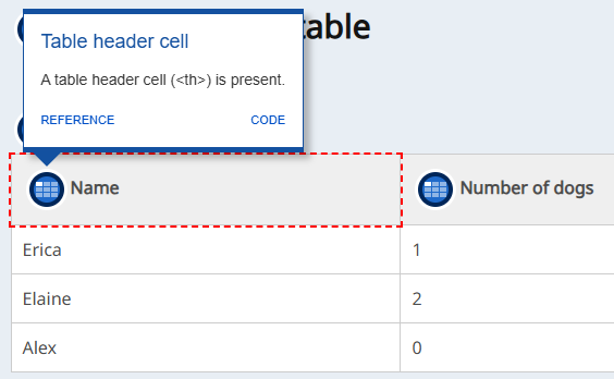
The WAVE add-in will identify tables and will identify that the top row has been set as a table header.
- The color contrast ratio between text and background color should be at least 4.5:1.
- Incidental text has no contrast requirements. The following types of text fall into this category:
- Text that is part of a logo or brand name.
- Text that is part of an interactive user interface component.
- Text that is pure decoration.
- Text that is not visible to anyone.
- Text that is part of a picture that contains significant other visual content.
- Text supports reflow (zoom in the browser) up to 400% and is supported without loss of content or functionality.
- Images of text are only used for pure decoration or where a particular presentation of text is essential to the information being conveyed.
- Unusual words—a mechanism is available for identifying specific definitions of words or phrases used in an unusual or restricted way, including idioms and jargon.
- Abbreviations—a mechanism for identifying the expanded form or meaning of abbreviations is available.
- Reading Level—text should be at a level that can be understood by someone with a lower secondary education.
- Lower secondary education level: seven to nine years of schooling.
- Key takeaways to consider are providing concepts with clear, concise language, and avoiding complex jargon and idioms.
- Pronunciation—a mechanism is available for identifying specific pronunciation of words where the meaning of the words, in context, is ambiguous without knowing the pronunciation.
- Text over images—if text will be placed on top of an image, ensure that minimum contrast ratios are always met by giving the text a semi-transparent background fill to the text block, as demonstrated below.
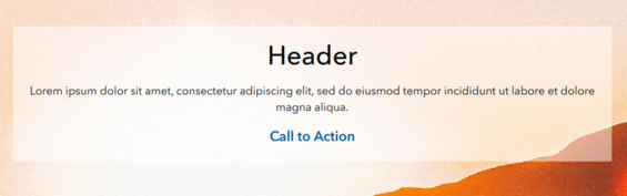
Apply a semi-transparent background fill to any text which is on top of images. Adjust the level of transparency as needed to ensure that when a user zooms in on the page, that contrast requirements are met between the text and background.
Text Hyperlinks
When creating links in text or within narrative, keep the following in mind:
- Do not use "click here" or "here" as the hyperlinked text. Using this text as a link can raise questions for users of assistive technology such as:
- Where is here?
- What does this link do and where does it go?
- How does this relate to the text before or after it?
- What is its context?
- Links should be underlined. While not required by WCAG, it is best practice to underline links. WCAG does require that links have a visual indication besides color, which is typically done so with underlining the word or phrase to be linked.
- Do not underline text that is not a link.
- If text needs to be emphasized, but is not a link, use bold text instead. Though as a rule of thumb, keep bold text limited.
- Links should be configured to open in the current app window. An exception is if a link navigates a user to a non-secure URL (e.g. http), then you can open it in a new window.
- Phone numbers, email addresses, and place addresses should receive a link. While this is not an accessibility requirement, it provides a better user experience for everyone.
Category
The Category element is useful for presenting groups of content using an icon. These may be the most helpful when presenting groups of data (e.g. like you might see on an Open Data site), by using multiple categories together. One element is equal to one category.
Accessibility Considerations:
- Link Text
- Each category should have unique link text. Link text must be unique to help users of assistive technology identify what a link’s purpose is.
- Links are underlined by default.
- This setting is found under “Appearance”.
- Icon
- Select or upload an icon that has a logical connection to the category (and link text).
- Ensure icon color matches theme and passes contrast requirements (3:1 for graphical elements).
- Heading level
- It is not possible to assign a heading level, and when tested with the WAVE add-in, it appears no heading level is automatically assigned.
- Nest under appropriate heading level using a text element.
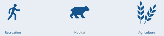
A sample showing three Category elements configured with meaningful titles and icons.
Application
Proceed with caution! Due to potential issues with embedded content, such as no alternative text, unpredictable keyboard access, keyboard traps and navigation, we recommend that this layout element is used with caution. Please ensure thorough testing is performed to ensure accessibility of any applications embedded in your site.
Consider using an alternative layout element, such as the “Gallery”.
Image
Images in ArcGIS Hub support three different workflows:
- Decorative Images
- Non-decorative Images
- Image Hyperlinks
Depending on the type of image(s) on your page, the alternative text, caption, and function of the image can impact how an assistive technology, such as a screen reader, will interpret the image within the Hub site.
Image Type 1: Decorative Image
If the image is purely decorative or aesthetic in nature, alternate text and a caption should be omitted, as this creates audible clutter for a screen reader and user to navigate. To be considered decorative, the image should meet the following criteria as defined by WCAG:
- Serves only an aesthetic purpose to provide visual enhancements, decorations, or embellishments.
- Provides no information.
- Has no functionality, beyond aesthetics.
Image Type 2: Non-decorative Images
If the image or graphic is critical to supporting the narrative of your Hub site, alternative text and a caption must be provided. These should not be the same. This group of images can be broken up into further categories:
- Informative Images—These types of images convey a simple concept or information that can be conveyed to a user in a short phrase or sentence. This phrase or sentence should convey the meaning or content of what is being displayed, without being a literal description of the image. In some cases, a literal description is required; however, this is only when the image is all, or a large part, of the information being conveyed.
- Images of Text—These types of images are strongly discouraged. Generally, images of text are intended to be read. But because assistive technology cannot read text contained in an image, it is best to avoid this whenever possible. If an image must contain text, then the alt text must contain the same text as shown in the image.
- Complex Images—These image types contain substantial information that can't be conveyed in a short phrase or sentence. Complex images are generally: graphs, charts, diagrams, illustrations (where surrounding text relies on user understanding of presented image), and maps. For complex images, the alt text must provide two parts:
- A short description to identify the image and (if needed) where the long description can be located.
- A long description which provides the essential information conveyed by the image.
- Groups of Images—If a group of images is used to convey one piece of information, only one of the images requires alt text to describe the entire collection, while the other images have a null alt text attribute.
Image Type 3: Image Hyperlink
Also referred to as Functional Images, these types of images are used to initiate actions rather than convey information. A link can be applied to an image in ArcGIS Hub. In this situation, alt text should convey the action that will be initiated, rather than a description of the image.
These types of images should have alt text and a caption filled out. In this situation, the caption should provide the user with a description of where the link goes to help a user determine if they want to click the link. The alt text description should be concise but provide enough information to help someone determine where the link will take them. When possible, ensure that the link opens in the app window rather than a new window; please refer to guidance from the Links section for more details.
Writing Alt Text
To determine if alt text is required for an image included within your Hub site, please refer to the above guidance on image types. Once the category of alt text necessary for your image type is established, please review these guidelines from Perkins on how to write alt text. In addition, please keep in mind that you should not duplicate captions that are already present when writing alternate text.
Survey
The Survey element allows a Survey123 form to be included within your Hub site. There are two options for presenting a Survey123 form in your site – Feature (as card) or Embed (interactive).
Accessibility Considerations:
- Feature—Button (link) Text
- Each Survey should have unique link text. Link text must be unique to help users of assistive technology identify what a link’s purpose is.
- Ensure link is set to open in the same tab.
- These settings are found under “Options”.
- Embed—Proceed with caution! Due to potential issues with embedded content, such as no alternative text, unpredictable keyboard access, keyboard traps and navigation, we recommend that this layout element is used with caution. Please ensure thorough testing is performed to ensure accessibility of any applications embedded in your site. Consider using the “Feature” option, described above.
Contact Info
The Contact Info element is a quick and easy way to add an email address to your Hub site. Enter in a valid email address and default subject line.
Accessibility Considerations:
- Heading Level
- Each card automatically receives a title “Contact Information” and a clickable email address. Both are configured as heading level 2 (H2).
- This should follow logical heading structure and use the next logical heading level for your site or page.
Map
The Map element allows you to add a simple map to your Hub site. There are limited settings available, so consider if this is the best option, or if an Instant App, Experience Builder application, or link to the Web Map Viewer are more appropriate.
Proceed with caution! Due to potential issues with embedded content, such as no alternative text, unpredictable keyboard access, keyboard traps and navigation, we recommend that this layout element is used with caution. Please ensure thorough testing is performed to ensure accessibility of any applications embedded in your site. Consider using an alternative layout element, such as the “Gallery”.
Accessibility Considerations:
- Keyboard Navigation—during testing, it appears that logical keyboard navigation is not followed.
- Title
- Provide a short, descriptive title for your map. This should be in sentence case. The title is not assigned a heading level.
- Title should be left-justified.
- This setting is found under “Options”.
- Legend—enable map legend. This allows users to decode map symbology.
- Missing Widgets
- The map element lacks a “Search” option. This option would allow a user to interact with the map without a mouse.
- There is no “Home” option. This option would allow a user to easily navigate back to the default map extent.
- Alternative text and map description
- It is not possible to add alternative text to a map in your Hub site.
- All maps must be accompanied by an appropriate description. This should preserve the intent, meaning and nuance of the map for users. Add this with a text element before or after the map.
Chart
The Chart element allows one of five chart types to be added to the layout. Select from bar, line, pie, scatter or custom JSON. When using the non-JSON options, you can connect to a feature service data source within your content, the EEA organization, ArcGIS Online, or in the Living Atlas.
Chart settings are straightforward. When selecting a bar, line, or pie chart, select an attribute field for the category, which will be your X axis. The value axis will be the count of the features by default if another statistic type is not selected. For bar and line charts, the value axis is the Y axis.
When selecting a scatterplot, you must select an attribute field for the X and Y axes. Under “Options” select the sort field and direction (ascending or descending order). Though the use of scatterplots is strongly discouraged as they are not read out in a coherent manner by screen readers and create audio clutter for screen reader users.
Accessibility Considerations:
- Title and Labels
- Add a short, descriptive chart title in sentence case. Note: chart titles default to heading level 4 (H4) and cannot be changed. Ensure you configure the site with proper heading structure ahead of and after each chart through the use of text elements.
- Provide the value and category axes with a short, descriptive label. Do not include abbreviations. For example, use “Weight in Pounds” instead of “Weight (lbs)”.
- Color
- Select a primary chart color that matches the site theme. If using a custom (non-theme) color, ensure it passes color contrast requirements (3:1 for graphical elements).
- Pie charts do not allow you to select custom ‘slice’ colors. There is no way to guarantee that there is sufficient color contrast between adjacent slices or that the colors selected are colorblind-friendly. Avoid pie charts where possible.
Iframe
The Iframe element allows any secure (https) URL to become embedded in the Hub site. This should not be used to embed videos—instead use the dedicated video layout element.
Proceed with caution! Due to potential issues with embedded content, such as no alternative text, unpredictable keyboard access, keyboard traps and navigation, we recommend that this layout element is used with caution. Please ensure thorough testing is performed to ensure accessibility of any applications embedded in your site.
Accessibility Considerations:
- Keyboard Navigation—in limited testing, it seems that this may support logical keyboard navigation.
- User Interaction—if the embedded URL cannot display the full page, it is recommended to set the “Allow Scrolling” setting to “Auto”. If scrolling is disabled (Allow Scrolling is set to “No”), and the embedded URL does not fit within the specified height of the Iframe, then content could be hidden from your users.
- Mobile
- If the embedded URL does not perform well on mobile devices, you can provide an alternative URL.
- Consider enabling the “Hide on Mobile” setting.
Summary Statistics
The Summary Statistics element adds a large statistic to your Hub site. This can be connected to a feature service, or a static statistic, or the value can be manually entered.
Accessibility Considerations:
- Context
- Never use a number or statistic alone. Provide your users with context for the number or statistic provided. Hub provides the following optional details fields:
- Title—if included, it should be short, descriptive and in sentence case. Placed above the statistic.
- Subtitle—if included, it should be short, descriptive and in sentence case. Placed above the statistic.
- Trailing text—if included, this should provide additional context or information to the reader. Placed below the statistic.
- Link—if included, the link (URL) and link text are required. The link text should be unique to help users of assistive technology identify what a link’s purpose is.
- Provide the data source. This setting is available under “Appearance” and requires that the “Informational” card style has been selected. This information will be added to a modal toggle.
- Never use a number or statistic alone. Provide your users with context for the number or statistic provided. Hub provides the following optional details fields:
- Alignment—content should be left-justified. Center-justified content can be harder to interpret for people living with neurodivergence.
- Color—if changing the statistic color, ensure that appropriate color contrast is met when measured against the background (4.5:1 for text content).
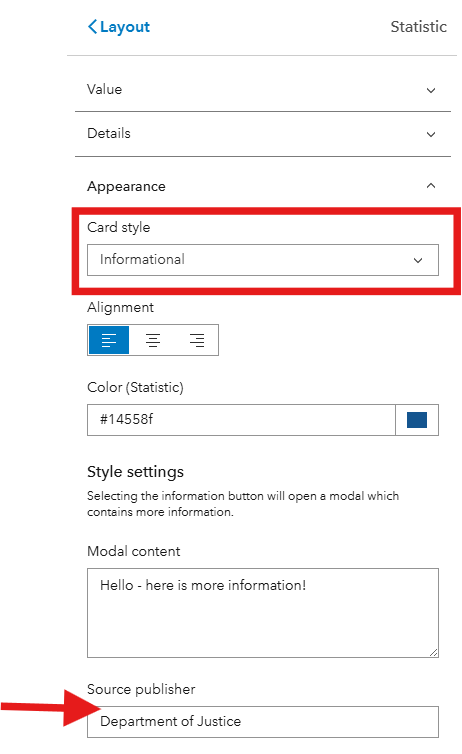
When the Summary Statistics card style is set to informational (red rectangle above), you can add the “Source publisher” (red arrow).
People
Showcase people involved in the project or initiative. This requires an ArcGIS organizational account – either within the EEA ArcGIS Online, or a public profile from another organization.
Accessibility Considerations:
- Heading Level
- Do not provide a title (under “Appearance”) as this is automatically assigned heading level 5 (H5) and will likely cause a skipped heading level on your site.
- Use a Text layout component to manually add a section title at the proper heading level.
- Colors—If selecting a custom color palette, ensure all color contrast requirements are met.
Search
The Search element provides users with a quick and easy way to search for content associated with your Hub site. Add this element in a consistent and logical location on each page to aid with navigation and wayfinding. Consider adding custom search text to help users get started. Always use the search bar and never the “browse button” option. We recommend placing the Search element near the top of your page. Placement under your site title will ensure this is prominent and easy to find.
Important! The Search element will only search for content shared to your site, like feature services, maps, applications, or other site pages. This will not search for content included in headers, text blocks, or layout elements (like “Gallery”).
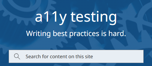
A sample search element that has been placed at the top of the Hub site under the page title. A custom search prompt has been added.
Video
Embed videos from YouTube, Facebook, and Vimeo. Provide a title for your video. Do not enable loop—ensure the user has control over video playback. Refer to the Animation section for more information. The Commonwealth’s Accessibility Office provides detailed guidance on making videos accessible, refer to this resource to ensure your videos meet requirements.
Animation
Animation can refer to transitions (think like in PowerPoint) between elements and pages, or it can refer to GIFs and videos. Best practices include:
- Allowing users to control animation by including start, stop, and pause options.
- When controls are not possible, disable animation.
- The use of GIFs is strongly discouraged because they will play on a loop with no ability to stop the animation.
- Never embed videos (MP4 or from YouTube) with autoplay enabled.
- Removing content that could cause medical issues (e.g. seizures) such as content with flashes.
- Eliminating all non-essential motion—element animation should not be used. Avoid using animated symbols in any map(s) included within the Hub site.
Checklist
-
Hub Site Accessibility Checklist, Open PDF file, 281.08 KB (English, PDF 281.08 KB)
| Date published: | October 13, 2026 |
|---|